1. Advert analysis – Foo Fighters – Greatest Hits
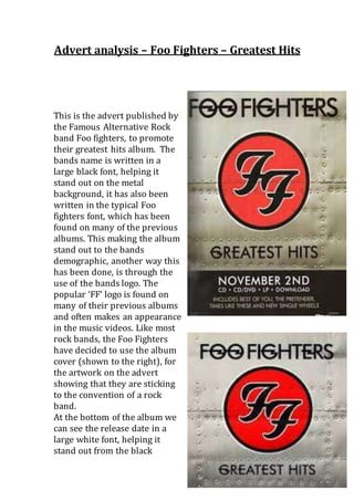
This is the advert published by
the Famous Alternative Rock
band Foo fighters, to promote
their greatest hits album. The
bands name is written in a
large black font, helping it
stand out on the metal
background, it has also been
written in the typical Foo
fighters font, which has been
found on many of the previous
albums. This making the album
stand out to the bands
demographic, another way this
has been done, is through the
use of the bands logo. The
popular ‘FF’ logo is found on
many of their previous albums
and often makes an appearance
in the music videos. Like most
rock bands, the Foo Fighters
have decided to use the album
cover (shown to the right), for
the artwork on the advert
showing that they are sticking
to the convention of a rock
band.
At the bottom of the album we
can see the release date in a
large white font, helping it
stand out from the black
2. background in attempt to catch the audiences attention.
Here we can also see the different forms of the album (CD .
CD/DVD . LP . DOWNLOAD), this showing that the album is
available to different types of listeners, rather than those
with access to a CD player. In further attempt to attract the
bands demographic, they have included a brief track listing
including some of their most popular songs and also a new
single, which would urge the fans to buy the album in order
to listen to the new single.