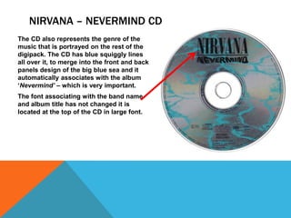
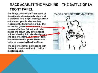
CONVENTIONS OF DIGIPACKS
Digipacks should include the following information:
-

A recognisable font that’s used across the advertising campaign –
album, posters and the digipack itself

-

The colour scheme must be simple and the same scheme must be used
throughout, to make the artist recognisable to that colour

-

A visual image and album title which can be the main cover and can
also feature along the spine, but usually, the album title is the only thing
featured along the spine – as well as the artists name

-

Reviews from well known companies to give the artist positive
recognition

-

Bar code and the music label that produced the final product

-

Track list
WHAT’S INSIDE A DIGIPACK?
-

Front panel – on the front panel of the digipack there should be a
recognisable image of the artist or band, and the other features in the
main image such as the title should coordinate with the band itself –
meaning, fonts etc. should be the same as they always have been so
people recognise instantly who the artist is and what type of produce
the artist produces. This also applies to the colour schemes the artist
would usually use.

-

It is important that while complying to the requirements I’ve mentioned
above, the artist produces an album cover that stands out in the
shops, so that people will want to buy it.
WHAT’S INSIDE A DIGIPACK?
-

Spine - Usually on the SPINE of the digipack you find the artists name
and album title in the usual font that associates the artist with the rest
of their work throughout their career.

-

Fold in panel – this is where an image of the artist is placed with brief
information about the artist.

-

Back panel – this is where the track list for the album can be found as
well as logo’s for record companies and a bar code. There may also be
further imagery on the back panel, that perhaps fade in with the track
list to make it stand out further and look attractive. Of course the back
panel image must coincide with the front panel’s image to continue the
artists theme and association with the rest of their work, so it is
recognisable to fans, and the general population who don’t even
necessarily like that particular type of music.
REPRESENTATION
-

The representation of a digipack is dependant on the genre of the
music, the mood and the atmosphere the type of music represents.
Therefore, certain colour schemes will be used to represent that mood
and the type of music expressed on the CD. This is important as those
who aren’t familiar with the particular works of the artist can tell what
type of music its going to be and if it appeals to them at all.
ANALYSING DIGIPACKS
NIRVANA - NEVERMIND
NIRVANA – NEVERMIND TEXT
The text on the album cover Nirvana Nevermind’ is brief and shows only the
band name and the title of the album itself.
The font used for ‘Nirvana’ is the same font
used across every album Nirvana have ever
released and therefore this makes the band
recognisable to most people.
The band name is in larger font than the
album title in order for it to stand out to
consumers. The font is in CAPITALS and is
quite unique which matches the image used
for the main cover which was seen as very
controversial.
DESIGN AND IMAGERY – FRONT PANEL
The image used to represent the album
cover is very different, unique and
alternate, which is exactly what Nirvana
were at the time of the albums release
in 1991. This image has been used to
stand out and to deliberately cause
controversy to get the band noticed
and to make people interested in the
album and to hopefully buy. The image
shows a naked baby, swimming in the
sea, following an American dollar note
attached to a fishing rod.
The image used is alternate and very
controversial and this is exactly what
Nirvana wanted to be a part of, the
alternate rock scene, and this grabs
consumers attention immediately and
makes a scene and recognises what
genre they aim themselves at, focusing
on a particular audience.

The blue front and back cover of the
album is also a good way to attract
consumer attention as it is very
bright and stands out.
DESIGN AND IMAGERY – BACK PANEL
Like many digipacks the back panel
corresponds directly to the front panel
in terms of style, font, and colour
schemes. This is important as it
reflects the mood and type of music
your going to be listening too, and
therefore pinpoints a particular
audience.
Of course, like all digipacks, on the
back we have the tracklist.
We also have a bar code on the back,
like all digipacks, as well as the record
labels logo and some small writing
labelling the copyright rules and legal
matters.
As well as the back panel, we have the spine located on the far right of the image.
On the spine, we can see, like most digipacks the album name and artist name in
the original fonts in smaller font, so that is able to fit into the small space, but still
associate completely with the rest of the artists work and target the audience it
wants.
NIRVANA – NEVERMIND CD
The CD also represents the genre of the
music that is portrayed on the rest of the
digipack. The CD has blue squiggly lines
all over it, to merge into the front and back
panels design of the big blue sea and it
automatically associates with the album
‘Nevermind’ – which is very important.
The font associating with the band name
and album title has not changed it is
located at the top of the CD in large font.
OFFSPRING - SMASH
OFFSPRING – SMASH TEXT
The text on the Offspring album –
‘Smash’ is like most other digipacks.
The text shows the band and album
name in large font, with the band name
at the top and the album name at the
bottom. The band name like most
digipacks is in larger font than the
album name, because it needs to stand
out for people to want to buy it when
walking past it in a shop or somewhere
else that would sell music. This is
because a consumer is more likely to
recognise the band name, then the
album name especially if it’s a new
album.
The font is very bold and large and is
white on black – this reflects the mood
and genre of the music immediately
and allows a particular audience to see
what type of music the album has to
offer and if its what they like, genre
wise.

The font used on this particular
album is different to other Offspring
albums and this is quite unique
amongst most digipacks as it doesn’t
create a stable identity for the band.
OFFSPRING – SMASH FRONT PANEL
The image used for the front panel of the
album cover is extremely dark and uses
what I would describe as ‘mouldy’
colours, such as dark brown and yellow.
This immediately tells the audience what
genre of music is being expressed within
the album – and obviously its going to be
grungy and metallic. The image is of a
skeleton, merged with a human like body
as well, suggesting dark and destructive
music like metal.
The colour schemes correspond with the
back panel as well which is like most
digipacks.
The colour scheme isn’t very bright and
attractive to consumers, however, it is
attracting an alternative image and this is
what is required to attract that audience.

To make the album stand out the best
it can the album title is in red, and is
in large capital letters in order for it to
be noticed on the shelves.
OFFSPRING – SMASH BACK PANEL
Like many digipacks the back panel
corresponds directly to the front panel in
terms of style, font, and colour schemes.
This is important as it reflects the mood
and type of music your going to be
listening too, and therefore pinpoints a
particular audience.

Of course, like all digipacks, on the back
we have the tracklist.
We also have a bar code on the back, like
all digipacks, as well as the record labels
logo and some small writing labelling the
copyright rules and legal matters.

As well as the back panel, we have the spine located on the far right of the image.
On the spine, we can see, like most digipacks the album name and artist name in
the original fonts in smaller font, so that is able to fit into the small space, but
still associate completely with the rest of the artists work and target the audience
it wants.
OFFSPRING – SMASH CD
The CD also represents the genre of the
music that is portrayed on the rest of the
digipack. The CD for the Offspring – Smash
album replicates the front and back panels
with the same image in more of a ‘reddish’
colour. Therefore, like most digipacks, it is
following the colour schemes in order to
associate itself with the rest of the
digipack.
The font is the same on the CD however,
the word, SMASH is now in white in
comparison to the red SMASH on the front
panel – this is because the colour of the
CD has changed to red and the font colour
needed to be changed in order to be seen.
RAGE AGAINST THE MACHINE – THE BATTLE OF LA
RAGE AGAINST THE MACHINE – THE BATTLE OF
LA TEXT
The text on the album The Battle of LA
by Rage Against the Machine is like
most other digipacks. The text shows
the band and album name in large font,
with the band name at the top and the
album name in the middle, although
sometimes the album name can be at
the very bottom of the album. The band
name like most digipacks is in larger
font than the album name, because it
needs to stand out for people to want
to buy it when walking past it in a shop
or somewhere else that would sell
music. This is because a consumer is
more likely to recognise the band
name, then the album name especially
if it’s a new album. The album name on
this particular digipack is in a different
font to the band name because it is
reflecting the image on the digipack
and perhaps the mood and genre of the
music that is going to be expressed in
the album.

The font used for the band name is in bold
and in CAPITALS to make it stand out –
whilst the font for the album name is in
‘graffiti’ like font to coincide with the
image, which is an example of graffiti and
will perhaps reflect the genre and mood of
the album.
RAGE AGAINST THE MACHINE – THE BATTLE OF LA
FRONT PANEL
The image used for the front panel of
the album is almost purely white and
is therefore very bright making it stand
out to most people whether they
recognise the band name or not. The
distinctive graffiti like outline of a
person with their fist in the air, also
makes the album very different and
unique, allowing it to stand out greatly.
The colour scheme immediately tells
the audience what genre of music is
being expressed within the album.
The colour schemes correspond with
the back panel as well which is like
most digipacks.
RAGE AGAINST THE MACHINE – THE BATTLE OF
LA BACK PANEL
Like many digipacks the back panel
corresponds directly to the front panel
in terms of style, font, and colour
schemes. This is important as it
reflects the mood and type of music
your going to be listening too, and
therefore pinpoints a particular
audience.
Of course, like all digipacks, on the
back we have the tracklist.
We also have a bar code on the back,
like all digipacks, as well as the record
labels logo and some small writing
labelling the copyright rules and legal
matters.
As well as the back panel, we have the spine located on the far right of the image. On
the spine, we can see, like most digipacks the album name and artist name in the
original fonts in smaller font, so that is able to fit into the small space, but still
associate completely with the rest of the artists work and target the audience it
wants.
RAGE AGAINST THE MACHINE – THE BATTLE OF
LA CD
The CD also represents the genre of
the music that is portrayed on the rest
of the digipack. The CD for the
digipack of ‘The Battle of LA’
replicates the front and back panel
with the graffiti like figure and the
fonts for the band name and album
name, however, like most digipacks,
this CD doesn’t follow the same
colour schemes, as this CD is purely
black compared to the front and back
panels which are white.

diiigii

  • 2.
    CONVENTIONS OF DIGIPACKS Digipacksshould include the following information: - A recognisable font that’s used across the advertising campaign – album, posters and the digipack itself - The colour scheme must be simple and the same scheme must be used throughout, to make the artist recognisable to that colour - A visual image and album title which can be the main cover and can also feature along the spine, but usually, the album title is the only thing featured along the spine – as well as the artists name - Reviews from well known companies to give the artist positive recognition - Bar code and the music label that produced the final product - Track list
  • 3.
    WHAT’S INSIDE ADIGIPACK? - Front panel – on the front panel of the digipack there should be a recognisable image of the artist or band, and the other features in the main image such as the title should coordinate with the band itself – meaning, fonts etc. should be the same as they always have been so people recognise instantly who the artist is and what type of produce the artist produces. This also applies to the colour schemes the artist would usually use. - It is important that while complying to the requirements I’ve mentioned above, the artist produces an album cover that stands out in the shops, so that people will want to buy it.
  • 4.
    WHAT’S INSIDE ADIGIPACK? - Spine - Usually on the SPINE of the digipack you find the artists name and album title in the usual font that associates the artist with the rest of their work throughout their career. - Fold in panel – this is where an image of the artist is placed with brief information about the artist. - Back panel – this is where the track list for the album can be found as well as logo’s for record companies and a bar code. There may also be further imagery on the back panel, that perhaps fade in with the track list to make it stand out further and look attractive. Of course the back panel image must coincide with the front panel’s image to continue the artists theme and association with the rest of their work, so it is recognisable to fans, and the general population who don’t even necessarily like that particular type of music.
  • 5.
    REPRESENTATION - The representation ofa digipack is dependant on the genre of the music, the mood and the atmosphere the type of music represents. Therefore, certain colour schemes will be used to represent that mood and the type of music expressed on the CD. This is important as those who aren’t familiar with the particular works of the artist can tell what type of music its going to be and if it appeals to them at all.
  • 6.
  • 7.
  • 8.
    NIRVANA – NEVERMINDTEXT The text on the album cover Nirvana Nevermind’ is brief and shows only the band name and the title of the album itself. The font used for ‘Nirvana’ is the same font used across every album Nirvana have ever released and therefore this makes the band recognisable to most people. The band name is in larger font than the album title in order for it to stand out to consumers. The font is in CAPITALS and is quite unique which matches the image used for the main cover which was seen as very controversial.
  • 9.
    DESIGN AND IMAGERY– FRONT PANEL The image used to represent the album cover is very different, unique and alternate, which is exactly what Nirvana were at the time of the albums release in 1991. This image has been used to stand out and to deliberately cause controversy to get the band noticed and to make people interested in the album and to hopefully buy. The image shows a naked baby, swimming in the sea, following an American dollar note attached to a fishing rod. The image used is alternate and very controversial and this is exactly what Nirvana wanted to be a part of, the alternate rock scene, and this grabs consumers attention immediately and makes a scene and recognises what genre they aim themselves at, focusing on a particular audience. The blue front and back cover of the album is also a good way to attract consumer attention as it is very bright and stands out.
  • 10.
    DESIGN AND IMAGERY– BACK PANEL Like many digipacks the back panel corresponds directly to the front panel in terms of style, font, and colour schemes. This is important as it reflects the mood and type of music your going to be listening too, and therefore pinpoints a particular audience. Of course, like all digipacks, on the back we have the tracklist. We also have a bar code on the back, like all digipacks, as well as the record labels logo and some small writing labelling the copyright rules and legal matters. As well as the back panel, we have the spine located on the far right of the image. On the spine, we can see, like most digipacks the album name and artist name in the original fonts in smaller font, so that is able to fit into the small space, but still associate completely with the rest of the artists work and target the audience it wants.
  • 11.
    NIRVANA – NEVERMINDCD The CD also represents the genre of the music that is portrayed on the rest of the digipack. The CD has blue squiggly lines all over it, to merge into the front and back panels design of the big blue sea and it automatically associates with the album ‘Nevermind’ – which is very important. The font associating with the band name and album title has not changed it is located at the top of the CD in large font.
  • 12.
  • 13.
    OFFSPRING – SMASHTEXT The text on the Offspring album – ‘Smash’ is like most other digipacks. The text shows the band and album name in large font, with the band name at the top and the album name at the bottom. The band name like most digipacks is in larger font than the album name, because it needs to stand out for people to want to buy it when walking past it in a shop or somewhere else that would sell music. This is because a consumer is more likely to recognise the band name, then the album name especially if it’s a new album. The font is very bold and large and is white on black – this reflects the mood and genre of the music immediately and allows a particular audience to see what type of music the album has to offer and if its what they like, genre wise. The font used on this particular album is different to other Offspring albums and this is quite unique amongst most digipacks as it doesn’t create a stable identity for the band.
  • 14.
    OFFSPRING – SMASHFRONT PANEL The image used for the front panel of the album cover is extremely dark and uses what I would describe as ‘mouldy’ colours, such as dark brown and yellow. This immediately tells the audience what genre of music is being expressed within the album – and obviously its going to be grungy and metallic. The image is of a skeleton, merged with a human like body as well, suggesting dark and destructive music like metal. The colour schemes correspond with the back panel as well which is like most digipacks. The colour scheme isn’t very bright and attractive to consumers, however, it is attracting an alternative image and this is what is required to attract that audience. To make the album stand out the best it can the album title is in red, and is in large capital letters in order for it to be noticed on the shelves.
  • 15.
    OFFSPRING – SMASHBACK PANEL Like many digipacks the back panel corresponds directly to the front panel in terms of style, font, and colour schemes. This is important as it reflects the mood and type of music your going to be listening too, and therefore pinpoints a particular audience. Of course, like all digipacks, on the back we have the tracklist. We also have a bar code on the back, like all digipacks, as well as the record labels logo and some small writing labelling the copyright rules and legal matters. As well as the back panel, we have the spine located on the far right of the image. On the spine, we can see, like most digipacks the album name and artist name in the original fonts in smaller font, so that is able to fit into the small space, but still associate completely with the rest of the artists work and target the audience it wants.
  • 16.
    OFFSPRING – SMASHCD The CD also represents the genre of the music that is portrayed on the rest of the digipack. The CD for the Offspring – Smash album replicates the front and back panels with the same image in more of a ‘reddish’ colour. Therefore, like most digipacks, it is following the colour schemes in order to associate itself with the rest of the digipack. The font is the same on the CD however, the word, SMASH is now in white in comparison to the red SMASH on the front panel – this is because the colour of the CD has changed to red and the font colour needed to be changed in order to be seen.
  • 17.
    RAGE AGAINST THEMACHINE – THE BATTLE OF LA
  • 18.
    RAGE AGAINST THEMACHINE – THE BATTLE OF LA TEXT The text on the album The Battle of LA by Rage Against the Machine is like most other digipacks. The text shows the band and album name in large font, with the band name at the top and the album name in the middle, although sometimes the album name can be at the very bottom of the album. The band name like most digipacks is in larger font than the album name, because it needs to stand out for people to want to buy it when walking past it in a shop or somewhere else that would sell music. This is because a consumer is more likely to recognise the band name, then the album name especially if it’s a new album. The album name on this particular digipack is in a different font to the band name because it is reflecting the image on the digipack and perhaps the mood and genre of the music that is going to be expressed in the album. The font used for the band name is in bold and in CAPITALS to make it stand out – whilst the font for the album name is in ‘graffiti’ like font to coincide with the image, which is an example of graffiti and will perhaps reflect the genre and mood of the album.
  • 19.
    RAGE AGAINST THEMACHINE – THE BATTLE OF LA FRONT PANEL The image used for the front panel of the album is almost purely white and is therefore very bright making it stand out to most people whether they recognise the band name or not. The distinctive graffiti like outline of a person with their fist in the air, also makes the album very different and unique, allowing it to stand out greatly. The colour scheme immediately tells the audience what genre of music is being expressed within the album. The colour schemes correspond with the back panel as well which is like most digipacks.
  • 20.
    RAGE AGAINST THEMACHINE – THE BATTLE OF LA BACK PANEL Like many digipacks the back panel corresponds directly to the front panel in terms of style, font, and colour schemes. This is important as it reflects the mood and type of music your going to be listening too, and therefore pinpoints a particular audience. Of course, like all digipacks, on the back we have the tracklist. We also have a bar code on the back, like all digipacks, as well as the record labels logo and some small writing labelling the copyright rules and legal matters. As well as the back panel, we have the spine located on the far right of the image. On the spine, we can see, like most digipacks the album name and artist name in the original fonts in smaller font, so that is able to fit into the small space, but still associate completely with the rest of the artists work and target the audience it wants.
  • 21.
    RAGE AGAINST THEMACHINE – THE BATTLE OF LA CD The CD also represents the genre of the music that is portrayed on the rest of the digipack. The CD for the digipack of ‘The Battle of LA’ replicates the front and back panel with the graffiti like figure and the fonts for the band name and album name, however, like most digipacks, this CD doesn’t follow the same colour schemes, as this CD is purely black compared to the front and back panels which are white.