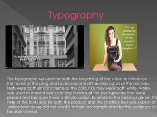
How effective is the combination of your
     product and ancillary texts?
Typography


The typography we used for both the beginning of the video to introduce
the name of the song and band and one of the inlay cards of the ancillary
texts were both similar in terms of the colour as they were both white. White
was used to make it eye catching in terms of the backgrounds that were
placed and because it was a simple colour, to relate to the jazz/soul genre. The
style of the font used for both the product and the ancillary text was kept in an
 artless form as we did not want it to look too complicated for the audience to
be able to read.
For our ancillary designs we had to crate a front cover album , back cover,
two inlay cards, a magazine advertisement as well as the final music video.
I had looked at typical conventions and codes of ancillary work taken from
Signed artists, especially amongst the soul/jazz genre and had taken them
Into consideration when creating our final products.


 This is taken from a front cover album of a jazz singer called John Coltrane. The main image
 Consists of John being placed at the centre of the cover, in a medium shot showing to be looking
 In deep thought as this is expressed with him looking away from the camera, but like our front
  over album is, with the performer looking as if she is in some sort of daze and not staring directly
 Into the camera. The reason for choosing this image of the performer for our front cover is that
 it shows the surroundings that would be the park and this is linked with the location of the music
 video where towards the end, she collects the balloons and lets them go in a random park. We
 also chose this because of her gaze away from the camera, it wants the audience not to focus
 solely on her image but her music as well, and that is how real life artists from the jazz/soul genre
 want to be portrayed as.
Mise en scene


The conventional way of artists from this particular type of genre to dress would be smartly dressed
and clothing that is simple yet elegant to wear. This is consistent throughout both the video, album
covers and the magazine advertisement. The actress most importantly that we have chosen to pursue
these overall products has fitted perfectly into who we were aiming to look for and that is that she had
to fit the stereotypical convention and that was from a white nationality.
The positioning of the actress in both the ancillary and video was that she was placed in the centre
most of the time for the audience to be aware of her presence and the lighting that was used was
natural lighting and this was used for both the product and ancillary tasks. We had used natural
lighting because we did not want the lighting to be contrasting to the natural locations and keeping
it simple was what we were aiming for. All these elements when they are put together creates the
closest possible representation of the jazz/soul genre.
Colour
The colour that was used through
out the video and the ancillary
products were mainly in black and
white and this was constant through
out the video. The reasoning for
using the black and white effect
represents a different time period
and it also reflects the mood of the
artists approach and mood to
everything that is around her.
There is some hint of colour on the
front and back cover of the album
because we wanted this to relate to
the last scene of the video . Applying
colour to the performance scenes
and the last scene of the video would
create a build up of the video,
leading it to an end where the overall
mood has changed to a more uplifting one
and the colours represent that. We wanted
that to be inserted into the ancillary tasks
as well.
Ancillary

Ancillary

  • 1.
    How effective isthe combination of your product and ancillary texts?
  • 2.
    Typography The typography weused for both the beginning of the video to introduce the name of the song and band and one of the inlay cards of the ancillary texts were both similar in terms of the colour as they were both white. White was used to make it eye catching in terms of the backgrounds that were placed and because it was a simple colour, to relate to the jazz/soul genre. The style of the font used for both the product and the ancillary text was kept in an artless form as we did not want it to look too complicated for the audience to be able to read.
  • 3.
    For our ancillarydesigns we had to crate a front cover album , back cover, two inlay cards, a magazine advertisement as well as the final music video. I had looked at typical conventions and codes of ancillary work taken from Signed artists, especially amongst the soul/jazz genre and had taken them Into consideration when creating our final products. This is taken from a front cover album of a jazz singer called John Coltrane. The main image Consists of John being placed at the centre of the cover, in a medium shot showing to be looking In deep thought as this is expressed with him looking away from the camera, but like our front over album is, with the performer looking as if she is in some sort of daze and not staring directly Into the camera. The reason for choosing this image of the performer for our front cover is that it shows the surroundings that would be the park and this is linked with the location of the music video where towards the end, she collects the balloons and lets them go in a random park. We also chose this because of her gaze away from the camera, it wants the audience not to focus solely on her image but her music as well, and that is how real life artists from the jazz/soul genre want to be portrayed as.
  • 4.
    Mise en scene Theconventional way of artists from this particular type of genre to dress would be smartly dressed and clothing that is simple yet elegant to wear. This is consistent throughout both the video, album covers and the magazine advertisement. The actress most importantly that we have chosen to pursue these overall products has fitted perfectly into who we were aiming to look for and that is that she had to fit the stereotypical convention and that was from a white nationality. The positioning of the actress in both the ancillary and video was that she was placed in the centre most of the time for the audience to be aware of her presence and the lighting that was used was natural lighting and this was used for both the product and ancillary tasks. We had used natural lighting because we did not want the lighting to be contrasting to the natural locations and keeping it simple was what we were aiming for. All these elements when they are put together creates the closest possible representation of the jazz/soul genre.
  • 5.
    Colour The colour thatwas used through out the video and the ancillary products were mainly in black and white and this was constant through out the video. The reasoning for using the black and white effect represents a different time period and it also reflects the mood of the artists approach and mood to everything that is around her. There is some hint of colour on the front and back cover of the album because we wanted this to relate to the last scene of the video . Applying colour to the performance scenes and the last scene of the video would create a build up of the video, leading it to an end where the overall mood has changed to a more uplifting one and the colours represent that. We wanted that to be inserted into the ancillary tasks as well.