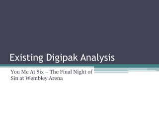
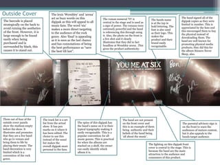
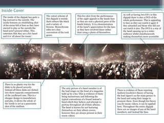
Existing Digipak Analysis 
You Me At Six – The Final Night of 
Sin at Wembley Arena
Outside Cover 
The track list is a set 
list from the actual 
show. It has pen 
marks on it where it 
has been edited. The 
choice to use this 
instead of the usual 
list makes the 
overall digipak more 
personal to the fans. 
The parental advisory sign is 
on the front to warn the 
audiences of mature content, 
but it also appeals to the 
bands target audience. 
The lexis ‘Wembley’ and ‘arena’ 
act as buzz words on this 
digipak as this will appeal to all 
music fans. The word ‘sin’ 
makes a more direct targeting 
to the audience of the rock 
genre. Also ‘final’ is appealing 
as it is seen as the last chance 
and has connotations of being 
the best performance as “save 
the best till last”. 
Three out of four of the 
outside cover panels 
show the stadium empty 
before the show. It 
illustrates and promotes 
that they are a live band 
who go to venues and 
bring them to life by 
playing their music. The 
band decoration is very 
limited which is a 
convention of the rock 
genre. 
The bands name 
is at the top in 
bold lettering. The 
font is also used 
as their logo. This 
makes the 
product and their 
brand easily 
recognisable. 
The barcode is placed 
strategically on the back to 
avoid ruining the aesthetics 
of the front. However, it is 
large enough to be found 
easily when being 
purchased and is 
surrounded by black, this 
causes it to stand out. 
The roman numeral ‘VI’ is 
central in the stage and is used as 
a sign of power. The romans were 
extremely powerful and the band 
is referencing this through using 
it. Also, the photo on the front is 
a live shot and it clearly 
illustrates that they did in fact 
headline at Wembley arena . This 
gives the product authenticity. 
The spine of this digipak has 
the band’s name on it in their 
typical typography making it 
easily recognisable. This is a 
popular convention for all 
music genres. This is practical 
for when the albums are 
stacked on a shelf, the owner 
can easily identify which 
album it is. 
The band are not present 
on the front cover and 
this is an example of them 
being authentic and their 
beliefs of the band being 
‘all about the music’. 
The band signed all of the 
digipak copies as they were 
limited in number. This is 
appreciated by the fans and 
this encouraged them to buy 
the physical instead of 
downloading them. The 
band are well known for 
promoting physical media 
products, they did this for 
the album Sinners Never 
Sleep, also. 
The lighting on this digipak front 
cover is central to the stage. This is 
because the band are the main 
attraction to the audience and 
consumers of this product.
Inside Cover 
The inside of the digipak has quite a 
big contrast to the outside. The 
inside features an establishing shot 
of the arena full of fans as they have 
started to play as the outside the 
band aren’t present either. This 
reiterates that they are a live band 
and it is ‘all about the music’. 
There is no plastic tray for the 
disks to be placed securely. 
Instead all three disks are slotted 
into three separate compartments 
of the cardboard case. This is a 
cheaper design to manufacture 
and also, it allows the whole of 
the inside to act as a panoramic 
shot of the stadium. 
As well as having two CD’s in this 
digipak there is also a DVD of the 
whole performance. This is appealing 
to fans as they can watch it again if 
they attended and those who did not 
can watch it also. The DVD is a way of 
the band opening up to a wider 
audience whilst simultaneously 
making themselves more accessible. 
There is evidence of them rejecting 
Andrew Goodwin’s theory of having 
the lead signer’s as the main person in 
the band and using their image to 
promote them. Even though his theory 
was for music videos, it can be applied 
here. Throughout the entire digipak 
there are no images of any of the band 
members, and instead the fans. 
This live shot from the performance 
of the night appeals to the bands fans 
as they are now a physical piece of the 
bands history. It is a demonstration 
of the band’s appreciation for the fans 
as they have involved them rather 
than using a photo of themselves. 
The colour scheme of 
this digipak is mainly 
dark colours like black 
and a variety of 
browns. Monochrome 
edits are a key 
convention of the rock 
genre. 
The only picture of a band member is of 
the lead singer on the front of a magazine 
held up by a fan. This is evidence of them 
being mainstream and following the 
typical conventions of a brand instead a 
band which they believe and attempt to 
portray throughout all of their albums. 
The band is known for not featuring 
themselves on their album covers, 
however they are always present in their 
music videos.

A2 Media Studies: You Me At Six Digipak Analysis

  • 1.
    Existing Digipak Analysis You Me At Six – The Final Night of Sin at Wembley Arena
  • 2.
    Outside Cover Thetrack list is a set list from the actual show. It has pen marks on it where it has been edited. The choice to use this instead of the usual list makes the overall digipak more personal to the fans. The parental advisory sign is on the front to warn the audiences of mature content, but it also appeals to the bands target audience. The lexis ‘Wembley’ and ‘arena’ act as buzz words on this digipak as this will appeal to all music fans. The word ‘sin’ makes a more direct targeting to the audience of the rock genre. Also ‘final’ is appealing as it is seen as the last chance and has connotations of being the best performance as “save the best till last”. Three out of four of the outside cover panels show the stadium empty before the show. It illustrates and promotes that they are a live band who go to venues and bring them to life by playing their music. The band decoration is very limited which is a convention of the rock genre. The bands name is at the top in bold lettering. The font is also used as their logo. This makes the product and their brand easily recognisable. The barcode is placed strategically on the back to avoid ruining the aesthetics of the front. However, it is large enough to be found easily when being purchased and is surrounded by black, this causes it to stand out. The roman numeral ‘VI’ is central in the stage and is used as a sign of power. The romans were extremely powerful and the band is referencing this through using it. Also, the photo on the front is a live shot and it clearly illustrates that they did in fact headline at Wembley arena . This gives the product authenticity. The spine of this digipak has the band’s name on it in their typical typography making it easily recognisable. This is a popular convention for all music genres. This is practical for when the albums are stacked on a shelf, the owner can easily identify which album it is. The band are not present on the front cover and this is an example of them being authentic and their beliefs of the band being ‘all about the music’. The band signed all of the digipak copies as they were limited in number. This is appreciated by the fans and this encouraged them to buy the physical instead of downloading them. The band are well known for promoting physical media products, they did this for the album Sinners Never Sleep, also. The lighting on this digipak front cover is central to the stage. This is because the band are the main attraction to the audience and consumers of this product.
  • 3.
    Inside Cover Theinside of the digipak has quite a big contrast to the outside. The inside features an establishing shot of the arena full of fans as they have started to play as the outside the band aren’t present either. This reiterates that they are a live band and it is ‘all about the music’. There is no plastic tray for the disks to be placed securely. Instead all three disks are slotted into three separate compartments of the cardboard case. This is a cheaper design to manufacture and also, it allows the whole of the inside to act as a panoramic shot of the stadium. As well as having two CD’s in this digipak there is also a DVD of the whole performance. This is appealing to fans as they can watch it again if they attended and those who did not can watch it also. The DVD is a way of the band opening up to a wider audience whilst simultaneously making themselves more accessible. There is evidence of them rejecting Andrew Goodwin’s theory of having the lead signer’s as the main person in the band and using their image to promote them. Even though his theory was for music videos, it can be applied here. Throughout the entire digipak there are no images of any of the band members, and instead the fans. This live shot from the performance of the night appeals to the bands fans as they are now a physical piece of the bands history. It is a demonstration of the band’s appreciation for the fans as they have involved them rather than using a photo of themselves. The colour scheme of this digipak is mainly dark colours like black and a variety of browns. Monochrome edits are a key convention of the rock genre. The only picture of a band member is of the lead singer on the front of a magazine held up by a fan. This is evidence of them being mainstream and following the typical conventions of a brand instead a band which they believe and attempt to portray throughout all of their albums. The band is known for not featuring themselves on their album covers, however they are always present in their music videos.