
Recommended
More Related Content
What's hot
What's hot (20)
Viewers also liked
Viewers also liked (20)
Similar to Evaluation Question 1
Similar to Evaluation Question 1 (20)
More from asmediad14
More from asmediad14 (20)
Recently uploaded
Recently uploaded (20)
Evaluation Question 1
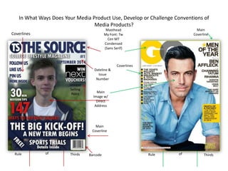
- 1. In What Ways Does Your Media Product Use, Develop or Challenge Conventions of Media Products? Masthead My Font: Tw Cen MT Condensed (Sans Serif) Main Coverline Main Coverline Main Image w/ Direct Address Coverlines Coverlines Dateline & Issue Number BarcodeRule of Thirds Rule of Thirds Unique Selling Point
- 2. In What Ways Does Your Media Product Use, Develop or Challenge Conventions of Media Products? My colour scheme on the front cover was consistent throughout as I used the colours blue and white in order to link the main image to my coverlines. By having a consistent colour scheme keeps the magazine looking attractive and professional as everything is clear to read and understand. I have used rule of thirds as I have my main image in the centre of the page with the coverlines on either side of the main image. This follows convention of magazine as it is similar to ‘GQ’ magazine who also have the cover star in the centre with the coverlines either side. I have positioned my issue number and dateline in the top left corner underneath the masthead in order to follow conventions and allow the audience to know that the information inside will be up to date. However, this is different to ‘GQ’ as they have not followed conventions by not including an issue number and dateline. Despite these not being essential to a front cover, I felt it necessary to use them as it allows the audience to be entirely convinced that the information inside is completely up to date. In contrast to ‘GQ’ magazine, I have included a unique selling point (USP) in order to provide a further incentive to my audience to purchase the magazine and therefore make the magazine more successful by selling more copies. The USP is relevant to the magazine as the intended audience is teenagers aged between 16-18 who are currently attending college. This is relevant because this audience will be interested in fashion and the USP is a competition allowing you to win ‘Next’ vouchers; ‘Next’ being a very popular high street shop. Similarly to ‘GQ’ magazine, my masthead is at the top of the page and is big and bold. I did this to follow magazine cover conventions and make it obvious to the audience what the magazine is called. My main image is a head and shoulders shot with direct address to speak directly to the intended audience and make them feel involved. This is very similar to ‘GQ’ magazine; this was done to stick to conventions and be as effective as possible. This didn’t change much from my original drafts as the layout and positioning of my main image remained in the same place. MY MAGAZINE ‘GQ’ MAGAZINE
- 3. In What Ways Does Your Media Product Use, Develop or Challenge Conventions of Media Products? Masthead My Font: Tw Cen MT Condensed (Sans Serif) Masthead Contents Title Contents Title Quotations Selection of Photos Quotations
- 4. In What Ways Does Your Media Product Use, Develop or Challenge Conventions of Media Products? MY MAGAZINE ‘GQ’ MAGAZINE I attempted to use rule of thirds on my contents page, however, it wasn’t quite as effective as on my front cover, because all of the hotspots didn’t contain elements of a contents page. This is in some in contrast to ‘GQ’ magazine because the page is split up into three columns containing text and images. In terms of my layout, it didn’t change much from my initial drafts. This is because I still have the masthead and contents title at the top of the page, with the actual contents list on the left and then a main image on the right. There were a couple of elements I added, however, such as the social networking logo’s in the top right and the contact information also in the top right corner. This follows conventions as, traditionally, contact information goes on the contents page, rather than the front cover. My colour scheme and font remained the same, as to keep the magazines design consistent and identifiable. The font is still Tw Cen MT Condensed (Sans Serif) for the masthead. The colour scheme is still a blue and white theme. This means the audience will still feel as if they are reading the same magazine because the style and design remains consistent and does not get confusing. I used pull quotations on my contents page in order to keep the magazine all linked together, rather than having each page feel like a separate magazine. This follows conventions as it allows the audience to find the main topics of the magazine quickly and without hassle. ‘GQ’ magazine have also used these for the same reasons. These were not originally on my drafts, however, I decided to add them in order to follow magazine conventions to more effect.