
Recommended
More Related Content
What's hot
What's hot (20)
Viewers also liked
Similar to Evaluation question 1
Similar to Evaluation question 1 (20)
More from asmediad14
More from asmediad14 (20)
Recently uploaded
Recently uploaded (20)
Evaluation question 1
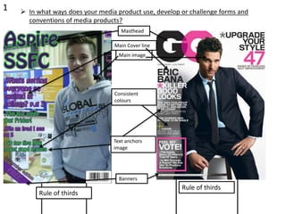
- 1. 1 In what ways does your media product use, develop or challenge forms and conventions of media products? Masthead Main image Main Cover line Consistent colours Banners Text anchors image Rule of thirds Rule of thirds
- 2. • In my student magazine I have used one masthead so the reader will not be distracted from what the magazine is and offers, in the masthead also I located it on the top left corner of the magazine this was done so when the magazine is placed in a shop is will be stacked but still readable this follows convention. Another example of how I have followed convention is in my main image in which the student used was directly facing the camera like in ‘GQ’ this use of direct is suitable because it makes the image the focus of the magazine. In the image the shot type is also similar with both magazines using a medium length camera shot also creating a focus form the reader into the image whom is the subject of the magazine. I have also followed convention by using a consistent and continuous colour scheme of college colours green and purple this is used to try and prevent the reader from not understanding all text on display. However one thing I did change was the font used as ‘san serif’ is usually the magazine convention, I differed from this and used more a bold and attractive font called ‘hobo std’ which feels younger and less formal for young adults whom are the target audience compared with a magazine such as ‘GQ’. I put a small banner in the corner of my magazine to add an important piece of information e.g. the price of the magazine this also follows the typical convention. 22
- 3. 3 In what ways does your media product use, develop or challenge forms and conventions of media products? Selection of photos Contents title Page reference Consistent colours Rule of thirds Rule of thirds
- 4. 4 In what ways does your media product use, develop or challenge forms and conventions of media products? My contents title I used breaks the usual convention used on a magazine due to it using a font other than ‘san serif’ as just like on by front cover I have continued to follow my house style by using ‘hobo std’ the reason for this is it feels a younger and less formal font for young adults whom are the target audience compared with a magazine such as ‘Q’. I have used a range of photos of my contents page which is convention on a contents page in a magazine usually to give the reader a small image preview of what is contained on that page but also as seen on my magazine images that relate to the contents text such as ‘sports trials this week’ being associated with an image of a rugby ball while ‘Q’ has a text of ‘the courteeners’ and then an image of the band. In my contents page I have included page references as this is the main purpose of a contents page and does not make sense to break this convention. On the contents page I have also followed my colour scheme of green and purple (college colours)to keep consistency and follow my house style and not break convention. Rule of thirds is used my magazine to help separate information and not confuse the reader this also follows convention as seen on ‘Q’