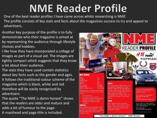
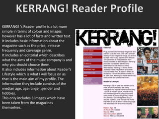
2. Another key purpose of the profile is to fully
demonstrate who their magazine is aimed at
by representing the audience through lifestyle
choices and hobbies.
I like how they have incorporated a collage of
images as part of a visual aid. The images are
tightly compact which suggests that they know
a lot about their audience.
The stats they have used contain statistics
about key facts such as the gender and ages.
It follows the traditional colour scheme of the
magazine which is black, white and red
therefore will be easily recognised by
advertisers.
The quote “The NME is damn honest” shows
that the readers are older and mature and
adds a bit of humour to the page.
A masthead and page title is included.
One of the best reader profiles I have came across whilst researching is NME.
The profile consists of key stats and facts about the magazines success to try and appeal to
advertisers.
3. KERRANG! ‘s Reader profile is a lot more
simple in terms of colour and images
however has a lot of facts and written text.
It includes basic information about the
magazine such as the price, release
frequency and coverage genre.
It includes an editorial which describes
what the aims of the music company is and
why you should choose them.
It also includes information about Reader’s
Lifestyle which is what I will focus on as
that is the main aim of my profile. The
information they include consists of the
median age, age range , gender and
hobbies.
This only includes 3 images which have
been taken from the magazines
themselves.
4. After doing a small amount of research into reader profiles, I found that my two
favourite ones were by NME and KERRANG! After looking at these, I have decided I
will include the following features in my own readers profile:
• A collage of target audience images
• Cover Price
• Frequency of Release
• Statistics with percentages
• Lifestyle facts about my audience
• Articles my magazine focuses on
• Will stick to a basic colour scheme
• Keep it simple and straight to the point.