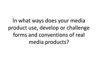
My magazine cover uses conventions of real magazine covers such as a masthead, cover lines, and consistent color scheme. It challenges conventions by placing the masthead on the left instead of center, adding a barcode and issue date, and using two banners with cover lines.
My contents page challenges conventions by not using columns and structuring text around images instead. It develops conventions by including page numbers, artist quotes, and a subscription advertisement.
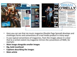
My double page spread develops conventions by including a page number, aligning text and images, and including a full article interview. It challenges conventions by placing smaller images in polaroid frames and adding a personal touch.