1. Research into existing texts
What we want our product to look like
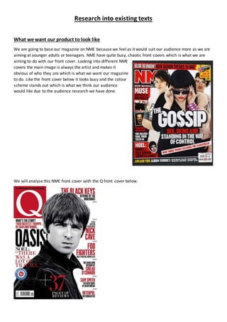
We are going to base our magazine on NME because we feel as it would suit our audience more as we are
aiming at younger adults or teenagers. NME have quite busy, chaotic front covers which is what we are
aiming to do with our front cover. Looking into different NME
covers the main image is always the artist and makes it
obvious of who they are which is what we want our magazine
to do. Like the front cover below it looks busy and the colour
scheme stands out which is what we think our audience
would like due to the audience research we have done.
We will analyse this NME front cover with the Q front cover below.
2. Colour
Both front covers use the colour scheme of black, white and red. This makes both magazines look more
chaotic and dramatic. This would appeal to an audience as it would stand out and intrigue them to read it.
It could also suggest that the magazines are aimed at the younger generation because of the colours it
uses. However NME adds yellow into its front cover to make it stand out even more. This also fits into the
house style of NME as most of their magazines include red and yellow. The use of yellow also makes the
magazine look more vibrant and interesting whereas Q uses the colour scheme to make it look more
sophisticated and simple.
Fonts
NME uses 2 different fonts on the front cover. However both fonts look similar and stand out. NME mainly
uses bold and blocky fonts to make the magazine stand out and look more dramatic. Whereas Q uses a
variety of different fonts as some of the fonts are swirly and flouncy but it also includes blocky and bold
fonts to make a statement at the same time. We are going to use similar fonts to NME as we think they will
fit better with our target audience and we want our magazine to make a statement.
Images
The images are different in both covers. NME uses a mid-shot to show the bands image and has images as
anchorage around to fit with the chaotic theme and makes it look more vibrant and colourful. Whereas Q
uses one main image in black and white to stick with the simple and sophisticated theme. This helps to give
the impression that Q is a high class music magazine for older adults. On the other hand NME is busy and
hectic suggesting it is aimed at the younger more energetic generation.
Layout
The layout on both magazines are pretty similar. Both magazines have the title of the magazine in the left
hand corner. This could be a connotation of music magazines and that they keep their title in the same
place. NME has a very hectic layout and includes lots of different anchorage with different coloured
backgrounds to fit with the layout and make the magazine look busy to fit with its target audience.
Whereas Q uses a simple and neat layout with most of the anchorage down one side with the same colours
for all the different headlines. This suits the target audience for the magazine as it is aimed at a higher class
generation so the magazine have gone for a simple layout.
Price
NME costs between £2-£3. This price is in the middle class of most magazines. This is a reasonable price
which shows it is aimed at middle class people. Also it is better for the younger target audience as they will
be able to afford it. Whereas Q is £3 which is more expensive suggesting that is supposed to be aimed at
the higher class and the older generation as they will be able to afford it.
Name
NME (New Musical Express) is a very simple and effective name. This will make it stand out compared to
other magazines as it is well recognised. The name NME makes a statement and is very bold which could
suggest it wants to find new readers by standing out to other magazines to make people notice it and want
to read it. In comparison to Q which is very simplistic and does not stand out on a front cover suggesting
that it is aimed at an audience that already know about Q as it doesn’t need to make a statement. It also
fits with the high class generation it is aimed at and fits with the layout and looks simplistic.
3. Analysing contents page
Words/layout
Both magazines use different colours and fonts throughout the contents page. The different colours and
fonts help to split the contents into sections to make the page easier to read. The right hand side of NME
and the left hand side of Q break the magazines down into sections so the reader can find the bits they are
most likely to be interested in. NME also includes an index on the contents page to help the reader find the
words or articles they are interested in. This makes it more likely to buy and read the magazine as they
know it includes articles they want to see. Both magazines also include a features section which tells the
reader what else the magazine features. NME also has a section at the bottom advertising their
subscriptions, this is a good idea as it entices the reader to subscribe as it works out cheaper. Q still keeps
it style simple but effective on the contents page. It only uses 3 fonts and only large text on the main
headlines. This fits in with the magazine as a whole as the words fit with the sophisticated style and appeal
to the audience as they want a higher class magazine. Both magazines include page numbers to help the
reader skip to the articles they are interested in.