
Recommended
More Related Content
What's hot
What's hot (20)
Similar to Front Cover Analysis; Mixmag
Similar to Front Cover Analysis; Mixmag (20)
More from paduaanne
More from paduaanne (11)
Recently uploaded
Recently uploaded (20)
Front Cover Analysis; Mixmag
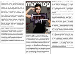
- 1. Masthead > The name ‘Mixmag’ suggests that the magazine focuses on dance music and the idea that DJ’s are mixing music on deck, this will interest the target audience because they will want to know what the magazine has to say about dance/club music. The typography for the masthead is written in display font with a curvy type, this causes it to look sophisticated yet simple and interesting which will appeal the viewers. It is a clear bold font making it stand out from the rest of the writing on the page even if it just has color white in it; this makes it easy for audiences to identify the magazine and its genre as well. The font used for the masthead is EmBauhaus Bold, which portrays modern aesthetic. The model is super imposed over the masthead not to make it rubbish but can still be easily read. The tagline also says it all, another factor to persuade viewers to buy the product is the tagline that says “The World’s Biggest Dance Music and Clubbing Magazine”, and this is again used to create familiarity in this particular kind of magazine. Main Image > Nina Kraviz is a Russian DJ, producer, and singer (source: wikepedia) and this model and also the used image suits the magazine as it is all about dance music and it can also be linked to the masthead “Mixmag” as she is a DJ. The image was a medium shot and it shows from above the head as an allowance for the masthead. The image also used a formal balance and direct mode of address to establish a fine look for the reader. Lead Article/Cover Lines > words such as “plus” usually can be as an incentive for buying this magazine as it adds extra information that could interest buyers. It is used for the magazine to look more fulfilling than others. It creates an idea that this magazine has so much to offer. The artists indicated in this magazine have been also picked specifically to also attract the target audience. The cover lines are used to show what may be included in the magazine and are anchored by pull quotes to further attract the reader to buy the magazine so they can read what is inside. Most of the font is also the same and is in capitals again to be easily read by the target audience. Target Audience > target audience of this magazine can be estimated to 24 years of age and above and preferably male. As males are more interesting in clubbing and nightlife and they are more interesting in the possible information and articles included in this magazine although there are some contents that could possibly attract women in a way. And also, majority of DJ’s are male so they males have something to do more with this kind of magazine than women do. House Style > The colour lines follow a colour scheme and a house style; they use the same font and are all sans serif with only the colours pink black and white used. These colours are used to make it more friendly and easy to read and are blended in the background colour s well the model’s image as it is dark and so bright colour has to be used including neutral colours, black and white. It is just simple as there are certain features that must be met for the target audience. Though it has only 3 colours, it was used and placed properly to their corresponding areas. Guttenberg Design > in the primary optical area, there’s no additional information just the title of the magazine which can be seen in the masthead however on the terminal area, we can see that there’s a bit of details on what you can see inside the magazine. It kind of follows the principle because after travelling to the terminal area, we go straight to strong fallow area which has a little bit of additional information that can be easily seen as it is placed on a clear area in the strong fallow area which can get the viewer’s attention and there also pieces of information in the weak fallow area which are of much relevant to the magazine but has no badge added for some irrelevant bits.