The document discusses the design of a magazine cover and contents page and how it uses and develops conventions of magazine design. Some key points:
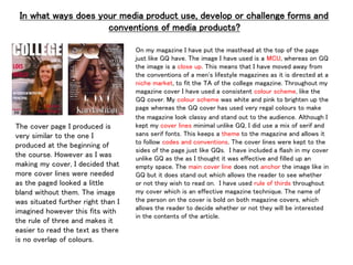
- The magazine cover uses a masthead, consistent colors, serif fonts, cover lines, and anchors the main image like typical magazine covers. However, it uses a medium close-up image rather than close-up to fit its niche college audience.
- The contents page uses consistent colors, photos, page references, serif subtitles and numbers, and rule of thirds composition like conventional magazines.
- Minor changes were made from draft designs to better follow conventions - adding more cover lines, repositioning the image, and arranging images and text on the contents page