
Recommended
More Related Content
What's hot
What's hot (20)
Viewers also liked
Viewers also liked (13)
Similar to Evaluation bruuuuuuh
Similar to Evaluation bruuuuuuh (20)
More from AS Media Column E
More from AS Media Column E (20)
Recently uploaded
Recently uploaded (20)
Evaluation bruuuuuuh
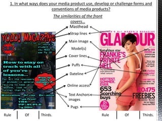
- 1. 1. In what ways does your media product use, develop or challenge forms and conventions of media products? The similarities of the front covers… Masthead Rule Of Thirds. Rule Of Thirds. Strap lines Main Image Model(s) Cover lines Dateline Online access Text Anchors images Pugs Puffs
- 2. The differences of the front covers… No stable colour scheme No direct address No quotes
- 3. In what ways does your media product use, develop or challenge forms and conventions of media products? *Key: Red Text are key terms. Use of Conventions: In my magazine, I have a very large masthead just like the GLAMOUR does, this gives a outline of the genre of the magazine, alerting potential readers on what its about, and its bold, has bright colours and has a unique font, so that if anybody who has read it previously, will remember it and may want to read it again. In my texts, “You’re” is used a lot for direct address, similar to how the Glamour magazines model looks directly at the camera. This is used to show the reader the magazine is speaking directly to them, engaging them. My front cover’s main image is of 2 students looking towards the 6th form, this is clearly aimed to relate to my Target audience which are students, showing them the genre of the magazine is a student magazine, which may help the audience gain a sense to read it.
- 4. How have I developed the codes and conventions?
- 5. Comparison with the drawn draft.
- 6. 1. In what ways does your media product use, develop or challenge forms and conventions of media products? The similarities of the Content pages… ‘Contents masthead’ Images (Relating to in-magazine articles) Page numbers
- 7. The differences of the content pages… Mine has the magazines logo Just one main image rather than multiple ones Quotes
- 8. In what ways does your media product use, develop or challenge forms and conventions of media products?
- 9. How have I developed the codes and conventions? *Key: Red Text are key terms. Use of Conventions: I added cover lines to the content page to give the readers a heads up on what their about to read. I threw in some quotes from students to make the magazine appeal to my TA (students). One the images I use has 2 of the models staring towards the camera which is direct address, this engages the reader and helps to let them know this is for them, as well as the line “Lets get started” does too. The masthead is in clear font to catch the attention of the reader.
- 10. Comparison with the drawn draft.