Hybridoma Technology ( Production , Purification , and Application )
Doc1
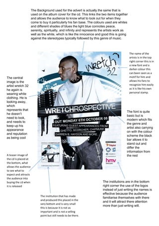
1. The Background used for the advert is actually the same that is
used on the album cover for the cd. This links the two items together
and allows the audience to know what to look out for when they
come to buy it particularly his fan base. The colours used are whites
and different shades of blues the light blue connotes peace,
serenity, spiritualty, and infinity and represents the artists work as
well as the white, which is like the innocence and good this is going
against the stereotypes typically followed by this genre of music.
The font is quite
basic but is
modern which fits
the genre and
artist also carrying
on with the colour
scheme the black
bar allows it to
stand out and
differ the
information from
the rest
The institutions are in the bottom
right corner the use of the logos
instead of just writing the names is
effective because the audience
familiarise themselves with there
and it will attract there attention
more than just writing will.
The central
image is the
artist wretch 32
he again is
wearing white
clothing. He is
looking away,
which
represents that
he doesn’t
need to look,
and needs to
keep up his
appearance
and reputation
as being cool
The name of the
artists is in the top
right corner this is in
a new font and a
darker colour this
can been seen as a
motif for him and
allows his fans to
recognize him easily
as it is like his own
personal stamp.
The institution that has made
and produced this placed in the
very bottom and is very small
this is because it is not as
important and is not a selling
point but still needs to be there.
A teaser image of
the cd is placed at
the bottom, what
allows the audience
to see what to
expect and attracts
the audience into
buying the cd when
it is released