
Recommended
More Related Content
What's hot
What's hot (20)
Similar to Jaymes - Ancillary Research
Similar to Jaymes - Ancillary Research (20)
More from rhsmediastudies
More from rhsmediastudies (20)
Recently uploaded
Recently uploaded (20)
Jaymes - Ancillary Research
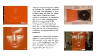
- 1. The colour orange not only stands out from the crowd due to its brightness, but also it’s a very clever piece of marketing. As we all know Ed Sheeran has ginger hair, this tied in with the fact the album and poster artwork are his face but in an orange/white take on a grey scale, makes a complete digipak marketing campaign for Ed Sheeran himself. This contrasts to the actual CD however, which is just plain black. This is used to reference the fact Ed does not put his sole focus on how a song is presented, but rather how it sounds and its meaning. The album front cover and tour promotion posters are virtually identically, the only difference being that the poster has writing on the front. In saying that, the goal of this album was to launch Ed Sheeran as a brand - make him a household face, recogniseable by his unique voice.
- 2. Both the tour poster and album artwork feature very clean, simple, and bright designs but with calm colours. This connotes to Sampha’s style of music, which is soul with modern beats etc. This is again shown through the font, which is modern for the era in which soul was more popular. The font could however be used, in an obscure way, to represent a digital alarm clock’s number style - giving a message that time is running out and you need to be quick to get a copy/ticket. In the tour poster, the fact Sampha is sort of in a falling/leaning back position says a few interesting things. One being that he could be suggesting that he is a free person and the music is not under the pressures of popular artists i.e he’s not selling out or moving to a genre that actually doesn’t suit him. He’s being loyal to himself.
- 3. Drake’s “Views” album and his subsequent tour are an interesting case of promotion. The two contrast completely, with the album artwork being just the same image of Drake sitting on top of the CN Tower in his hometown Toronto. Whereas the tour poster has no imagery, just words. Whilst this has no real consistency, the colour schemes provide a good link to the synergetic pieces, though not an obvious one.
- 4. Both the tour poster and album artwork feature the same font and colour scheme. The colour black is not just the canvas for the texts, however it represents the more serious nature of the songs Dave made for this album. Additionally, it contrasts well to the yellow and orange colours - helping to make the artist name, album/tour name and dates stand out. For the tour poster, the visual of Dave and a black panther have been split. This is a design choice and helps to portray Dave as an animal, waiting to take on his prey (often politicians and policies in his music). Overall the colour scheme and visuals work well together to promote Dave as a brand, and also as a kind of activist.