
Recommended
More Related Content
What's hot
What's hot (20)
Similar to BEN HOWARD
Similar to BEN HOWARD (20)
More from sarahpoore17
More from sarahpoore17 (20)
Recently uploaded
Recently uploaded (20)
BEN HOWARD
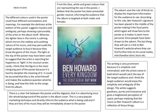
- 1. MEDIA STUDIES The different colours used in the poster could have differentconnotations and meanings. For example the darkness atthe bottom of the poster suggests mystery and ambiguity, perhaps showing a personality of the artist or the album itself. Whereas the lighter blue in the centre is calming which mirrors the mellow and soothing nature of his music, and may persuadethe target audience to buy it because they know the genre of the music. The light at the top of the poster may have been used to suggestthat the artist is searching for happiness or ‘light’ in his musical career. Lastly, i think that the figure is the most intriguing part of the poster because it is hard to decipher the meaning of it. It could be assumed that this is the artisthimself and makes the audience question whathe is doing, and how this links to the songs fromhis album. There is a clear link between the poster and the digipack, that it is advertising since the wholebackground of the poster is the album cover. This is a very popular marketing technique and directly informs the audience what is being sold and if they are fans of his music they will be immediately drawn to the poster. The advert uses the rule of thirds to display the important information for the audience to see. According to this rule, Ben Howard’s signature has been placed in the middle of the poster making it the focal point, which again will draw fans to the poster as it makes it seem more personal. Oncepeople have been drawn to the advert, The last thing they will see is a link to Ben Howard’s websitewherethey can find further links to his social media, merchandisestore, tours etc. The writing is very prominent because it is simplistic and minimalistic with the artists name in bold which would catch the eye of the target audience and i think the target audience would enjoy the simplicity and ambiguity of the design. The white suggests goodness, purity and innocence and gives a heightened perception of space, perhaps implying that the music on Ben Howard’s albumis a reflection of those things. Fromthe blue, white and green colours that are representing the sea in the poster, I believe that the poster has been presented gender neutral, informing the audience that the album is targeted at both males and females.