1. Digi Pak analysis -
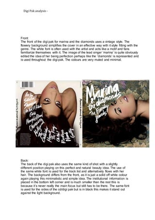
Front:
The front of the digi pak for marina and the diamonds uses a vintage style. The
flowery background simplifies the cover in an effective way with it style fitting with the
genre. The white font is often used with the artist and acts like a motif and fans
familiarize themselves with it. The image of the lead singer ‘marina’ is quite obviously
edited the idea of her being perfection perhaps like the ‘diamonds’ is represented and
is used throughout the digi pak. The colours are very muted and minimal.
Back:
The back of the digi pak also uses the same kind of shot with a slightly
different position playing on this perfect and natural beauty idea. The use of
the same white font is used for the track list and alternatively flows with her
hair. The background differs from the front, as it is just a solid off white colour
again playing this minimalistic and simple idea. The institutional information is
placed in the bottom left corner and is much smaller than the rest this is
because it’s never really the main focus but still has to be there. The same font
is used for the sides of the cd/digi pak but is in black this makes it stand out
against the light background.