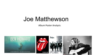
2. This is a magazine advertisement for Ben Howards album
cover, Every Kingdom. The designers have covered all the
codes and conventions of a typical music advertisement. At
the top of the cover there is a big title with the Artists
name, Ben Howard, in bold capital letters which draws the
audiences attention.
This poster reflects the artist and his music style as Its plain and
simplistic design as the colours have connotations which reflect
his cool calm music he plays.
At the bottom of the album cover
there is all the details for the
release of his new album, Every
Kingdom. Again, white font to
make it stand out from the rest of
the background and keep the
house style consistent.
The use of the underwater
photography and the cool blue
colours has connotations of the
type of artist he is.
Ben Howards target audience is a niche folk indie audience which
isn’t mainstream, but with the colours he has decided to use it
would possible target both female and males aged 26-24.
3. The image has been manipulated black and white. This has probably been done to represent and
reinforce the era that the band are from with new advanced technology starting to appear.
The bold black logo in the
top left
Is the bands iconic logo
that is used on every
piece of advertising that
they have. Therefore, the
use of repetition helps it
the audience recognise
it. Also, the designers
have put the font black
to make it stand out
against the white
background, but also
keep with the house
style.
All the band members have been dressed in
smart suits to represent their preferred
meaning. Making them appear smart also
makes them an ideal self / partner (Carl
Rodgers 1959).
The location of the shoot appears to be a low
class apartment building complex which has
connotations that the band aren’t all for
money as they haven’t spend vast amounts
on locations. This makes them appear to be
on the same level as the general
public, which automatically creates a sudo
relationship between the fan and artist.
4. Here is an advertisement
poster or Kurt Cobain in
which he is holding his
acoustic guitar while
smoking a cigarette. This
all adds to creating a
preferred reading, Stuart
Hall 1980. The way he is
a famous artist for his
music, the way he is
smoking on an
advertisement piece, this
shows his rebellious
personality, and that idea
that he doesn’t care
about other peoples
thoughts. This leads to
him creating a Star
Persona, Richard Dyer, as
he is famous for his
music and personality
too.
The acoustic guitar acting
as the prop in the
poster, reinforces Kurt
Cobains music which also
helps him target his
audience. The way he has
also signed his own name
on his guitar, also
reinforces his personality
again, connoting he is
quite vain which
again, creates a star
persona.
5. Here is a graphic logo for the rolling
stones. The gesture of the vector
with red lips sticking his tongue out
connotes multiple attitudes. Firstly,
the gesture in todays society and in
previous decades has been said to
connote a provocative and rude
attitude. Also, the lead singer of the
group, Mick Jagger, is known for his
rebellious attitude with drug taking,
but the graphic has represented the
star persona, Richard Dyer, as he is
known for this gesture when he
performs on stage. Below the
graphic, there is the text “The
Rolling Stones” the name of the
band which is in capital white bold
text which makes is stand out
against the black background and
makes it easier to read. The text has
been anchored to the graphic to
reinforce the name of the band.