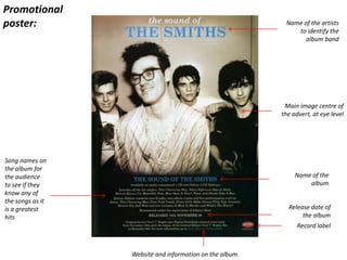
2. Name of the artists
to identify the
album band
Main image centre of
the advert, at eye level
Record label
Release date of
the album
Name of the
album
Song names on
the album for
the audience
to see if they
know any of
the songs as it
is a greatest
hits
Website and information on the album
Promotional
poster:
3. Names of the songs are in the same
font type as the front of the album and
promotional poster which contributes
to the continuity
Artist and name of
the album in the
same but smaller
font on the album
spine
Artist and name of
the album in the same
but smaller font on
the album spine
Barcode so it can be
scanned when being
purchased
Album name at the
top right hand side in
the same colour
scheme as expected
4. The album image is the same as the promotional poster
which is tinted with a faint black and white with sepia, I
believe this is to represent that The Smiths is a band
which was formed in the 1980’s and the image is
produced in a way to reflect this. The image is an old one
of the band and is iconic which also gives a sense in
terms of the album is not a new album but is a best of
album. The band name is in capitals which makes it
centered view point, it is also in a different colour from
the rest which sets it apart.
The album colour is blue which corresponded with the
blue on the album cover, similarly the white also is on
the album which is creating a theme of continuity. The
disc is very simple and is just a block colour.
5. Artists name bold
and bigger than the
rest of the fonts on
the advert. This
makes it stand out
and the artists
name is at eye level Image centre focus to make
it the main feature of the
advertisement
Name of the album centred of
the advertisement
Internet retailer
website to show where
you can buy it from Website for interaction
between artist and
consumer Record label
Release date of the album so you
can pre-order
Well known songs to help the
album sell to audiences who
may be interested about the
album
Promotional
poster:
6. The album cover is simple and uses the same image
as the promotional advertisement which creates
continuity between the products. The fonts are the
same but in different font size and the name of the
artists looks x3 bigger than the name of the album
name itself. The colours are in a colour scheme
between the album image and the font of blue and
white and as Lana is a different colour to the rest of
the scheme she greatly stands out again the
background.
The CD itself is very simple and is very different
from the album cover and the promotional poster.
The colours are white and red rather than blue and
white, the image of the roses could be related to
death as the album is called “Born To Die”. This is
something that I like about the CD, the simplicity
and when I create my own I can use the white rose I
have in my music video as the CD image.
7. The back of the album is in
the same colour scheme of
white and blue
Names of the songs are in the same
font type as the front of the album and
promotional poster which contributes
to the continuity
Record label is on the
spine and on the main
album
Artist and name of
the album in the same
but smaller font on
the album spine
Barcode so it can be
scanned when being
purchased
Privacy regulations in
America to give
warning about legal
downloading or
selling
Record label is on
the spine and on
the main album
Artist and name of
the album in the same
but smaller font on
the album spine
8. Album cover
Website and social media accounts
Reviews from well known
music magazines with a
rating in stars
Release date of
the album
Interacting
with the
audience by
asking them a
question and
identifying the
album name
Image is faint in the
background and is the
same image as the album
cover but with a pink tint
to ensure the font and
colour stands out
Where to buy it
from online
Record label
Promotional poster:
9. Promotional poster:
Artists name
gives
indication who
the album is by
Album art work
corresponds with
the promotional
poster
Reviews from
newspapers and well
known music
magazines
Social media accounts and website
Record label
Name of the album
Singles which have
reached the charts
to help sell the
album
10. The album is very simple and doesn’t have the
album name on the cover only the artist name. the
image is centered and is the same as the
promotional poster and other than that it only has
the record label. It may be deemed as so simple due
to it being the first album of the band I they want
there name to be known.
The CD is bright compared to the album and
poster, the colours goes into an ombre effect
where it goes darker to light. Again it has
the record label and has the artist name and
the songs in order. The album looks good
even though it is simply coloured and sets it
apart against any other CD’s I have looked at
11. Barcode so it can be
scanned when being
purchased
Copyrights to the label i.e. Sony records
The colour
scheme is the
same as the front
of the album and
the promotional
video
Name of the album at the top and centered
Names of the
songs are in
the same font
type as the
front of the
album and
promotional
poster which
contributes to
the continuity
The image on the
back is very different
from the front image,
this may be to reflect
how the songs
change from a
relationship to a
break up
12. Artists name, gives the poster clear
recognition of who the album is by
Reviews from music magazine/
newspapers which give the audience a
clear idea of the album without any
biasness
Website of the band so fans can get
more information, form of social
interaction
Image is basic and has colours that
don’t blend with the writing of the
advertisements
Music label
Promotional poster:
13. The album image is the same as the
promotional poster which is a convention, the
name of the band looks 3D and makes the
album unique in terms of how it looks on a
shelve amongst other albums
The CD is simple and is a different colour to the
album and promotional poster however it sticks
with the conventional two colour theme as this
CD is black and white. The main feature is the
band name and the songs on the CD, this maybe
to reduce the amount of wording on the album
itself. Also it has the record label which is an
occurring theme
14. Conclusion:
After looking at all the albums and promotional posters together
it is clear that the coloured themes relate not only to the album
but across the board. The themes tend to be of two colours
which stick with making the image centre point. The image tends
to be a medium shot from the waist upwards, the image is the in
the centre of the cover and the poster with a plain background.
The poster tends to have reviews and social media sectors to
allow audiences to interact with the band/ artists. However
surprisingly many posters do not have a release of the album and
suggests the poster is put up just around when the album is
released. When I create my own I will have to make sure I use
simple of two colours to follow conventions.