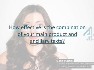
1. How effective is the combination
of your main product and
ancillary texts?
2. • In our documentary we looked into the side of the
beauty industry and what women and also men are
perceived as. We wanted our product to be
presented as a women of different sides fake or
natural. I can compare this to other printing
adverts, as I have used the same channel 4 logo,
which is placed onto the centre right hand side. I
have used the colour blue for our logo, which we
reviewed back into the audience research to show
that most of our target audience liked the colour
blue so we used the blue channel 4 logo. We didn’t
however use the same blocking colour for the titles,
as the background of the picture did not suit the
titles, so instead we used a white font and a black
block colour over the font to make it stand out.
In this documentary it is more professional and
more detailed with how specific the picture is
presented, where it’s set and the lighting of the
photo. The pictures also uses the channel 4 logo
that I have used in my print advert but they have
used the colour red and placed the logo on the
centre right hand side of the screen. With the title
of the documentary they have used white font like I
have used and a blocking around the font, but they
have contrasted there’s with the colour of there
logo, which makes it look more ideal and
professional They have also took the shot from a
good angle as it shows all of the Great Wall of
China, and added pictures of children on to the wall
to match with the title and what the programme is
about.
3. • In our opening titles we have used a full
image of a girl applying her make up on but
in fast pace motion with the music of Barbie
girl playing in the background and ends with
a kiss onto the screen with the titles across
the girl’s lips who is kissing the screen. We
used a girl to kiss the camera to show the
image of beauty and feminine side of
women. The font of the documentary is not
simple or professional but it shows that it
relates to what the documentary about and
that it stylistic.
In this opening of this documentary it uses a
simple white font, which shows simplicity and
that it is professional. It uses a background of
a baby to make the audience more interested
in to the documentary and to see the world of
babies and what goes on in the delivery room.
They have also put the channel 4 logo on to
the top left hand corner of the screen to show
that this programme is representing channel
4.
4. In the documentaries they use cutaways to keep the viewer
and the audience interested into the interview. In our
documentary we used cutaways of make up and women
using the make up. Using just an interview in a documentary
bores the viewer and can make it less interesting but
including a cutaway half way through an interview can make
it more interesting to watch and understanding to the viewer
of watching the documentary. In my documentary it shows
different and varieties of products like maybelline, loreal,
rimmel and collection 2000 to show what are the most
popular products and images of men and women in different
ways.
In this documentary you can see that for the
cutaways they have used different sides to this
documentary, like images of his past and what he was
like as a kid and what he looks like now. This
perceives the audience view on how they see him and
what there verdict on him is. This relates to our
product as its shows different products to give the
audience a feedback on which product is better and
what is the most popular brand of product.