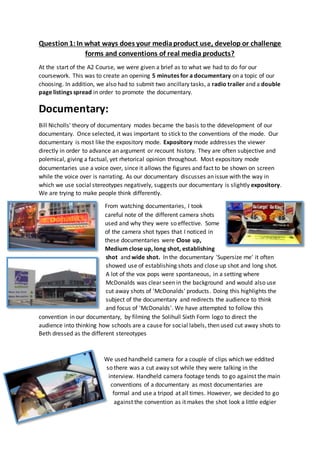
1. Question1:In what ways does your mediaproduct use, develop or challenge
forms and conventions of real media products?
At the start of the A2 Course, we were given a brief as to what we had to do for our
coursework. This was to create an opening 5 minutes for a documentary on a topic of our
choosing. In addition, we also had to submit two ancillary tasks, a radio trailer and a double
page listings spread in order to promote the documentary.
Documentary:
Bill Nicholls' theory of documentary modes became the basis to the ddevelopment of our
documentary. Once selected, it was important to stick to the conventions of the mode. Our
documentary is most like the expository mode. Expository mode addresses the viewer
directly in order to advance an argument or recount history. They are often subjective and
polemical, giving a factual, yet rhetorical opinion throughout. Most expository mode
documentaries use a voice over, since it allows the figures and fact to be shown on screen
while the voice over is narrating. As our documentary discusses an issue with the way in
which we use social stereotypes negatively, suggests our documentary is slightly expository.
We are trying to make people think differently.
From watching documentaries, I took
careful note of the different camera shots
used and why they were so effective. Some
of the camera shot types that I noticed in
these documentaries were Close up,
Medium close up, long shot, establishing
shot and wide shot. In the documentary 'Supersize me' it often
showed use of establishing shots and close up shot and long shot.
A lot of the vox pops were spontaneous, in a setting where
McDonalds was clear seen in the background and would also use
cut away shots of 'McDonalds' products. Doing this highlights the
subject of the documentary and redirects the audience to think
and focus of 'McDonalds'. We have attempted to follow this
convention in our documentary, by filming the Solihull Sixth Form logo to direct the
audience into thinking how schools are a cause for social labels, then used cut away shots to
Beth dressed as the different stereotypes
We used handheld camera for a couple of clips which we eddited
so there was a cut away sot while they were talking in the
interview. Handheld camera footage tends to go against the main
conventions of a documentary as most documentaries are
formal and use a tripod at all times. However, we decided to go
against the convention as it makes the shot look a little edgier
2. and fast pace, which is how we perceived our target audience.
Another was we set up our camera shot was using a tripod. The
main use of the tripod was for expert interviews and Vox pops.
Doing this allowed us to be able to set
the camera in not only a professional
manor but also still. As we wanted to get some good establishing
shots of the college ground and canteen, we found the tripod to
be very useful for this. We would set up the tripod and do a
combination of a pan and zoom, to achieve a shot that would
look effective and professional. A convention we followed, was
the position and direction in which the person being interviewed
looked. During 'Supersize Me' people who were being interviewed didn’t look towards the
camera, but at Spurlock while he was asking the questions. This is something we also
decided to do, so when filming we would stand behind the camera to the left and when
asking the questions, interview would look to wards us. This then give the appearance that
the answers being given are purely their answers and their opinions and aren't giving an
answer crafted because they are speaking to the camera. We know and our audience knows
the authenticity of answers.
In our documentary, we followed the conventions
of having both vox pops and expert interviews. We
used vox pops as a way of gaining authentic and
truthful opinions of teenagers to whom our
documentary is targeted towards. Using the vox
pops helps to build an argument for our expository
documentary. In 'Supersize Me', they used a
handheld camera for the vox pops. However, as it
was an interview, we felt this was too informal, so
we challenged this convention and decided to use
the tripod when filming interviews as it was far
more professional and steady looking. An important
factor when filming these interviews was mise-en-
scene. We made sure that our experts were near a
desk and dressed smartly, in order to convey their
importance and expertise. In addition, from
watching documentaries, we discovered that the
use of caption on the expert interviews also showed
that they were important on the subject and topic
3. of the documentary. However, we slightly challenged the conventions of using a caption in a
documentary due to the fact we used a white, slightly opaque, background. We felt that this
really helped that little bit more to make the caption stand out even more, reinforcing the
fact that this expert opinion is valuable. In addition, we made sure that our expert was also
sitting on the right side of the screen
Our documentary uses a rhetorical narrative
structure, and tries to voice an argument which tries
to persuade and inform the target audience of the
problem of 'Social Stereotypes' and the labels and
judgment of their appearance may be both negative
and incorrect. In the creation of our documentary, we
had the option of either having an on screen
presenter, voice over, or even both, we decided on
having a voice over. The use of a voice over both
challenges and conforms to real media products. The
main reason we decided to use a voice over is because it
is highly effective at putting across the argument. We
thought this suited our documentary style much better and decided to challenge the
convention of having an on screen presenter as we didn’t want the audience focusing on us,
but at the facts and figure and the cut away shots
designed to back up the argument.
Within the voice over, we followed the conventions of
having facts linked to our documentary. This follows
the 'Voice of God' element. To do this, in our planning
and research we used a questionnaire and focus group
design to give use an idea about the topic of our
documentary. From this, we learned that 75% of the
people we asked felt they had been victimised due to
their appearance. Along with this statistic, we also showed it subtitled on the screen, while a
clip was shown of a group of teenager. Doing this helped link back to the subject of the
documentary and who we are targeting this statistic
towards. We found this to follow the main
convention of statics and facts, as seen in 'Supersize
me' they also shows the statistics on screen, while
they were read out by the voice over, Morgan
Spurlock, which we found as an audience to be
effective and well received. You not only read the
fact but you hear it to.
4. Background music was something that we followed in the conventions of documentaries.
The background music chosen had to be just right and balanced in sound levels so that it
isn't too over powering, or isn't noticeable at all. In the documentary 'Supersize Me' the
background music were copyrighted songs such as 'Fat Bottomed Girls'. As a consequence,
we had to challenge this and use music that wasn’t copyrighted off the media website. We
selected 'Jam1' for our background music as it had a quick tempo which helped give the
documentary a fast pace, extremely suitable for our target audience.
Transitions and special effects were an important feature in the
documentary. From watching 'Supersize me' they often changed the
use of transition depending the effect they were trying to give. Often
they wouldn’t use a transition which meant the clips when straight
from one to another, the effect of this was that the pace of the
documentary was quickened. We decided to follow this convention
and use it in our documentary. Towards the beginning and end we also
put clips one after another to increase the pace. We felt that by doing
this, it would suit and appeal more to our target audience. Also, we
adopted the use of the 'Fade t black' which was often used. By using
this, it made the transition from
one clip to another much
smoother. However, we did challenge the conventions
of transitions as we used the cube transition when
going from a vox pop to archive footage. We really liked
the effect of this, it was something a bit different for
our documentary.
Here is an
example ofthe
fadingto black
transition.
Here is an example of the
transition.
5. Magazine:
For our listing magazine's double page
spread, we decided to choose 'Radio
Times'. One of the main reasons for this is
because it is one of the most well know,
and popular listings magazines.
One of the main conventions of a 'Radio
Times' magazine is the fact that at the
bottom of the page it always says 'Radio
Times' in a bold font. We have chosen to
do the same as we want to make our
magazine as authentic and as aesthetically
pleasing as possible.
I have followed the conventions of having
a drop cap at the start of my
article. I decided to followed
this convention as the bold
capital letter helps to direct the
audiences eyes to the start of the article.
The fact that the drop cap is also blue in
colour again helps to draw attention to
the start of the article as it is a strong
bright contrast in colour compared to the
standard, professional black font.
These images selected to be presented in
the magazine follow the convention of a
listings magazine as the images selected
are from the documentary itself. Therefore, it enables a link to be made between the article
and the actual documentary. Also, the fact
that we used images from the documentary
give and insight as to what the documentary is
about. In addition, we have chosen to follow
the magazine s convention of using a large
image that takes up more than one page as we
feel it is the image that sums up our
documentary. Also, we decided to but the
main image mostly on the left side of the page as it follows the convention of a magazine.
Since we read and look left to right, it seemed appropriate to place the image more
dominantly on the left hand side.
6. However, we have decided to challenge the conventions of use of colour within our double
page spread. Even though there I little use above,
we made the decision to chose something bright
and fun as an accent colour so that it could
highlight key point on our double page spread.
The use of colour also adds some edginess and fun to the article, which would be more
appealing to our younger target audience.
We also followed the conventions of a TV listings
magazine by including pull quotes. These were
embedded within the article. These were specific
points in the article that we wanted to emphasise.
Radio trailer:
In order to gain a full understanding as to the convention of a radio
trailer, we listened to a ranges of different ones for different
stations. We looked at the main station which have advert
breaks such as Capital fm, Free radio and heart. Due to the fact our
target audience in 13-21, we felt it was suitable to go for a radio
station which also has a close enough target audience. As a result, we found Capita Fm as
the most suitable radio station to feature our documentary trailer.
The opening of the radio trailer features rhetorical questions 'Ever feel stereotyped or like
you don’t fit in?' These questions are quite deep and generic which means they will apply to
a lot of people. A listener may hear this and become interested in the documentary as it is a
topic which many both understand and have been subjected to. This is one of the main
conventions with radio adverts as they are great way to engage the listener, the question
only sums up what the advert it trying to say.
The radio trailers we listened to were all in between 20-40 seconds. This isn't too long,
which meant all points needed to be put across clearly and quickly. We mirrored the
duration in our radio trailer as it was just over 30 seconds. We felt that everything important
and vital was put across quickly and clear