The document describes the process of creating a film poster. They began by uploading a photo of the main character, Rebecca, and cropping it to be portrait. They added a background image of a science lab with bottles and blood. Editing tools were used to add makeup and highlight hair to make her look more dramatic. A purple tint was added to give an airbrushed effect and connote power. Additional blood splatter was layered on to reinforce the blood element. Text was added in Bighugelabs including the title, names, and caption split over two lines to build suspense. Logos were subtly added in the corners to complete the poster.
Here is our film poster analysis, mentioning the conventions of a poster and Neo-Noir that we have conformed or challenged.
A2 ADVANCED MEDIA PORTFOLIO EVALUATION.
Here is our film poster analysis, mentioning the conventions of a poster and Neo-Noir that we have conformed or challenged.
A2 ADVANCED MEDIA PORTFOLIO EVALUATION.
Palestine last event orientationfvgnh .pptxRaedMohamed3
An EFL lesson about the current events in Palestine. It is intended to be for intermediate students who wish to increase their listening skills through a short lesson in power point.
Students, digital devices and success - Andreas Schleicher - 27 May 2024..pptxEduSkills OECD
Andreas Schleicher presents at the OECD webinar ‘Digital devices in schools: detrimental distraction or secret to success?’ on 27 May 2024. The presentation was based on findings from PISA 2022 results and the webinar helped launch the PISA in Focus ‘Managing screen time: How to protect and equip students against distraction’ https://www.oecd-ilibrary.org/education/managing-screen-time_7c225af4-en and the OECD Education Policy Perspective ‘Students, digital devices and success’ can be found here - https://oe.cd/il/5yV
How to Make a Field invisible in Odoo 17Celine George
It is possible to hide or invisible some fields in odoo. Commonly using “invisible” attribute in the field definition to invisible the fields. This slide will show how to make a field invisible in odoo 17.
The Art Pastor's Guide to Sabbath | Steve ThomasonSteve Thomason
What is the purpose of the Sabbath Law in the Torah. It is interesting to compare how the context of the law shifts from Exodus to Deuteronomy. Who gets to rest, and why?
Welcome to TechSoup New Member Orientation and Q&A (May 2024).pdfTechSoup
In this webinar you will learn how your organization can access TechSoup's wide variety of product discount and donation programs. From hardware to software, we'll give you a tour of the tools available to help your nonprofit with productivity, collaboration, financial management, donor tracking, security, and more.
How to Split Bills in the Odoo 17 POS ModuleCeline George
Bills have a main role in point of sale procedure. It will help to track sales, handling payments and giving receipts to customers. Bill splitting also has an important role in POS. For example, If some friends come together for dinner and if they want to divide the bill then it is possible by POS bill splitting. This slide will show how to split bills in odoo 17 POS.
Read| The latest issue of The Challenger is here! We are thrilled to announce that our school paper has qualified for the NATIONAL SCHOOLS PRESS CONFERENCE (NSPC) 2024. Thank you for your unwavering support and trust. Dive into the stories that made us stand out!
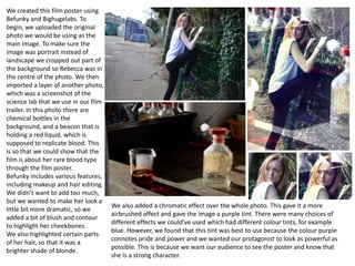
1. We created this film poster using
Befunky and Bighugelabs. To
begin, we uploaded the original
photo we would be using as the
main image. To make sure the
image was portrait instead of
landscape we cropped out part of
the background so Rebecca was in
the centre of the photo. We then
imported a layer of another photo,
which was a screenshot of the
science lab that we use in our film
trailer. In this photo there are
chemical bottles in the
background, and a beacon that is
holding a red liquid, which is
supposed to replicate blood. This
is so that we could show that the
film is about her rare blood type
through the film poster.
Befunky includes various features,
including makeup and hair editing.
We didn’t want to add too much,
but we wanted to make her look a
little bit more dramatic, so we
added a bit of blush and contour
to highlight her cheekbones.
We also highlighted certain parts
of her hair, so that it was a
brighter shade of blonde.
We also added a chromatic effect over the whole photo. This gave it a more
airbrushed affect and gave the image a purple tint. There were many choices of
different effects we could’ve used which had different colour tints, for example
blue. However, we found that this tint was best to use because the colour purple
connotes pride and power and we wanted our protagonist to look as powerful as
possible. This is because we want our audience to see the poster and know that
she is a strong character.
2. Once we had done some editing on the photo, we decided that we wanted to
add another layer of blood onto the photo. We found a picture of blood splatter
on google and layered it on the top of our image. We wanted to do this to
reinforce that blood is one of the main elements in our film trailer. This is
because the science lab in the background of the image doesn’t clearly show
blood, as all that can be seen is half of the beacon filled with red liquid. We
decided to add the blood splatter into the left bottom corner so it was not
overpowering but still noticeable.
This is the final edited image that we chose to use for our film trailer and we did
not change how the background looked from here.
Once we had our image, we saved it and transported it onto Bighugelabs. This
website enabled us to create a movie poster by just adding our background and
typing in the text we wanted to use for the headline and the billing block. For
the headlines, we chose to put six of the names from the billing block, including
the main character’s name first (Rebecca Maguire).
It was difficult to choose a colour of text to fit our film poster because there are
a lot of colours in the background. For example, we couldn’t use white because
the text would not be visible or readable. Therefore, we settled on black
because it is the most visible colour we could have chosen that matched our
background and theme.
3. In order to complete the film poster we saved the photo from Bighugelabs
and imported it back onto Befunky. The next thing we did was add the film
title. This was easy to do because Befunky is the website that we used for
our main font of the title; the font is called ‘captured’. However, again, the
colour of the text was difficult to choose. We wanted to make the title colour
match the colour we chose for our trailer. But the colour we used for the
trailer was a light grey, which we tested out but the shade was too light. This
is why the shade of grey is darker on the film poster than it is on the
magazine cover and film trailer.
Next, we added the caption, which is “what if you had to run…to protect
your blood?”. We made the caption red because it highlights the blood
element of the film. We also chose to split up the caption into two lines of
text so that when the audience reads it they will feel more suspense.
We added the release date in the same font as the film title because this is
how it looks on the trailer. It is in white because it makes it stand out against
the image. The release date is written as ‘august 17’ instead of ‘august 2017’.
As well as this, it is positioned on top of the billing block because this is a
common place for release dates to be placed in film posters.
The last thing we had to do to complete the
film poster was add the film production
logos. We did this by adding the blue arrow
productions in the bottom right corner.
There is no black background around the
logo because we made it transparent.
Although this means the logo doesn’t stand
out as much, we like how subtle it looks.
We then finally did the same with the black
tape productions logo mad placed it in the
bottom left corner