HOW EFFECTIVE ISTHE
COMBINATION OFYOUR
MAIN PRODUCT AND
ANCILLARYTEXTS?
■ For ourA2 coursework we created a promotional package, which included: a
trailer, a film poster and a magazine.Through our ancillary promotional texts we
were promoting the film ‘TYPE Z’.
■ Throughout the creation of our promotional package, we made sure that each
product contained synergy (similar features), so that it was clear to our audience
that they were all connected.
■ The theorist, Stuart Hall aided us significantly during our development process.
We specifically focused on his theory of encoding and decoding, which means
how an audience member understands and/or accepts or declines a media text.
For example, we wanted our audience to gain the sense of a fast paced,
explosive action film, which was achieved through camera work, angles, props
and mise-en-scene.
■ Our ancillary products include similar features such as, the characters and the
title.
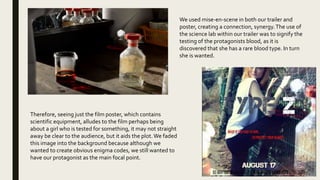
We used mise-en-scene in both our trailer and
poster, creating a connection, synergy.The use of
the science lab within our trailer was to signify the
testing of the protagonists blood, as it is
discovered that she has a rare blood type. In turn
she is wanted.
Therefore, seeing just the film poster, which contains
scientific equipment, alludes to the film perhaps being
about a girl who is tested for something, it may not straight
away be clear to the audience, but it aids the plot.We faded
this image into the background because although we
wanted to create obvious enigma codes, we still wanted to
have our protagonist as the main focal point.
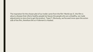
The inspiration for the chosen plot of our trailer came from the film ‘World war Z’, this film is
about a disease that infects healthy people but leaves the people who are unhealthy, we made
adjustments to story line to get the product, ‘Type Z’. Obviously, we focused more upon the action
side of the film, therefore the sci-fi element is masked.
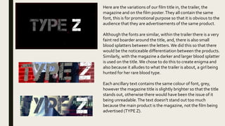
Here are the variations of our film title in, the trailer, the
magazine and on the film poster.They all contain the same
font, this is for promotional purpose so that it is obvious to the
audience that they are advertisements of the same product.
Although the fonts are similar, within the trailer there is a very
faint red boarder around the title, and, there is also small
blood splatters between the letters.We did this so that there
would be the noticeable differentiation between the products.
Similarly, with the magazine a darker and larger blood splatter
is used on the title.We chose to do this to create enigma and
also because it alludes to what the trailer is about, a girl being
hunted for her rare blood type.
Each ancillary text contains the same colour of font, grey,
however the magazine title is slightly brighter so that the title
stands out, otherwise there would have been the issue of it
being unreadable.The text doesn't stand out too much
because the main product is the magazine, not the film being
advertised (TYPE Z).
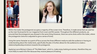
Within the trailer the protagonist occupies a majority of the screen time.Therefore, it made sense that we used her
as the main focal points for our magazine front cover and film poster.Throughout the different products, we
ensured that the protagonist was dressed in the same thing (however, there are some shots within the trailer, where
the protagonist costume is adjusted to give a sense of time).
Using the same character as a point of focus across the three different mediums aids the audience in having an
understanding about the media texts, specifically the plot. It further allows for the audience to create a
relationship/develop emotions towards the protagonist.
Applying Laura Mulvey’s theory of ‘The Male Gaze’, which is, males enjoy looking at women, therefore they are
more likely to watch this film because they receive pleasure of looking.
■ The genre of our media text is action, therefore, this meant that we had to use a variety of
different locations, this was so that our trailer had a sense of a fast paced narrative which took
place over a number of days.This is a convention of the action genre, which is shown in my
research.
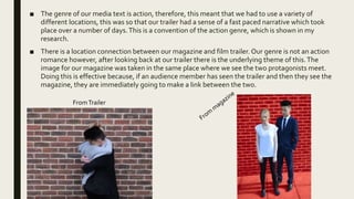
■ There is a location connection between our magazine and film trailer. Our genre is not an action
romance however, after looking back at our trailer there is the underlying theme of this.The
image for our magazine was taken in the same place where we see the two protagonists meet.
Doing this is effective because, if an audience member has seen the trailer and then they see the
magazine, they are immediately going to make a link between the two.
FromTrailer
I CAN CONCLUDETHAT OUR MAIN PRODUCTANDANCILLARYTEXTS HAVE
CONCISE LINKS BETWEENTHEM, I CANTHEREFORE SAYTHATTHETHREE
ARE EFFECTIVE. DUETOTHESE LINKS I CAN FURTHER STATETHAT
AUDIENCESWOULD BE ABLETO

Evaluation Question 2

  • 1.
    HOW EFFECTIVE ISTHE COMBINATIONOFYOUR MAIN PRODUCT AND ANCILLARYTEXTS?
  • 2.
    ■ For ourA2coursework we created a promotional package, which included: a trailer, a film poster and a magazine.Through our ancillary promotional texts we were promoting the film ‘TYPE Z’. ■ Throughout the creation of our promotional package, we made sure that each product contained synergy (similar features), so that it was clear to our audience that they were all connected. ■ The theorist, Stuart Hall aided us significantly during our development process. We specifically focused on his theory of encoding and decoding, which means how an audience member understands and/or accepts or declines a media text. For example, we wanted our audience to gain the sense of a fast paced, explosive action film, which was achieved through camera work, angles, props and mise-en-scene. ■ Our ancillary products include similar features such as, the characters and the title.
  • 3.
    We used mise-en-scenein both our trailer and poster, creating a connection, synergy.The use of the science lab within our trailer was to signify the testing of the protagonists blood, as it is discovered that she has a rare blood type. In turn she is wanted. Therefore, seeing just the film poster, which contains scientific equipment, alludes to the film perhaps being about a girl who is tested for something, it may not straight away be clear to the audience, but it aids the plot.We faded this image into the background because although we wanted to create obvious enigma codes, we still wanted to have our protagonist as the main focal point.
  • 4.
    The inspiration forthe chosen plot of our trailer came from the film ‘World war Z’, this film is about a disease that infects healthy people but leaves the people who are unhealthy, we made adjustments to story line to get the product, ‘Type Z’. Obviously, we focused more upon the action side of the film, therefore the sci-fi element is masked.
  • 5.
    Here are thevariations of our film title in, the trailer, the magazine and on the film poster.They all contain the same font, this is for promotional purpose so that it is obvious to the audience that they are advertisements of the same product. Although the fonts are similar, within the trailer there is a very faint red boarder around the title, and, there is also small blood splatters between the letters.We did this so that there would be the noticeable differentiation between the products. Similarly, with the magazine a darker and larger blood splatter is used on the title.We chose to do this to create enigma and also because it alludes to what the trailer is about, a girl being hunted for her rare blood type. Each ancillary text contains the same colour of font, grey, however the magazine title is slightly brighter so that the title stands out, otherwise there would have been the issue of it being unreadable.The text doesn't stand out too much because the main product is the magazine, not the film being advertised (TYPE Z).
  • 6.
    Within the trailerthe protagonist occupies a majority of the screen time.Therefore, it made sense that we used her as the main focal points for our magazine front cover and film poster.Throughout the different products, we ensured that the protagonist was dressed in the same thing (however, there are some shots within the trailer, where the protagonist costume is adjusted to give a sense of time). Using the same character as a point of focus across the three different mediums aids the audience in having an understanding about the media texts, specifically the plot. It further allows for the audience to create a relationship/develop emotions towards the protagonist. Applying Laura Mulvey’s theory of ‘The Male Gaze’, which is, males enjoy looking at women, therefore they are more likely to watch this film because they receive pleasure of looking.
  • 7.
    ■ The genreof our media text is action, therefore, this meant that we had to use a variety of different locations, this was so that our trailer had a sense of a fast paced narrative which took place over a number of days.This is a convention of the action genre, which is shown in my research. ■ There is a location connection between our magazine and film trailer. Our genre is not an action romance however, after looking back at our trailer there is the underlying theme of this.The image for our magazine was taken in the same place where we see the two protagonists meet. Doing this is effective because, if an audience member has seen the trailer and then they see the magazine, they are immediately going to make a link between the two. FromTrailer
  • 8.
    I CAN CONCLUDETHATOUR MAIN PRODUCTANDANCILLARYTEXTS HAVE CONCISE LINKS BETWEENTHEM, I CANTHEREFORE SAYTHATTHETHREE ARE EFFECTIVE. DUETOTHESE LINKS I CAN FURTHER STATETHAT AUDIENCESWOULD BE ABLETO