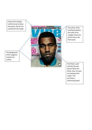
1. The colour of the
masthead matches
the collar of his
cardigan and some
of the text on the
front cover.
Colour font changes
catch the eye to show
key points, but do not
overwhelm the reader.
The background
of the magazine
matches his
clothes.
The Photo is well
centred; the text
doesn’t block the
photo. Also, his eyes
are looking at the
reader. This
promotes a
welcoming aspect.
2. Clear font for
masthead with
its own unique
style.
Sub stories are well
placed on the
cover. They don’t
collide with each
other.
Main photo is
well centralised
on the cover,
readers know
the main article
is about him
The colour
scheme is a bit
all over the
place.
3. Text is wrapped
around the cover
photo. Grabs the
reader’s attention
immediately without
affecting the text.
Eyes are focused
on the reader,
promoting a
welcoming
image.
Font colours
match clothes.
This creates a
personal
atmosphere for
the reader.
Text colour is
well readable in
contrast with
the white
background.