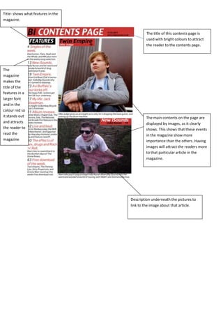
1. Title- shows what features in the
magazine.
The title of this contents page is
used with bright colours to attract
the reader to the contents page.
The
magazine
makes the
title of the
features in a
larger font
and in the
colour red so
it stands out
and attracts
the reader to
read the
magazine
The main contents on the page are
displayed by images, as it clearly
shows. This shows that these events
in the magazine show more
importance than the others. Having
images will attract the readers more
to that particular article in the
magazine.
Description underneath the pictures to
link to the image about that article.
2. Bold lettering to
attract the reader
to them pages in
the magazine
The title is bold and catches the
reader’s eye. Also, as the title is so
bold and is in the centre of the
spread, readers will remember it.
All the pictures are linked to the
contents, which draws the reader
more into each article.
Quote the musicians have said
give the reader some sort of idea
of what is in them particular
articles.
Advertiesent for the
magazine is in a different
colour and stands out more
than the other images. This
will attract the reader
more.
3. The title is bold and
attracts/stands out to the
reader.
Bold lettering stands out and
attracts the reader to look at what
they are reading in the magazine.
The layout and lack of text or
imagery makes the spread
look more neat and modern.
The red titles don’t seem to stand
out and blends in with the
background
Quote from the musician gives an
insight to what is written in the
magazine; this attracts the reader to
the magazine and makes them want
to read more.