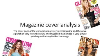
1. Magazine cover analysis
The cover page of these magazines are very overpowering and they give
a punch of very vibrant colours. The magazine main image is very simple
yet deep with many hidden meanings.
5. Masterhead
Master head is the title of the the magazine that is the most prominent text. It is usually on
the top of the magazine and written in bold and dark colours. It is usually written in simple
font to make it look more appealing and bold on white background. The master head.stays the
same in every magazine issue. Usually the master heads are half covered.with the main image
because the editor might think that he doesn't need to show the full name of the.magazine
because it is already well known. The two master heads are in dark and bold colours so that
they are more prominent. The master head is in pink colour to make it look more funky and
girly.
6. Cover line
Cover line usually gives a hint about the
articles in the magazine. Cover lines make
the magazine cover page look more
appealing and some people might want to
read it just because of the headlines. It is
written in bold and in a different colour so
that it appeals the reader as soon as he
looks at the magazine cover.
7. Main Image
Is picture is the main picture
that usually features a celebrity
to make the magazine look
more attractive and to catch the
audiences attention. In all three
magazines main image the
models are very bold and
glamorous to show the latest
trends. All three magazines
feature well known
models/celebrities to make the
magazine more eye catching
and the reader might buy the
magazine just because of the
celebrity on the cover page.
8. Main Cover line
The main cover line basically
highlights the main content of the
magazine. The line font is bold so
that it immediately catches the
audiences attention. The three
different main cover lines give a
small sneak peak of the content
inside the magazine like the first one
says "the right bag and shoe buy
now" this might encourage the
customer to buy the magazine
immediately thinking that they might
get some fashion advice from
Beyoncé. The other magazine says
"the fashion edit" it might give a
small hint to the audience the the
model khloe kardashian might give
them some tips about the latest
trends.
9. Puff
Puff is put on the corner of the
magazine. It is like a stamp that
highlights the text since it is written
in a different colour font and the
sticker colour is also different then
the cover page so that it is more
appealing to the eye. The puff is
usually put to promote something
inside the magazine, to make the
reader more curious about the
content inside the magazine. The
first puff says "6 steps to sexy hair"
by reading this the reader will be
more curious to know some new hair
tips.