The document discusses how the creator of a music magazine addressed and attracted their audience through design elements. Key points include:
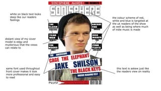
- Using a consistent font throughout to make the magazine look professional and easy to read.
- Incorporating colors like red, white and blue to target a UK audience where much indie music originates.
- Including distant, edgy cover model photos and contest prizes to engage readers.
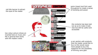
- Organizing content in a way that looks new but is still useful.
- Maintaining branding elements like impactful fonts and a red banner across pages.
- Using a three-column layout and section headings to help readers navigate efficiently.
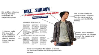
- Continuing the red
2. same font used throughout
front cover makes it look
more professional and easy
to read
white on black text looks
deep like our readers
feelings
this text is askew just like
the readers view on reality
the colour scheme of red,
white and blue is targeted at
the uk readers of the show
as well as being where much
of indie music is made
distant view of my cover
model is edgy and
mysterious that the views
can relate to
3. a win section with products
that the reader would like to
buy so this would cause
more people to buy the
magazine for the possibility
of winning vans gear
the contents has been laid
out as so to make it look
new but still be useful and
accessible
same impact text font used
throughout to create a sense
of branding and powerred title banner to attract
the eyes of the reader
two colour picture shows an
inverted look on music and
life in general that works
with the readers views
4. title and font following
through from the
cover to tie the
magazine together
3 columns make
this page look
fuller and better
for the reader to
read by dividing
things it perfect
sections
these heading allow the readers to access
the information faster by showing the correct
sections
this picture is deep and
mysterious as it does not
face the camera and is
wearing indie thrift shop
clothes
the red , white and blue
colour scheme has followed
through the magazine for
the uk readers
5. Things that I would change:
● I would change the layout
of the double page spread
to be more interesting.
● The choice of pictures on
the contents page and
stuck to one main picture
which would be bolder and
more appealing.
● The editor's notes at the
bottom of the contents page
to a better layout to look
less rushed and blurry.
Things that could've gone better:
● The contents pages red
edited picture could have
looked nicer and been
bigger.
● The cutting out of the front
cover picture could of have
been sharper.
● The blurring on the double
page spreads picture could
be done again and to better
effect.
● The masthead could have
been more original.
● The plus arrow at the
bottom of the front cover
could've been done better
for a more interesting
effect.
Things I wish I used:
● I wish I used a different
layout to the current one on
the double page spread to
look better and more
appealing to the audience.
● I wish I used different
picture to the one I used on
the double page spread to
make it more striking and
less blurry and badly cut
out.
● I wish I took better
advantage of fonts used to
create a more interesting
magazine.