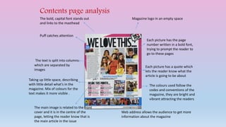
1. Contents page analysis
Magazine logo in an empty space
Each picture has the page
number written in a bold font,
trying to prompt the reader to
go to these pages
Each picture has a quote which
lets the reader know what the
article is going to be about
The colours used follow the
codes and conventions of the
magazine, they are bright and
vibrant attracting the readers
Web address allows the audience to get more
information about the magazine
The bold, capital font stands out
and links to the masthead
Puff catches attention
The text is split into columns
which are separated by
images
Taking up little space, describing
with little detail what’s in the
magazine. Mix of colours for the
text makes it more visible .
The main image is related to the front
cover and it is in the centre of the
page, letting the reader know that is
the main article in the issue