
Recommended
More Related Content
What's hot
What's hot (20)
Viewers also liked
Viewers also liked (20)
Similar to Generic Layouts
Similar to Generic Layouts (20)
More from kaitlyn bodham
Recently uploaded
Recently uploaded (20)
Generic Layouts
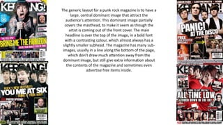
- 1. The generic layout for a punk rock magazine is to have a large, central dominant image that attract the audience's attention. This dominant image partially covers the masthead, to make it seem as though the artist is coming out of the front cover. The main headline is over the top of the image, in a bold font with a contrasting colour, which almost always has a slightly smaller subhead. The magazine has many sub- images, usually in a line along the bottom of the page, which don’t draw much attention away from the dominant image, but still give extra information about the contents of the magazine and sometimes even advertise free items inside.
- 2. The generic layout for this genre is to have a large, dominant image in the top right corner. The header is either a banner across the top, or in the top left hand corner. The page always has at least one sub-image, which has no generic placing. The contents are in a list form, each with a sub-headline encased in a black box. This draws the attention of the reader away from the dominant image and encourages them to read the articles within the magazine. The page almost always has a small editors note, which personalizes the magazine and makes the reader feel like they should buy more issues so as to become further acquainted with the editor.
- 3. The generic layout for double page articles is to have a large, dominant image that draws the reader’s attention. If there is only one model, the convention seems to be that the image is quite close up, and usually focusing on their face and torso. The convention may be different for images with multiple models. The headline is particularly bold, in a colour (or colours) that contrast(s) with the background. They don’t always have a sub-header, but if they do they are usually slightly smaller, but in the same contrasting colour(s). The article itself is particularly small, but main aspects are highlighted in a different colour to draw attention to them and allow readers to simply skim the article instead of reading in full. The page uses a pull-quote to give further hints about the contents and encourage the viewer to read long articles.