
Recommended
More Related Content
What's hot
What's hot (19)
Similar to Rule of Thirds Magazine Layout Guide
Similar to Rule of Thirds Magazine Layout Guide (20)
More from asmediad14
More from asmediad14 (20)
Recently uploaded
Recently uploaded (20)
Rule of Thirds Magazine Layout Guide
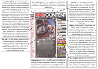
- 1. Rule Of Thirds Layout/Rule of Thirds - The contents page has a clear layout. The Band Index is presented in the left third, so that the reader is easily able to identify the featured bands. Whilst in the right third, the articles are arranged in categories, such as ‘News’. The Editor’s note is centred to highlight the theme of the magazine, which in this case is ‘Touring Special’. Main Image/Borders- The main image has been highlighted by using a border. This adds depth to the image so that it appears separate to the rest of the magazine and can be clearly identified by the reader. Masthead – The codes and conventions of magazine design ensure that the contents page includes the masthead. This is usually presented in bold towards the top of the page. Thus, the magazine can be clearly identified by the target audience, as often they can recognise the house style that has been developed by the magazine. Caption – The main image is directly linked to a caption, so that the Editor’s note is easily recognised in association with the main image. The caption ‘special’ suggests a sense of exclusivity and encourages the reader to purchase the magazine, in order to be part of this ‘special offer’. Page Numbers – Page numbers provide the reader with a clear indication of where certain articles will be featured in the magazine. Often it will only be the main articles that are highlighted, such as from the front cover, rather than every single page. Main Heading – Main-headings allow various articles to be categorised. This makes it even simpler for the reader to identify where certain articles are featured. For example, they may only be interested in ‘Reviews’. Sub-headings – Often the sub-headings are highlighted in bold, as they usually refer to the main articles, which are most likely featured on the front cover. Therefore, the reader can clearly identify them, whilst getting an insight into the article. House style – A magazine’s house style is usually identified by its use of colours and fonts. Different magazines will tend to use the same design/layout, so that the target audience are able to recognise a consistency. Once a house style becomes instantly recognisable, the magazine can become branded. Target audience – Because this is a music magazine, the target audience would clearly be interested in music. However, this is a rock music magazine; therefore the Band Index would be relevant to the music/reader, so that it would maintain interest and they would be recognisable to the reader. Shot Type – The main image is a medium-close up. This allows the image to show enough emotion through direct address; thus allowing the reader to engage in the image. Also, it enables more background to be incorporated, so that mise-en-scene can be introduced, demonstrating the effect/relevance of the tour bus. Date – due to the codes and conventions of magazine design, the date is necessary to include on the contents page. It allows the reader to identify if it is ‘up-to-date’ with the relevant news/music. Editorial Letter- This gives a personal insight into the magazine and allows the reader to engage with the Editor of the magazine, so that it does not have such a serious or tense persona. Often it will incorporate activities/trips relevant to the magazine’s content.