1. Layout/Rule of Thirds – The text/contents is arranged into 3 columns, which correspond to the rule of thirds. The features, such as ‘News’ and ‘Albums’ are located in the centre and left-third; whilst the editor’s letter is presented in the right- third. By spitting the text into three columns, it allows the designers to incorporate various images and graphics in relation to the articles featured in the magazine/on the contents page.
House style – In order to build a house style, magazines will use a collection of key colours throughout the magazine, such as red and yellow. Also, font styles, particularly ‘Sans Sariff’ allows particular articles to be identified by the target audience. These particular layouts allow the reader to recognise the magazine without looking at its masthead; this would suggest the magazine is branded.
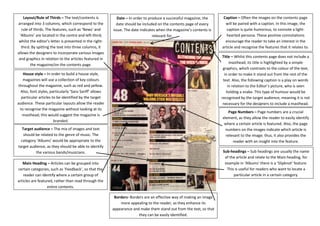
Target audience – The mix of images and text should be related to the genre of music. The category ‘Albums’ would be appropriate to the target audience, as they should be able to identify the various bands/musicians.
Caption – Often the images on the contents page will be paired with a caption. In this image, the caption is quite humorous, to connote a light- hearted persona. These positive connotations encourage the reader to take an interest in the article and recognise the features that it relates to.
Borders- Borders are an effective way of making an image more appealing to the reader, as they enhance its appearance and make them stand out from the text, so that they can be easily identified.
Title – Whilst this contents page does not include a masthead, its title is highlighted by a simple graphics, which contrasts to the colour of the text, in order to make it stand out from the rest of the text. Also, the following caption is a play on words in relation to the Editor’s picture, who is seen holding a snake. This type of humour would be recognised by the target audience, meaning it is not necessary for the designers to include a masthead.
Date – In order to produce a successful magazine, the date should be included on the contents page of every issue. The date indicates when the magazine’s contents is relevant for.
Page Numbers – Page numbers are a crucial element, as they allow the reader to easily identify where a certain article is featured. Also, the page numbers on the images indicate which article is relevant to the image; thus, it also provides the reader with an insight into the feature.
Main Heading – Articles can be grouped into certain categories, such as ‘Feedback’, so that the reader can identify where a certain group of articles are featured, rather than read through the entire contents.
Sub-headings – Sub headings are usually the name of the article and relate to the Main heading, for example in ‘Albums’ there is a ‘Slipknot’ feature. This is useful for readers who want to locate a particular article in a certain category.