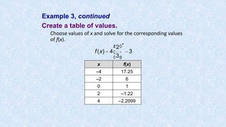
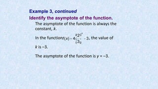
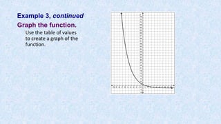
This document provides instructions and examples for using a TI-83/84 graphing calculator. It covers how to graph equations, systems of equations, and linear inequalities. It also demonstrates how to calculate the correlation coefficient between two data sets using the calculator. Examples are provided to illustrate graphing linear and exponential functions, finding points of intersection for systems of equations, and interpreting correlation values. Key steps are outlined for entering data and functions into the calculator to perform graphing and statistical analysis.


![Graphing Equations Using a TI-83/84:
Step 1: Press [Y=] and key in the equation using
[X, T, Θ, n] for x.
Step 2: Press [WINDOW] to change the viewing
window, if necessary.
Step 3: Enter in appropriate values for Xmin, Xmax,
Xscl, Ymin, Ymax, and Yscl, using the arrow
keys to navigate.
Step 4: Press [GRAPH].
• 1.3.1: Creating and Graphing Linear Equations in Two Variables
5](https://image.slidesharecdn.com/usingtheti83-84-170112135949/85/Using-the-ti-83-84-5-320.jpg)
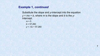
![Example 1, continued
Graph the equation on your calculator.
On a TI-83/84:
Step 1: Press [Y=].
Step 2: At Y1, type in [(–)][5][X, T, Θ,
n][+][57260].
Step 3: Press [WINDOW] to change the viewing
window.
Step 4: At Xmin, enter [0] and arrow down 1
level to Xmax.
Step 5: At Xmax, enter [3000] and arrow down 1
level to Xscl.](https://image.slidesharecdn.com/usingtheti83-84-170112135949/85/Using-the-ti-83-84-8-320.jpg)
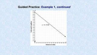
![Example 1, continued
Redraw the graph on graph paper.
On the TI-83/84, the scale was entered in [WINDOW]
settings. The X scale was 100 and the Y scale was
1,000.
Set up the graph paper using these scales. Label the
y-axis “Fuel used in gallons.” Show a break in the
graph from 0 to 40,000 using a zigzag line. Label the
x-axis “Distance in miles.”
To show the table on the calculator so you can plot
points, press [2nd][GRAPH]. The table shows two
columns with values; the first column holds the x-
values, and the second column holds the y-values.](https://image.slidesharecdn.com/usingtheti83-84-170112135949/85/Using-the-ti-83-84-9-320.jpg)
![Example 1, continued
Pick a pair to plot, and then connect the line. To
return to the graph, press [GRAPH]. Remember to
label the line with the equation.
(Note: It may take you a few tries to get the window
settings the way you want. The graph that follows
shows an X scale of 200 so that you can easily see
the full extent of the graphed line.)](https://image.slidesharecdn.com/usingtheti83-84-170112135949/85/Using-the-ti-83-84-10-320.jpg)
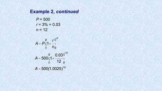
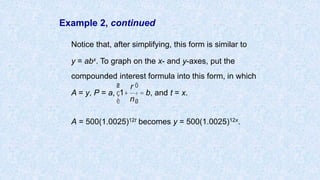
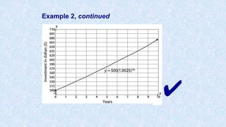
![Example 2, continued
Graph the equation using a graphing calculator.
On a TI-83/84:
Step 1: Press [Y=].
Step 2: Type in the equation as follows:
[500][×][1.0025][^][12][X, T, Θ, n]
Step 3: Press [WINDOW] to change the
viewing window.
Step 4: At Xmin, enter [0] and arrow down
1 level to Xmax.
Step 5: At Xmax, enter [10] and arrow
down 1 level to Xscl.](https://image.slidesharecdn.com/usingtheti83-84-170112135949/85/Using-the-ti-83-84-17-320.jpg)
![Example 2, continued
Step 6: At Xscl, enter [1] and arrow down 1 level to
Ymin.
Step 7: At Ymin, enter [500] and arrow down 1
level to Ymax.
Step 8: At Ymax, enter [700] and arrow down 1
level to Yscl.
Step 9: At Yscl, enter [15].
Step 10: Press [GRAPH].](https://image.slidesharecdn.com/usingtheti83-84-170112135949/85/Using-the-ti-83-84-18-320.jpg)
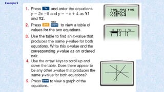
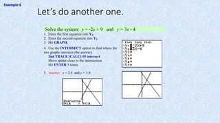
![Graphing Systems of Equations Using a TI-83/84:
Step 1: Press [Y=] and key in the equation using
[X, T, Θ, n] for x.
Step 2: Press [ENTER] and key in the second equation.
Step 3: Press [WINDOW] to change the viewing window, if
necessary.
Step 4: Enter in appropriate values for Xmin, Xmax, Xscl,
Ymin, Ymax, and Yscl, using the arrow keys to
navigate.
Step 5: Press [GRAPH].
Step 6: Press [2ND] and [TRACE] to access the Calculate
Menu.
Step 7: Choose 5: intersect.
Step 8: Press [ENTER] 3 times for the point of intersection.](https://image.slidesharecdn.com/usingtheti83-84-170112135949/85/Using-the-ti-83-84-33-320.jpg)
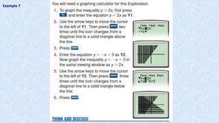
![Graphing Linear Inequalities Using a TI-83/84:
Step 1: Press [Y=] and arrow over to the left two times so that
the cursor is blinking on the “”.
Step 2: Press [ENTER] two times for the greater than icon “ ”
and three times for the less than icon “ ”.
Step 3: Arrow over to the right two times so that the cursor is
blinking after the equal sign.
Step 4: Key in the equation using [X, T, Θ, n] for x.
Step 5: Press [WINDOW] to change the viewing window, if
necessary.
Step 6: Enter in appropriate values for Xmin, Xmax, Xscl, Ymin,
Ymax, and Yscl, using the arrow keys to navigate.
Step 7: Press [GRAPH].](https://image.slidesharecdn.com/usingtheti83-84-170112135949/85/Using-the-ti-83-84-36-320.jpg)
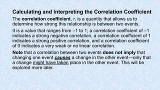
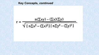
![On a TI-83/84:
You can use a calculator to calculate the correlation coefficient.
Step 1: Set up the calculator to find correlations. Press
[2nd], then [CATALOG] (the “0” key). Scroll down and
select DiagnosticOn, then press [ENTER]. (This step
only needs to be completed once; the calculator will
stay in this mode until changed in this menu.)
Step 2: To calculate the correlation coefficient, first enter the
data into a list. Press [2nd], then L1 (the “1” key).
Scroll to enter data sets. Press [2nd], then L2 (the “2”
key). Enter the second event in L2.
Step 3: Calculate the correlation coefficient. Press [STAT],
then select CALC at the top of the screen. Scroll
down to 8:LinReg(a+bx), and press [ENTER].
The r value (the correlation coefficient) is displayed along
with the equation.
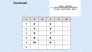
X Y
2 3
4 4
6 7
8 6
10 9](https://image.slidesharecdn.com/usingtheti83-84-170112135949/85/Using-the-ti-83-84-42-320.jpg)
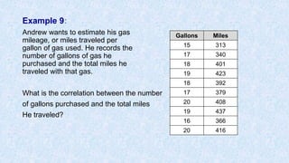
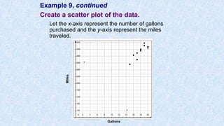
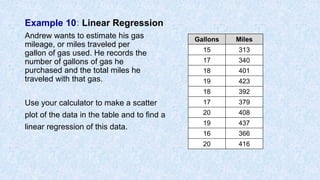
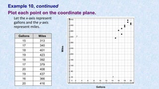
![Example 10 continued
Create a scatter plot showing the relationship
between gallons of gas and miles driven.
Gallons Miles
15 313
17 340
18 401
19 423
18 392
17 379
20 408
19 437
16 366
20 416
Step 1: Press [STAT].
Step 2: Press [ENTER] to select Edit.
Step 3: Enter x-values into L1.
Step 4: Enter y-values into L2.
Step 5: Press [2nd][Y=].
Step 6: Press [ENTER] to turn on Stat Plot,
Step 7: For Plot 1, press [ENTER] to turn on; scroll down to TYPE select type
scatter plot. (optional: select lists and MARK).
Step 7: Press [ZOOM][9] to select ZoomStat and show the scatter plot.](https://image.slidesharecdn.com/usingtheti83-84-170112135949/85/Using-the-ti-83-84-50-320.jpg)
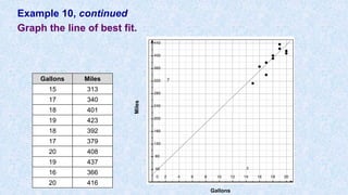
![Example 10, continued
• Your graphing calculator can help you to find a linear regression model
after you input the data.
Entering Lists Using a TI-83/84:
Step 1: Press [STAT].
Step 2: Arrow to the right to select Calc.
Step 3: Press [5] to select LinReg.
Step 4: At the LinReg (a + bx) screen, Press [ENTER]
y = a + bx
a = 24.10843373
b = 20. 30120482
Step 5: Press [y=] and enter regression equation y = 20.3x + 24.1
Step 6: Press [GRAPH]](https://image.slidesharecdn.com/usingtheti83-84-170112135949/85/Using-the-ti-83-84-52-320.jpg)
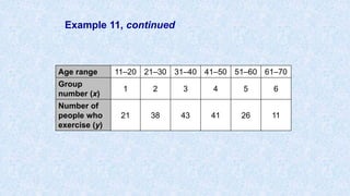
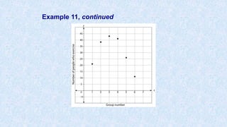
![Example 11, continued
Make a scatter plot of the data.
On a TI-83/84:
Step 1: Press [STAT].
Step 2: Press [ENTER] to select Edit.
Step 3: Enter x-values into L1.
Step 4: Enter y-values into L2.
Step 5: Press [2nd][Y=].
Step 6: Press [ENTER] twice to turn on the Stat Plot.
Step 7: Press [ZOOM][9] to select ZoomStat and
show the scatter plot.](https://image.slidesharecdn.com/usingtheti83-84-170112135949/85/Using-the-ti-83-84-56-320.jpg)
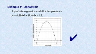
![Example 11, continued
Find the quadratic regression model that best fits this
data.
On a TI-83/84:
Step 1: Press [STAT].
Step 2: Arrow to the right to select Calc.
Step 3: Press [5] to select QuadReg.
Step 4: At the QuadReg screen, enter the parameters for the
function (Xlist: L1, Ylist: L2, Store RegEQ: Y1). To enter Y1,
press [VARS] and arrow over to the right to “Y-VARS.”
Select 1: Function. Select 1: Y1.
Step 5: Press [ENTER] twice to see the quadratic regression
equation.
Step 6: Press [ZOOM][9] to view the graph of the scatter plot and
the regression equation.](https://image.slidesharecdn.com/usingtheti83-84-170112135949/85/Using-the-ti-83-84-58-320.jpg)
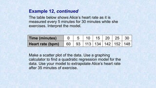
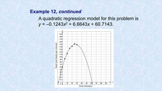
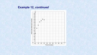
![Example 12, continued
Make a scatter plot of the data.
On a TI-83/84:
Step 1: Press [STAT].
Step 2: Press [ENTER] to select Edit.
Step 3: Enter x-values into L1.
Step 4: Enter y-values into L2.
Step 5: Press [2nd][Y=].
Step 6: Press [ENTER] twice to turn on the Stat Plot.
Step 7: Press [ZOOM][9] to select ZoomStat and
show the scatter plot.](https://image.slidesharecdn.com/usingtheti83-84-170112135949/85/Using-the-ti-83-84-62-320.jpg)
![Example 12, continued
Find a quadratic regression model using your
graphing calculator.
On a TI-83/84:
Step 1: Press [STAT].
Step 2: Arrow to the right to select Calc.
Step 3: Press [5] to select QuadReg.
Step 4: At the QuadReg screen, enter the
parameters for the function (Xlist: L1, Ylist:
L2, Store RegEQ: Y1). To enter Y1, press
[VARS] and arrow over to the right to “Y-
VARS.” Select 1: Function. Select 1: Y1.
Step 5: Press [ENTER] twice to see the quadratic
regression equation.
Step 6: Press [ZOOM][9] to view the graph of the
scatter plot and the regression equation](https://image.slidesharecdn.com/usingtheti83-84-170112135949/85/Using-the-ti-83-84-64-320.jpg)