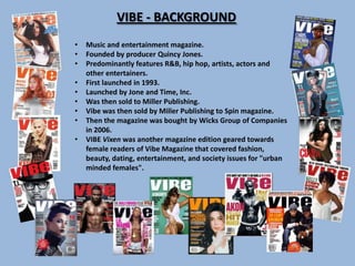
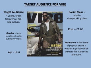
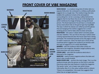
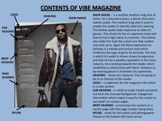
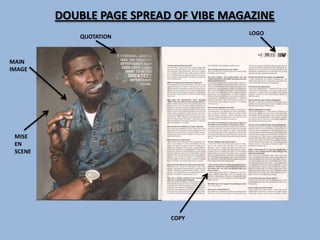
Vibe is a music and entertainment magazine founded by Quincy Jones in 1993. It features R&B and hip hop artists. The target audience is young, urban followers of hip hop culture aged 18-34. Vibe uses a consistent house style with colors like black, grey, and white to portray an image that is informal yet stylish and modern, reflecting the genres of music it covers.
2. VIBE - BACKGROUND
• Music and entertainment magazine.
• Founded by producer Quincy Jones.
• Predominantly features R&B, hip hop, artists, actors and
other entertainers.
• First launched in 1993.
• Launched by Jone and Time, Inc.
• Was then sold to Miller Publishing.
• Vibe was then sold by Miller Publishing to Spin magazine.
• Then the magazine was bought by Wicks Group of Companies
in 2006.
• VIBE Vixen was another magazine edition geared towards
female readers of Vibe Magazine that covered fashion,
beauty, dating, entertainment, and society issues for "urban
minded females".
3. TARGET AUDIENCE FOR VIBE
Target Audience Social Class –
– young, urban middle
followers of hip- class/working class
hop culture.
Cost – £1.65
Gender – both
female and male,
but mainly males
Attractions – the name
of popular artists is
written in yellow which
Age – 18-34 attracts the audiences
attention.
4. FRONT COVER OF VIBE MAGAZINE
MAIN IMAGE - is a medium long shot of Usher who is a
BANNER MASTHEAD popular RnB artist. He is dressed in a military outfit which
MAIN IMAGE suggests he is a tough man. The medium long shot also
enables the audience to look at the atmosphere
surrounding him. As he is carrying a safety helmet this
suggests that he has flown the air jet in the background
which reinforces his image of being a strong dominant
person. The facial expression he portrays is a moody and
COVER serious look which links to the genre type hip-hop/R&B.
LINES The way in which his sleeves are rolled up and the gloves
that are hanging of his clothes suggests he is a hard
working person and he takes what he does seriously.
MASTHEAD – the colour is black which connotes power
and also rebellion. This can link to the way in which Usher
is being represented and also the house style that is being
portrayed. The masthead spreads across the page to make
to make it stand out. Usher has been put in front of the
masthead which suggests the audience are familiar with
the type of magazine so it’s easily identifiable.
BANNER – tells the audience what other artists are
featured in the magazine. Broadens target audience who
MAIN have more than one artist interest.
BARCODE COVER COVER LINES - also tells the audience what else is
LINE featured in the magazine.
BARCODE - used on every magazine where the date and
price is also usually located.
MAIN COVER LINE - anchors the main image. This is so the
audience knows who the person on the front is and also
they know what the main feature is inside the magazine.
The words ‘usher’ are in lower case which shows
informality. Also it’s in the colour yellow which is vibrant.
‘There is no competition,’ this cover line suggests that
Usher has an arrogant persona.
5. CONTENTS OF VIBE MAGAZINE
LOGO HEADING MAIN IMAGE - is a another medium long shot of
MAIN IMAGE Usher. He is dressed in jeans, a denim shirt and a
leather jacket. The medium long shot is used to
SUB enable the reader to identify what he’s wearing.
HEADING The leather jacket looks expensive as does his
glasses. This shows he has an expensive taste and
that he has a high status to maintain. The clothes
also make him look like a style icon that readers
may look up to. Again the facial expression he
portrays is a moody and serious look which
reinforces the type of genre he portrays. The way
in which his watch is shown shows its expensive
BRIEF
and that he has a wealthy reputation in the music
HEADING
industry. He is looking towards the reader which
establishes a relationship with them. However as
by wearing glasses it maintains his superiority.
PAGE
HEADING - shows the ‘features’ that are going to
NUMBER
be of an interest to the reader.
LOGO – a trademark for the magazine vibe which
is a code symbol.
SUB HEADING - in white to make it bold and stand
out from the charcoal background. Categorises
information which makes it easy for the reader to
see what’s on certain pages.
BRIEF HEADING - summarises the content on a
certain page with the page number being black.
BYLINE BYLINE - credit for the author and photographer.
Placed on the bottom left hand corner.
6. DOUBLE PAGE SPREAD OF VIBE MAGAZINE
LOGO
QUOTATION
MAIN
IMAGE
MISE
EN
SCENE
COPY
7. DOUBLE PAGE SPREAD ANALYSIS
MAIN IMAGE – this time is a mid shot of Usher. He is wearing a denim jacket, jeans and a watch
which give him a casual look. The watch he is wearing looks expensive as does his denim jacket.
The denim jacket is G Star Raw which is a designer brand that create urban style clothing. This
shows he is a wealthy person and that he has an expensive taste. Furthermore the watch also
reinforces this point as it is looks very expensive and big. The fact that he is smoking a cigar shows
rebellion. The tattoos that cover his arms also support this suggestion. Again the facial expression
he portrays is moody and care free. His eyes are squinted which makes him look like he has an
attitude. This reinforces the type of genre he represents. The clothes also make him look like a
style icon that readers may look up to.
MISE EN SCENE – the background is very dull and grey. This sets the mood for the image as it
relates to the expression of Usher himself.
COPY - The article is organised into columns which makes it neat and look professional. The article
is an interview with Usher. The question is bold and the answer from Usher isn’t. Each question is
separated into paragraphs so it is clear to the reader what was answered for what question.
LOGO - a trademark for the magazine vibe which is a code symbol. It has also been used on the
contents page which means that the magazine have a particular house style which is kept
consistent.
QUOTATION – the quotation is picked out of the interview. It’s in a larger font than the rest of the
interview. Also the words ‘Greatest’ are in upper case. This attracts the readers attention to it. The
quote is put in front of the cloud of smoke which surrounds Usher. It also anchors the main image
of Usher as he has said those very words in his interview.
8. ANALYSIS OF WRITTEN ARTICLE
The article in itself is focused on an interview with Usher about his music career. The
magazine asks questions about the type of genre he represents. The quote on the page
of the main image informs the reader of who Usher aspires to be like and what his
intentions are for his career. Questions are also asked about his love life. This allows
the audience to get a close perspective of his personal life. This enables the reader to
have a close relationship with the artist. The interview is written and ‘spoken’
informally. This is evident by the use of the words ‘nah’ and ‘yo.’ Usher also curses
when replying to one question so this again shows lack of formality.
HOUSE STYLE - VIBE
The house style is represented by the use of colour throughout the magazine. For
example the colours black, grey and white are used for the cover, contents page and
double page spread. These colours are all appropriate for this genre of magazine as the
connotations of the colour black are power, dominance, authority and rebellion. This
reinforces the stereotype of urban artists. Also the colour grey is a stylish, modern and
fashionable which also relates to the way in which Usher is represented. They also
create an informal and attractive image which relates to the house style .