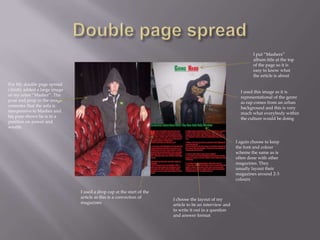
Masthead at the top of the
page as this is a convention of
a magazine. I choose the
colours Green and Red                 I positioned the barcode in the top
because these are bright and          right hand corner as it filled an
eye catching so they create a         empty space and would otherwise
strong contrast. I have chosen        of partially blocked the image
to stick with this colour
scheme throughout the
magazine as not to over           Cover lines are place
complicate the visuals of it      in a C shape as this
                                  is often done in
I added in a date and price of    magazines as this is
the issue as this is              how the eye scans
conventional of all magazines     over the page


                                      The image I used is a medium
                                      close up and the “Artist” is
                                      making eye contact with the
                                      camera this is conventional for all
                                      magazines. I also got a prop
                                      speaker as it is stereotypical of the
                                      Rap genre
The masthead is the exact
same colour as the                                                 Here i put in a
masthead on the front                                              promotional offer
colour to add uniformity                                           for my own
and consistency to the                                             magazine, this is
magazine                                                           fairly common in
                                                                   most magazines
   I stuck with the
   red and green
   colours in my
   text as it
   connotes
   consistency with
   in the magazine


           I inserted a clothing
           voucher which is
           representational of
           the genre of rap
                                   I added a black background to
                                   make the red and green colour
                                   increase the contrast
I put “Mashers”
                                                                                                                 album title at the top
                                                                                                                 of the page so it is
                                                                                                                 easy to know what
                                                                                                                 the article is about
For My double page spread
i firstly added a large image                                                                              I used this image as it is
of my artist “Masher”. The                                                                                 representational of the genre
pose and prop in the image                                                                                 as rap comes from an urban
connotes that the sofa is                                                                                  background and this is very
inexpensive to Masher and                                                                                  much what everybody within
his pose shows he is in a                                                                                  the culture would be doing
position on power and
wealth


                                                                                                         I again choose to keep
                                                                                                         the font and colour
                                                                                                         scheme the same as is
                                                                                                         often done with other
                                                                                                         magazines. They
                                                                                                         usually layout their
                                                                                                         magazines around 2-3
                                                                                                         colours

                                I used a drop cap at the start of the
                                article as this is a convection of      I choose the layout of my
                                magazines                               article to be an interview and
                                                                        to write it out in a question
                                                                        and answer format

Evaluation Q1

  • 2.
    Masthead at thetop of the page as this is a convention of a magazine. I choose the colours Green and Red I positioned the barcode in the top because these are bright and right hand corner as it filled an eye catching so they create a empty space and would otherwise strong contrast. I have chosen of partially blocked the image to stick with this colour scheme throughout the magazine as not to over Cover lines are place complicate the visuals of it in a C shape as this is often done in I added in a date and price of magazines as this is the issue as this is how the eye scans conventional of all magazines over the page The image I used is a medium close up and the “Artist” is making eye contact with the camera this is conventional for all magazines. I also got a prop speaker as it is stereotypical of the Rap genre
  • 3.
    The masthead isthe exact same colour as the Here i put in a masthead on the front promotional offer colour to add uniformity for my own and consistency to the magazine, this is magazine fairly common in most magazines I stuck with the red and green colours in my text as it connotes consistency with in the magazine I inserted a clothing voucher which is representational of the genre of rap I added a black background to make the red and green colour increase the contrast
  • 4.
    I put “Mashers” album title at the top of the page so it is easy to know what the article is about For My double page spread i firstly added a large image I used this image as it is of my artist “Masher”. The representational of the genre pose and prop in the image as rap comes from an urban connotes that the sofa is background and this is very inexpensive to Masher and much what everybody within his pose shows he is in a the culture would be doing position on power and wealth I again choose to keep the font and colour scheme the same as is often done with other magazines. They usually layout their magazines around 2-3 colours I used a drop cap at the start of the article as this is a convection of I choose the layout of my magazines article to be an interview and to write it out in a question and answer format