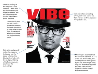
Nayabad Call Girls ✔ 8005736733 ✔ Hot Model With Sexy Bhabi Ready For Sex At ...
Final cover page
1. The main heading of
the magazine is large
and bold. Clearly tells
the audience what the
magazine is called and
the colour being red black and red are contrasting
attracts the audience colours, so it works well to use
to the magazine. them over one another as you can
clearly see the text.
Clearly stating who
the star is. Also a
quote used beneath
his name and written
in slang shows that its
from his own words
which could involve
the audience much
more.
Plain white background
makes the magazine
looks clear and the Main image is large to attract
colour scheme white the audiences attention. As T.I is
black and red helps with a very well known artist, this
the background being also helps to sell the magazine.
white because you can By the size of the image being
clearly see the large this shows how important
subheadings. the artist is and that the
magazine contains a lot of
features about him.
2. Sub headings are in bold
and these also tie in with
The masthead “VIBE” is the colour scheme. The
the definition of the colours are really
word vibe is that of a contrasting with the
feeling or a flavour background therefore the
which suggests that it text is easier to see as it
will appeal to people stands out. the cover lines
looking for an urban relate to Drake who is the
magazine. main image being “hip-
hop’s new religion”. This
cover line suggests the
artists status in the music
industry and with
reference to religion his
following therefore must
be large.
Barcode vertically on His jewellery also
the bottom left of the relates to the cover
magazine. line as it indicates his
new status of religion.
The imagine on the front cover is of
Drake looking straight into the
camera. It is a medium close up
image of him. His head is slightly
tilted and so his baseball cap is also Drake t-shirt has the words ‘unstoppable’ written in
slightly titled. The imagine being bold at the front in white which contrasts with his
large represents he is the main focal black top. By his top saying this it gives off the
point of the magazine. impression that drake is defiant .
3. The mast head is an
abbreviation for the
word ‘rewind’ , and this
mast head also has a
direct connation of the
magazine being a music
magazine.
This front cover is
predominantly made
up of the main image
which emphasis the
Other artists are written in
status off the artist.
black which contrasts with
the background colour
which is her face which
you can clearly see. This
emphasis that the
magazine will also include
features about other
artists but it doesn't give
out any information on the
front cover leaving its
Unconventional puff is audience wondering
used to emphasis the what's new about the
magazines reputation. artists having them need
to look into the magazine
to find out.
The ellipsis is used as a
literary technique to
make the reader want to
know what the
magazine is about.