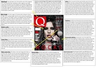
Provocative Woman and Vibrant Colors Attract Target Audience
1. Masthead: the mast head is set in the top left corner of the magazine; Comment on how the design of the magazine cover attracts the target Colour: there is consistent red, black, grey and white used on the cover of
audience: The design of the magazine cover attracts the audience this magazine. The colours contrast each other; the dark background shows
this is not formal like other mastheads as other magazine mast heads
as the image is of a provocative woman, this will attract the men that there could be a dark side to the girl. As ‘Cheryl’s’ songs are about love the
usually cover theSalford top of the magazine. By the editor being different
whole City College
Eccles Centre as it is a picture of the perfect woman. This attracts the men as consistent use of red could emphasise love. The black and grey colours could
and putting it at the Media Studies
AS
top left this shows that this magazine is different and
they find the image of the woman attractive. The magazine also represent Cheryl as being mysterious and dark minded, but also emphasises
not like other magazines. This firstly persuades the Dominant contrast of
Foundation Portfolio the sex appeal to men. The mast heat colours are red and white, it is also
attracts the target audience of music lovers and middle aged as
red and white. Red = power. White stands out on top the red background. placed at the top left of the cover. The red is a dominant colour, the white
round the side shows the things included in the magazine. It
Formal texted is used to create stands out on the read to show the name of the magazine. The editor of this
shows that it includes older bands which will attract the target
magazine has used these colours to show attract people’s eyes when it is on
audience with the vibrant dominant colours which are used. the shelves in the shops. The vibrant colour of red and white of the mast head
Main image: the main image is of a woman who is biting her ring on shows the enlighten of the magazine and attracts people to buy the magazine
her finger. She is looking straight into the corner to attract the audience to
buy the magazine. This image is used as a sex appeal to male. The editor of
the magazine is trying to create the ‘perfect woman’. The action she is
performing is rather provocative in nature which can also be seen as sexist. Typefaces: the editor uses informal font for the mast head to show the
The editor is creating a stereotype of a woman as men see them. The pose creativity of the magazine. The use of informal font also shows how different
Cheryl is doing is very mysterious and a sex appeals to the male target the magazine is to others as most magazine use formal writing for their mast
audience. head. Also the editor does use mature formal font and chooses to have it in a
bold capital letter for the cover lines, this shows that the magazine is for
Model credit: This relates to the main image on the front cover. mature ages and makes the writing stand out more to the audience as it is
There is a bold contrast to make it stand out on the front page. The font different to the informal font used for the mast head. The editor has used bold
writing for the cover line/main cover line and for the masthead to make it
style is very dominant and formal; it starts off small and gradually
aware to the public and stand out so the public will read the cover line to find
becomes bigger. This could relate to her fame, she is becoming bigger. The
out what’s included and then be drawn into the magazine and buying it.
use of red and white shows her power but could also mean bland. We Overall the text is clear and easy to read as it is in the right font size and the
don’t associate “Rocks” (rock music) with the artist on the cover, this right colour to stand out to the audience so they are persuaded to buy it.
could indicate that herself ‘rocks’ or her music ‘rocks’
Photography Lighting: the main photo is set in the middle of the
magazine with very dull lighting. This lighting creates a mysterious/ sexy mood
Cover lines: Text is bold and stands out at the side of the main image. for the picture as the editor wants to mostly appeal to men for this certain
The editor uses different colours (grey, red and white) which create a cover. The low key lighting could also show her emotions coming through. The
contrast with the dark background to draw the attention of the audience to main image may have low key lightning but as we focus on her face the
read the text and find out what’s inside. Formal text is used, but different lightning is lighter to show her beauty and the pose she is doing. As we have a
size font is used. “Best” is big to portray to the audience that the magazine lighter lighting we see she has very vibrant red lips, with her biting her ring.
This brings the sec appeal back into the image. The red emphasises the power
is the “best” this is also big to make it stand out to the audience and catch
she has over people. To conclude the lighting creates a mysterious and sexy
their eye.
mood for the audience and persuades them to read and buy the magazine.
Main cover line: This relates to the main image which takes up Design Principles Used? The principle has been used effectively on this
House Style: The font style used is consistent throughout the
the front cover. The text uses the same font but gradually becomes music magazine front cover as the primary optical area which is the top
magazine cover. Using formal font keeps the magazine looking formal
bigger. Red and white is used just like for the masthead. The editor left of the page has been used by putting the mast head there, this is a
and mature for its target audience. The text goes straight across like
used red and white again to create a dominant contrast with the good idea as it reminds the audience of which magazine they are
another magazine text. Keeping the text the same makes it look more
dark background and picture used. “Rocks” is in the largest font it is buying/reading. The design principle has been used up to a certain extent,
mature. Red, black, grey and white are the main colours used
formal and stands out in red. This represents power to show the the imaginary lines go vertical down the eyes of the woman of the image
throughout the cover, these are simplistic colours. These simplistic
power that women have. but don’t go horizontal across the eyes which doesn’t make the design
colours keep the magazine looking the same and formal. The colours
principle useful for this music magazine.
used also work well together as the red and white and grey stand out
on the dark background which is used.