The document analyzes the front covers of two music magazines - Vibe and Kerrang.
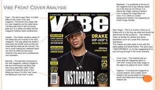
The Vibe analysis notes key elements like the masthead, flash, header, main image of Drake, cover lines about hip hop, and taglines connecting to social media.
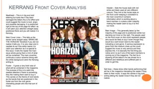
The Kerrang analysis discusses elements such as the damaged masthead suggesting loud music, the main image of a band member with tattoos, header information about a plane crash, and sell lines advertising other bands.
Both analyses examine visual elements that attract readers and communicate the magazines' brands and music genres.
2. Masthead - It is positioned at the top of
VIBE FRONT COVER ANALYSIS the magazine and is big making it stand
out in the shop as it at the top. It is
behind the image makinng it likehe's
over it making the image stand out
more. It is in white on a black
Flash – The fact is says “New” is a flash background making it very appealing as
effect on the cover of the vibe it has a huge contrast.
magazine. This informs the reader that
is a new magazine and the latest issue.
The New also links in with the house
style as it is in yellow and black like the
magazine making it seem professional. Main Image – This is a medium close up of
Drake who is a hip hop rap artist and would be
well known by the audience. . The medium
Header – The header contains names of close up shows his clothes and facial
the artists who are involved in the Vibe expression such as a pose like a serious
magazine. This may attract the reader if expression.
they enjoy this artists music as they will The clothes are plain black to link with the
know that the artist will be involved. The black yellow and white theme. The word says
font is small making the masthead stand “UNSTOPPABLE” on his tee suggesting he is
out more for effect but the colour just coming through in the music industry.
scheme is the same and is professional
and consistent.
Cover Lines – This instantly lets you
Barcode – The barcode is exclusive to know what the magazines genre is
this vibe magazine, making it eligible to “HIP-HOP” it links to the main image on
sell and informing the company vibe the page to by saying his name “Drake”.
how many sales they make. It also
contains the date and price on this Taglines – It connects the magazine to
letting you know if it is the “new” issue a social network, this is twitter which
and telling you how much it costs. relates to the young audience who
would most likely have this social
network site.
3. KERRANG FRONT COVER ANALYSIS Header – Sets the house style with red
white and black used all very different
colours. They link to the house style on
Masthead – This is in big and bold the front cover keeping it consistent to
lettering but looks like it has been the main coverline.It contains
damaged the letters this is for effect and information which is exciting about a
could suggest the music is loud, angry band member in a plane crash instantly
and possible damaging. It is positioned making the reader want to buy it to find
right at the top of the page for effect as out more.
it will catch your attention straight away
positioned there and you will realize it is Main Image – This generally takes up the
Kerrang. majority of the page and is positioned center but
standing out more on the right. The people used
Main Cover Lines – This tells us the on the front cover on this could represent people
bands name straight away “BRING ME who would be likely to buy it even though they
THE HORIZON” therefore if you did not would be a well known band to the reader
realize it tells you. It is very clear and in indicating a rock genre. A serious expression is
capitals its as if the editor wants it to given from this medium close up this could
catch your attention as it is special to suggest the music is very serious and they
this issue. It tells the reader the main express this. It is basically the first thing you
issue article giving them a hint of what notice and it is as if one of the band members is
will be contained. The main coverline coming out of the magazine. The fact he is
continues a colour scheme linking with showing off the tattoo’s he has shows he is
the white background were the Kerrang different and rebellious and suffered pain in
writing is. order to get this.
Footer - It gives a very brief view of
what will be contained in the magazine.
Sell lines – these show other bands performing that
The purpose of this is to catch the
will be in the magazine interesting the reader if they
readers attention if there is something
listen to their music. It says the names in big bold
they like making them want to buy it.
writing letting the reader know if they did not
This carries on the theme of rock bands
realize.
as the bands that are positioned in the
footer are from the rock genre
interesting people who like that sort of
music.