Download as DOCX, PPTX
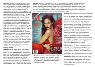

The document summarizes a magazine cover featuring Jennifer Lopez. Key details include: - Jennifer Lopez is the main cover image in the center, drawing readers in with her direct gaze. - The masthead and cover lines are in red and other colors, coordinating with Lopez's red dress. - The layout follows the rule of thirds, with cover lines on the left, image center, and right. - The target audience is affluent, fashion-interested women seeking inspiration from Lopez.


