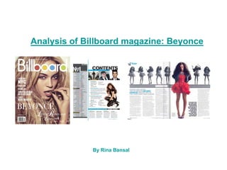
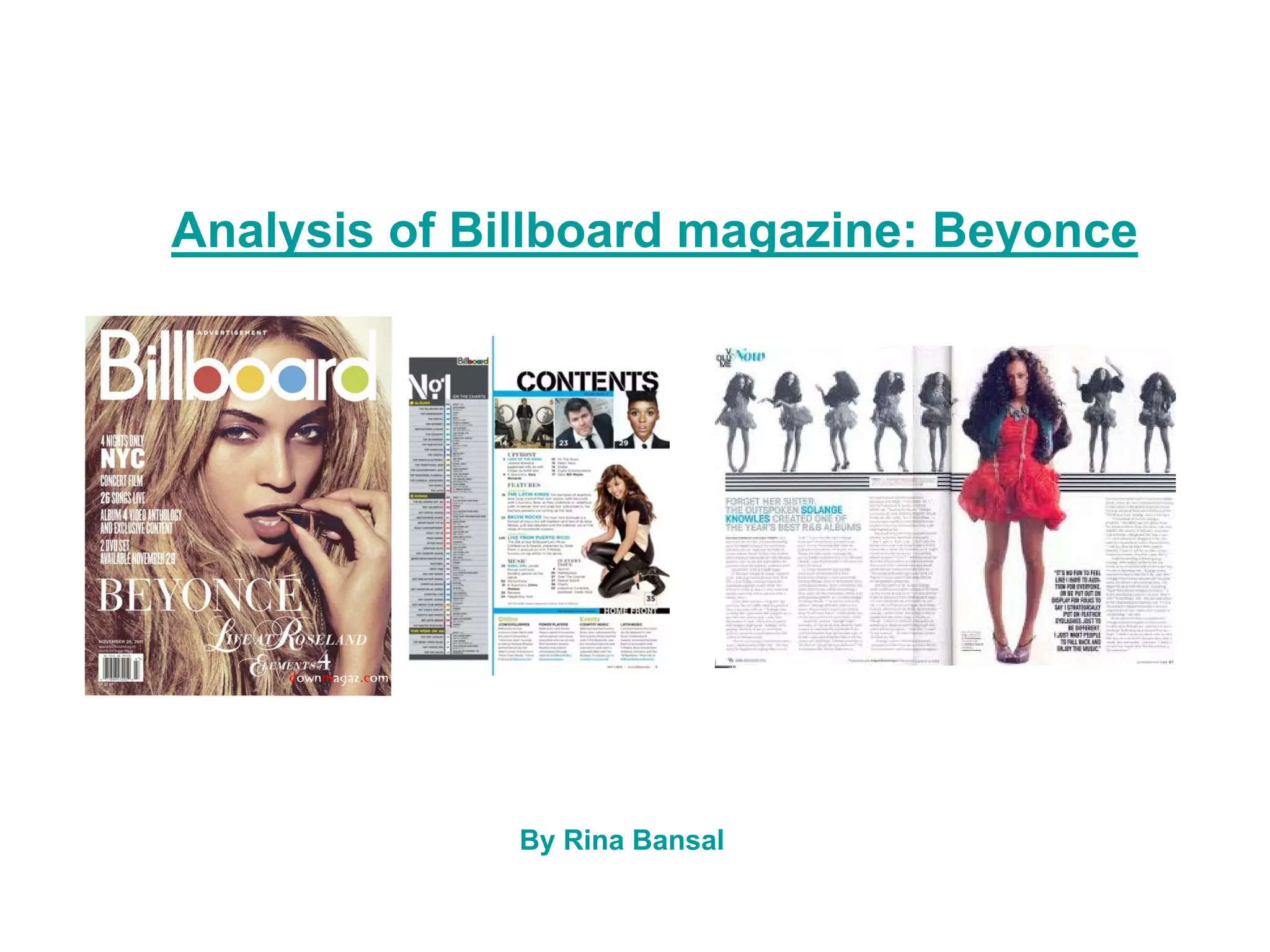
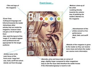
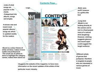
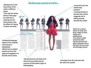
Analysis of Billboard magazine: Beyonce


              By Rina Bansal
Front Cover…
     -Title and logo of                                                -Medium close-up of
     the magazine                                                      the artist
                                                                       -Looking directly
                                                                       towards the camera:
                                                                       way of grabbing the
                                                                       readers attention to
-Cover lines                                                           the magazine
-Colloquial language and
Informal towards the reader
-Advertises other
articles that are inside the
                                                                           -Advertisement of the
magazine, however does
                                                                           artists concert or live
not give a lot of insight to
                                                                           performance
them
                                                                           -Bold, Italic and seriff
-Has used the layout of the
                                                                           font
‘magic C’ to make it appear
more professional and
appropriate for the target
audience                                                          -Website of the magazine is given
                                                                  to the reader so they can receive
                                                                  more views and where the reader
                                                                  can receive more information
-Artists name is the
main focus of the
front cover: large font          -Barcode, price and issue date on corner of
size, bold, seriff font which    page, slightly larger compared to other magazines:
stands out from the page         easy to see the issue date therefore the reader knows
                                 if the information/gossip is recent or old
Contents Page…
 -Lists of what
 songs are                       -Logo                                           -Bold, sans
 popular in the                                                                  seriff; however
 charts                                                                          is a gothic-like
 -Categorised into                                                               font
 albums, songs
 and singles
                                                                                 -Long shot
                                                                                 -Model is not
-It shows new and
                                                                                 looking directly at
recent most
                                                                                 the camera and is
popular albums,
                                                                                 not in a fixed posed;
songs etc which
                                                                                 more of a natural
is updated weekly
                                                                                 shot (laughing).
for the readers
                                                                                 However, clothing
                                                                                 suggests glamour
                                                                                 and recent style-
                                                                                 could suggest the
                                                                                 target audience
-Stuck to a colour theme of
white and blue; makes it more
subtle and professional
-The small use of yellow is                                                     -Different artists
done to highlight the category
                                                                                of genres that
names; makes them stand out
                                                                                juxtapose; therefore
                                                                                is targeted at people
                     -Suggests the website of the magazine; to have more        who are interested in
                     information on the recent updates of the artists of this   various genres of
                                                                                music
                     particular music industry
Double-page spread of article…
  -Background is full                                                               -Long shot (can see
  long shots of the                                                                 whole body
  artist in different                                                               position)
  poses                                                                             -Looking directly at
  -This sets the whole                                                              towards the camera
  theme of the page                                                                 suggests she is
  by what she is                                                                    talking directly
  wearing and her                                                                   towards the reader
  body posture and
  the effect of it being
  in black and white
                                                                                   -Stuck to a colour
                                                                                   theme of white and
                                                                                   blue; makes it more
                                                                                   subtle and
                                                                                   professional
                                                                                   -The artist’s outfit
-Colloquial language                                                               (red dress) then
                                                                                   stands out from the
-Name of the celebrity
                                                                                   page, therefore she is
interviewed is                                                                     the main focus on the
highlighted                                                                        double-page spread
-Whole text is capital-
stands out from the
page and suggests it is
the title of the article

                           -Advertisements and links from
                           where the journalist had her           -Anecdote from the interview that
                           sources of information (type of        the artist has quoted
                           bibliography)
Target Audience…

The target audience for Billboard magazine varies from young teens, from the age of
16, to young adults, at the age of 26. This is because the magazine provides its
readers with the latest updates from the charts, but of different and various types of
genres.

This is to widen the range of the target audience as it acquired to people who listen to
different genres such as; rock, metal, pop, R n B and plenty more.

As well as this, the layout of the magazine itself it very mature as it is not over-
crowded with images of teen bands and other artists, or even consisting of a colour
pallet which clashes.

Furthermore, it does not advertise news and gossip of the artist’s lives, but only
conveys the weekly update of the music charts. Although, it also conveys artist’s stylist
tips and what not.

Task 2 (billboard)

  • 1.
    Analysis of Billboardmagazine: Beyonce By Rina Bansal
  • 2.
    Front Cover… -Title and logo of -Medium close-up of the magazine the artist -Looking directly towards the camera: way of grabbing the readers attention to -Cover lines the magazine -Colloquial language and Informal towards the reader -Advertises other articles that are inside the -Advertisement of the magazine, however does artists concert or live not give a lot of insight to performance them -Bold, Italic and seriff -Has used the layout of the font ‘magic C’ to make it appear more professional and appropriate for the target audience -Website of the magazine is given to the reader so they can receive more views and where the reader can receive more information -Artists name is the main focus of the front cover: large font -Barcode, price and issue date on corner of size, bold, seriff font which page, slightly larger compared to other magazines: stands out from the page easy to see the issue date therefore the reader knows if the information/gossip is recent or old
  • 3.
    Contents Page… -Listsof what songs are -Logo -Bold, sans popular in the seriff; however charts is a gothic-like -Categorised into font albums, songs and singles -Long shot -Model is not -It shows new and looking directly at recent most the camera and is popular albums, not in a fixed posed; songs etc which more of a natural is updated weekly shot (laughing). for the readers However, clothing suggests glamour and recent style- could suggest the target audience -Stuck to a colour theme of white and blue; makes it more subtle and professional -The small use of yellow is -Different artists done to highlight the category of genres that names; makes them stand out juxtapose; therefore is targeted at people -Suggests the website of the magazine; to have more who are interested in information on the recent updates of the artists of this various genres of music particular music industry
  • 4.
    Double-page spread ofarticle… -Background is full -Long shot (can see long shots of the whole body artist in different position) poses -Looking directly at -This sets the whole towards the camera theme of the page suggests she is by what she is talking directly wearing and her towards the reader body posture and the effect of it being in black and white -Stuck to a colour theme of white and blue; makes it more subtle and professional -The artist’s outfit -Colloquial language (red dress) then stands out from the -Name of the celebrity page, therefore she is interviewed is the main focus on the highlighted double-page spread -Whole text is capital- stands out from the page and suggests it is the title of the article -Advertisements and links from where the journalist had her -Anecdote from the interview that sources of information (type of the artist has quoted bibliography)
  • 5.
    Target Audience… The targetaudience for Billboard magazine varies from young teens, from the age of 16, to young adults, at the age of 26. This is because the magazine provides its readers with the latest updates from the charts, but of different and various types of genres. This is to widen the range of the target audience as it acquired to people who listen to different genres such as; rock, metal, pop, R n B and plenty more. As well as this, the layout of the magazine itself it very mature as it is not over- crowded with images of teen bands and other artists, or even consisting of a colour pallet which clashes. Furthermore, it does not advertise news and gossip of the artist’s lives, but only conveys the weekly update of the music charts. Although, it also conveys artist’s stylist tips and what not.