This magazine product uses conventions of real magazines such as:
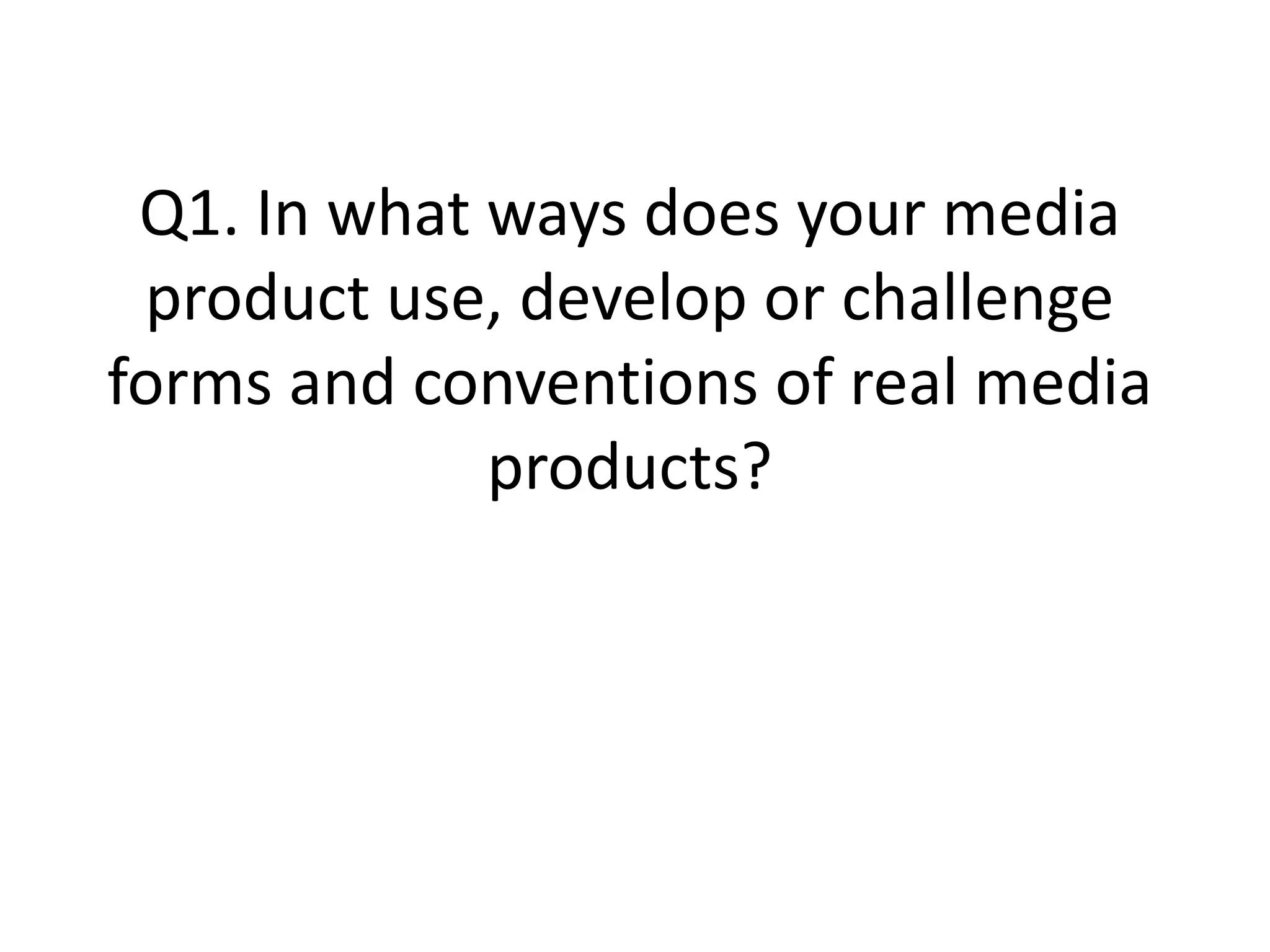
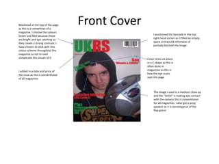
- A masthead at the top of the front cover and contents page
- Placement of the barcode, date, price and cover lines on the front cover
- Consistent color scheme and fonts throughout
- Inclusion of promotional offers, clothing vouchers, and album information
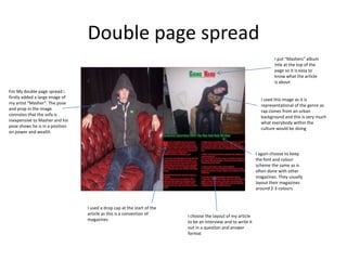
- Double page spreads with large images and article layouts using interviews