Magazine Design Research
Front Page, Content Page, Double page spread analysis
Featured Story: This is the next
important featured in the magazine
which comes after the main cover
story
Featured Stories: These are featured
stories in the magazine
Different Fonts: So other stories can be
separated from other stories
Cover Story: Always relating to the central
image
Website, Price and Issue date- General
Information magazine’s price and Issue
date
Mast Head: The name of the magazine
which is VIBE
Central Image: This is the image which
relates to the cover story in the magazine
of that issue which is usually a famous
person or a group, In this case its 50 Cent
and Eminem. However the Mast Head is
slightly being obscured by the image but
still the Target audience will recognize the
magazine due to the house style
Color Theme :The color theme for this
magazine is red and black and a white
background, Usually every magazine has
three color themes which is a convention of
Magazines . This is so that magazine could
become recognizable from its colorscheme
Banners: This shows the extra content which the magazine has.
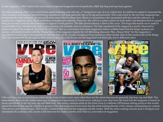
In this magazine „Vibe‟ follows the conventions of general magazines but in particular, R&B, hip-hop and rap music genres.
The title/masthead „Vibe‟ is in a bold block capital lettering with only the „e‟ being lower case. It is in a black font. It could be in capital to represent the
male audience as its big and powerful being capitalized, and male generally like to be big and powerful. This is also back by the fact this magazine has
predominantly male audience. So you could sense some Mise En Scene here. Black is a mysterious color associated with fear and the unknown. It
usually has a negative colour. Black symbolizes strength and authority. However, the color is a unisex colour for both males and femaleswhich is a good
thing as it would avoid sex discrimination to appeal to both genders. The title almost takesup a third of the cover. This huge title stands out to make it
recognizable from a distance and make it eye-catching and instantly attracts customers. The title/masthead of the magazine is partly obscured by
thepositioning of the image of „Eminem‟ & „50 Cent‟, this is a convention that many magazines follow withthe belief that the target audience are
already sufficiently familiar with the ‘House Style’ of the magazine despite the full title being obscured. This „House Style‟ for the magazine is
important because is gives themagazine an identity that can be visually recognized from numerous other similar titles in the market.One of the things
that Vibe consistently do throughout their issues is that they will always use the large,bold and thick title, but in different colors
Vibe will have one or more famous artists on the front of their cover, more often than not the artists theyuse are generally hip-hop, rap and R&B. This
immediately shows to the reader what type of magazine it isjust from it‟s front cover, making it very clear from the front that the magazine is based on
music,specifically in the hip-hop, rap and R&B area. Also using a famous artist on the front cover is a definite USP(unique selling point) as this would
attract the fans of that specific artist(s) or group to buy that magazine.Every cover has the artist looking directly at the camera, maintaining eye contact;
Vibe always uses thistechnique. This creates a relationship between the magazine and the reader. With the artist creating asincere look it intrigues and
intimidates the audience, this creates a link between the reader and the artist.This is a convention of magazines.
This contents page is from the magazine „Vibe‟. The heading of this contents page is in a
bold drop capital black sans-serif font. The word “contents‟ are split into three lines.
This style of headline is carried through all the “Vibe‟ magazine issues contents page
and therefore fits in with the magazines house style. This is also making it expected of
„Vibe‟ as it creates a whole new brand identity and makes that a feature of vibe
magazine. Vibe magazine are constantly trying to keep their contents and front cover
contemporary Also the way that it has been positioned makes it look more modern and
unique . As you can see like other conventions of contents page for music magazines ,
the main & biggest image on the contents page is of the same person/grow upon the
front cover. Where in this case it‟s rapper “ Kanye West‟. The main image is of the artist
“ Kanye West‟ who is taking up most of the space on the contents page. The artist is also
directly addressing the audience as he is looking straight at the camera, he is looking
quite serious, maintaining direct eye-contact with the camera, to engage directly with
the reader and creates a hidden link. There’s a hand reaching over holding a red heart
over Kanye‟s heart, this could be Mise En Scene, that a girl has taken over Kanye’s heart,
or is in the process of taking over his heart. This contents page also has its own cover
story section. Where in his case as you can see its right next to the picture, which is
situated to the left of the page . Another convention it follows is that it has a section
called „Features‟ which shows the stories featured on the front cover . However this
contents page only has two sections which is too little. The two section headings are in
different fonts to the contents of the sections. The colour for the heading is in black and
is in bigger font size. However for the contents, it‟s a mix of grey and black, and a
smaller font size Another convention it follows is the use of a chronological order of
page numbers for the sections on the contents page.One of the things that gives a
magazine its brand identity is the colour theme.The colour theme used here are quite
neutral colours which makes it look classy & professional appealing to its audience that
it aims at. Its grey and black colors, thats its brand identity. The only colour we see on
the page is the love heart which is held by a women towards Kanye West‟s heart. In the
back ground of the contents page is see a large letter “V‟ bold blue/grey sans-serif font,
behind the artists head which reminds the reader that themagazine is a Vibe magazine.
This contents page lacks other images which is a disadvantage. However on the whole it
follows basic music magazines codes and conventions . Another thing that gives a
magazine its brand identity is the layout, and the layout here is very simple and basic
with very little writing, 2 subheadings to the right, and one image used
These series of moving grey scale pictures are Solange Knowles. This seems to be showing her fun side
This text could be seen as a title or a stand first. It is
all in upper case letters and is very bold and
attractive to the eye of the audience
The main color of DPS are red blue and grey
scale. These colors all go well together, The color
red is used on the artist so that it can standout
and make the reader recognize who the artist is
in this case she is Solangee Knowles
The large main colorful image stands out the most on the double
page spread as she is very colorful and is in front of everything
Pull quote makes the audience want to read the rest
of the article. This is very important as readers
usually look at the picture and turn the page. The
pull quote is something attracts the readers
instantaneously.
The model in the main image is looking in the directly into the camera
making a connection with the audience and enticing them to buy the
magazine also known as the direct mode of address
There are only three main colors used on the cover and this is conventional for magazine covers because it keeps the professional look, defines the
house style, and stops the magazine from looking foreign towards its audience. One of the things that gives a magazine its brand identity is the
colour theme. And the colour theme here is white, black and red, and a hint of yellow. The red and black used for the writing , with only a hint of
yellow (part of cover line). Yellow is the colour of joy and happiness, and “Eminem” & „50Cent‟s‟ name is in yellow, I could infer from this that they
are both happy, further backed by the fact it says “A conversation by brothers‟. White has been used for the background, with also a hint of white
writing used (part of cover line). White is considered to be the colour of perfection. As opposed to black, white usually has a positive connotation.
White can represent a successful beginning. This could relate to the “A conversation between brothers” as it could be a positive thing, and could also
hint for a successful begging. Black is associated with power, elegance, death, evil . It‟s a mysterious colour associated with fear and the unknown. It
usually is a negative colour. This color could help connote and glamorize the gang life culture. Red is the colour of fire and blood, so it is associated
with energy, war, danger, strength, power, determination as well as passion, desire, and love . Red is also a strong colour that shows up a range of
seemingly conflicting emotions from passionate love to violence and warfare. This again could relate to the cover line, as the cover line has a red
background, and “A conversation between brothers” reflects a passionate and brotherly love sort of thing. This engages reader to want to find out
more and be pulled into this emotional chat
Above the title/Masthead is the most important story after the cover story which is a featured story. This draws the target reader to the one of the
main features in the magazine
Another thing that gives a magazine its brand identity is the typography, the text used here was pretty much plain. In this issue Vibe used the same
font all over the cover. However only altering colour and text size. The text varied between either red or black, however the cover story was yellow
and white. So it broke a convention here, as a convention of magazines is to have different fonts
The language that has been used on the cover does contain vocabulary their target audience are aware off, words such as “ Blood‟, “ Streets‟. This is
so the audience are aware of this language and would feel as tough they belong to what is being said, or they relate to it in a way .
Above the title/Masthead is the most important story after the cover story which is a featured story. This draws the target reader to the one of the
main features in the magazine. This is a convention of magazines.
Vibe

Vibe

  • 1.
    Magazine Design Research FrontPage, Content Page, Double page spread analysis
  • 2.
    Featured Story: Thisis the next important featured in the magazine which comes after the main cover story Featured Stories: These are featured stories in the magazine Different Fonts: So other stories can be separated from other stories Cover Story: Always relating to the central image Website, Price and Issue date- General Information magazine’s price and Issue date Mast Head: The name of the magazine which is VIBE Central Image: This is the image which relates to the cover story in the magazine of that issue which is usually a famous person or a group, In this case its 50 Cent and Eminem. However the Mast Head is slightly being obscured by the image but still the Target audience will recognize the magazine due to the house style Color Theme :The color theme for this magazine is red and black and a white background, Usually every magazine has three color themes which is a convention of Magazines . This is so that magazine could become recognizable from its colorscheme Banners: This shows the extra content which the magazine has.
  • 3.
    In this magazine„Vibe‟ follows the conventions of general magazines but in particular, R&B, hip-hop and rap music genres. The title/masthead „Vibe‟ is in a bold block capital lettering with only the „e‟ being lower case. It is in a black font. It could be in capital to represent the male audience as its big and powerful being capitalized, and male generally like to be big and powerful. This is also back by the fact this magazine has predominantly male audience. So you could sense some Mise En Scene here. Black is a mysterious color associated with fear and the unknown. It usually has a negative colour. Black symbolizes strength and authority. However, the color is a unisex colour for both males and femaleswhich is a good thing as it would avoid sex discrimination to appeal to both genders. The title almost takesup a third of the cover. This huge title stands out to make it recognizable from a distance and make it eye-catching and instantly attracts customers. The title/masthead of the magazine is partly obscured by thepositioning of the image of „Eminem‟ & „50 Cent‟, this is a convention that many magazines follow withthe belief that the target audience are already sufficiently familiar with the ‘House Style’ of the magazine despite the full title being obscured. This „House Style‟ for the magazine is important because is gives themagazine an identity that can be visually recognized from numerous other similar titles in the market.One of the things that Vibe consistently do throughout their issues is that they will always use the large,bold and thick title, but in different colors Vibe will have one or more famous artists on the front of their cover, more often than not the artists theyuse are generally hip-hop, rap and R&B. This immediately shows to the reader what type of magazine it isjust from it‟s front cover, making it very clear from the front that the magazine is based on music,specifically in the hip-hop, rap and R&B area. Also using a famous artist on the front cover is a definite USP(unique selling point) as this would attract the fans of that specific artist(s) or group to buy that magazine.Every cover has the artist looking directly at the camera, maintaining eye contact; Vibe always uses thistechnique. This creates a relationship between the magazine and the reader. With the artist creating asincere look it intrigues and intimidates the audience, this creates a link between the reader and the artist.This is a convention of magazines.
  • 4.
    This contents pageis from the magazine „Vibe‟. The heading of this contents page is in a bold drop capital black sans-serif font. The word “contents‟ are split into three lines. This style of headline is carried through all the “Vibe‟ magazine issues contents page and therefore fits in with the magazines house style. This is also making it expected of „Vibe‟ as it creates a whole new brand identity and makes that a feature of vibe magazine. Vibe magazine are constantly trying to keep their contents and front cover contemporary Also the way that it has been positioned makes it look more modern and unique . As you can see like other conventions of contents page for music magazines , the main & biggest image on the contents page is of the same person/grow upon the front cover. Where in this case it‟s rapper “ Kanye West‟. The main image is of the artist “ Kanye West‟ who is taking up most of the space on the contents page. The artist is also directly addressing the audience as he is looking straight at the camera, he is looking quite serious, maintaining direct eye-contact with the camera, to engage directly with the reader and creates a hidden link. There’s a hand reaching over holding a red heart over Kanye‟s heart, this could be Mise En Scene, that a girl has taken over Kanye’s heart, or is in the process of taking over his heart. This contents page also has its own cover story section. Where in his case as you can see its right next to the picture, which is situated to the left of the page . Another convention it follows is that it has a section called „Features‟ which shows the stories featured on the front cover . However this contents page only has two sections which is too little. The two section headings are in different fonts to the contents of the sections. The colour for the heading is in black and is in bigger font size. However for the contents, it‟s a mix of grey and black, and a smaller font size Another convention it follows is the use of a chronological order of page numbers for the sections on the contents page.One of the things that gives a magazine its brand identity is the colour theme.The colour theme used here are quite neutral colours which makes it look classy & professional appealing to its audience that it aims at. Its grey and black colors, thats its brand identity. The only colour we see on the page is the love heart which is held by a women towards Kanye West‟s heart. In the back ground of the contents page is see a large letter “V‟ bold blue/grey sans-serif font, behind the artists head which reminds the reader that themagazine is a Vibe magazine. This contents page lacks other images which is a disadvantage. However on the whole it follows basic music magazines codes and conventions . Another thing that gives a magazine its brand identity is the layout, and the layout here is very simple and basic with very little writing, 2 subheadings to the right, and one image used
  • 5.
    These series ofmoving grey scale pictures are Solange Knowles. This seems to be showing her fun side This text could be seen as a title or a stand first. It is all in upper case letters and is very bold and attractive to the eye of the audience The main color of DPS are red blue and grey scale. These colors all go well together, The color red is used on the artist so that it can standout and make the reader recognize who the artist is in this case she is Solangee Knowles The large main colorful image stands out the most on the double page spread as she is very colorful and is in front of everything Pull quote makes the audience want to read the rest of the article. This is very important as readers usually look at the picture and turn the page. The pull quote is something attracts the readers instantaneously. The model in the main image is looking in the directly into the camera making a connection with the audience and enticing them to buy the magazine also known as the direct mode of address
  • 6.
    There are onlythree main colors used on the cover and this is conventional for magazine covers because it keeps the professional look, defines the house style, and stops the magazine from looking foreign towards its audience. One of the things that gives a magazine its brand identity is the colour theme. And the colour theme here is white, black and red, and a hint of yellow. The red and black used for the writing , with only a hint of yellow (part of cover line). Yellow is the colour of joy and happiness, and “Eminem” & „50Cent‟s‟ name is in yellow, I could infer from this that they are both happy, further backed by the fact it says “A conversation by brothers‟. White has been used for the background, with also a hint of white writing used (part of cover line). White is considered to be the colour of perfection. As opposed to black, white usually has a positive connotation. White can represent a successful beginning. This could relate to the “A conversation between brothers” as it could be a positive thing, and could also hint for a successful begging. Black is associated with power, elegance, death, evil . It‟s a mysterious colour associated with fear and the unknown. It usually is a negative colour. This color could help connote and glamorize the gang life culture. Red is the colour of fire and blood, so it is associated with energy, war, danger, strength, power, determination as well as passion, desire, and love . Red is also a strong colour that shows up a range of seemingly conflicting emotions from passionate love to violence and warfare. This again could relate to the cover line, as the cover line has a red background, and “A conversation between brothers” reflects a passionate and brotherly love sort of thing. This engages reader to want to find out more and be pulled into this emotional chat Above the title/Masthead is the most important story after the cover story which is a featured story. This draws the target reader to the one of the main features in the magazine Another thing that gives a magazine its brand identity is the typography, the text used here was pretty much plain. In this issue Vibe used the same font all over the cover. However only altering colour and text size. The text varied between either red or black, however the cover story was yellow and white. So it broke a convention here, as a convention of magazines is to have different fonts The language that has been used on the cover does contain vocabulary their target audience are aware off, words such as “ Blood‟, “ Streets‟. This is so the audience are aware of this language and would feel as tough they belong to what is being said, or they relate to it in a way . Above the title/Masthead is the most important story after the cover story which is a featured story. This draws the target reader to the one of the main features in the magazine. This is a convention of magazines.