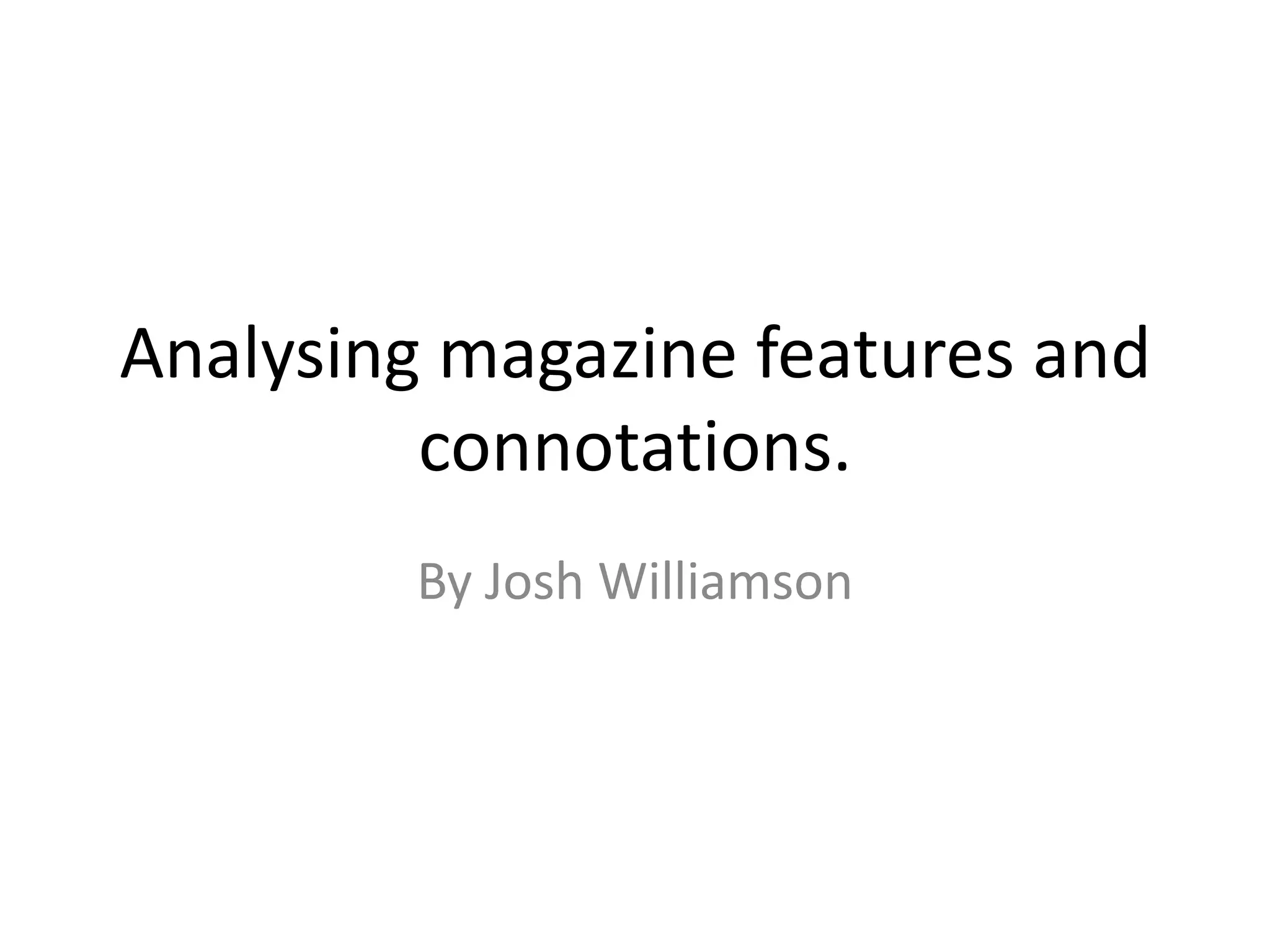
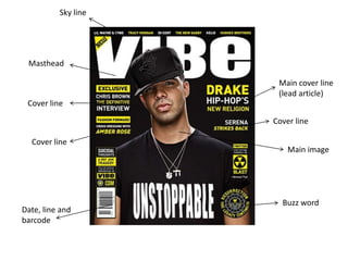
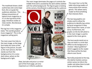
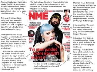
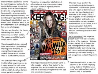
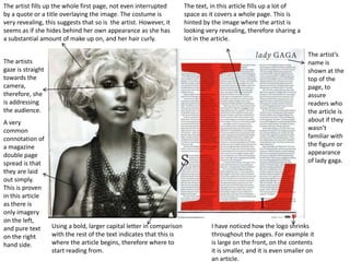
Analysing magazine features and
         connotations.
        By Josh Williamson
Sky line


 Masthead

                      Main cover line
                      (lead article)
 Cover line

                     Cover line

  Cover line
                         Main image


                       Buzz word
Date, line and
barcode
The main image dominates the page as it controls the
                                   middle third and is assisted by the dark clothes battled     This cover line is a list like
 The masthead shows a bold         with the white background. The figures gaze is looking       table informing readers of
 outline box and a very large      at the camera, therefore he is addressing the audience.      many artists from various
 font, this is to grab the                                                                      genres. This allows every
 audiences attention. This                                                                      reader to find something
 follows conventions of                                                                         that interests them.
 typical music magazines as
 it is in the top third of the                                                                The two top graphics are
 page, therefore visible on                                                                   simply used to allow the
 news stands. Also because                                                                    audience to identify two artists
 it is simple.                                                                                by facial recognition if they
                                                                                              didn’t know their name, or vice
The tag line in this magazine
                                                                                              versa. Furthermore, the
states “the worlds greatest
                                                                                              graphic on the far left which is
music magazine”. This is the
                                                                                              in the main image is used to
magazines selling point.
                                                                                              appeal to the music genre.

The main cover line links to                                                                  The buzz words stand out as
the main image, as the large                                                                  they are held in a circle that
font holds the name of the                                                                    differs to the background. It
figure in the picture. As well                                                                involves “album goldmine”
as the main picture, the font                                                                 which suggests to the reader
stands out from the                                                                           that these will be the best
background as it is a very                                                                    albums ever found.
dark colour, where as the
background is light.                                                                          Normally projected at the top,
                                                                                              the skyline involves various
                         Date, barcode and price is a minor                                   artists names to inform the
                         part of the front page, yet very                                     reader and allow them to look
                         important as it informs audience.                                    for an artist they like.
The masthead shows that it is the    The skyline is used to inform viewers. In this line,   The main image dominates
biggest font on the whole page,      red font is used to distinguish names of stars,        the whole page, as it takes up
but also uses the colour scheme      whereas, the black font invites the reader into        two thirds of the page. Even
according to other font on the       the story based inside.                                though the image is
page which is either red or black                                                           dominant, the main cover
– red in this case.                                                                         line is positioned on top,
                                                                                            where normally the main
This cover line is used as a                                                                image overpowers and text
quote, and uses suggestive                                                                  on the page that overlaps.
language. It involves a well
known band with a large fan                                                                 Using a quote on the cover
base, this will attract a larger                                                            line suggests dialogue, or
target audience for them.                                                                   that there is more to the
                                                                                            story, this invites the reader
The buzz word used on this                                                                  to open the page.
magazine cover includes the
                                                                                            In this cover line, it uses a
word “free” to attract a potential
                                                                                            rhetorical question. This as
buyer. Also, underneath, it shows
                                                                                            well as quote also invites the
names of artists that could also
                                                                                            reader to open the page to
be used for fans to buy the
                                                                                            read more.
product too.
                                                                                            Involving a plus above this
 The main cover line dominates                                                              list of artists included in the
 the bottom third of the cover,                                                             magazine acts as an extra
 proven by the way it overlays                                                              cover line, but also as an
 the main image. Apart from the                                                             additional skyline as it is
 masthead, the font is the                                                                  used to inform readers
 largest on the page and the                                                                about artists involved. The
                                         The date line and barcode is used
 involvement of violence is used                                                            plus is important as it
                                         simply to follow conventions and
 in the title explains its                                                                  approves that the extra
                                         enlighten readers.
 dominance also.                                                                            skyline is a brief summary.
The masthead is positioned behind            This skyline is unique to a lot of others. It      The main image overlays the
the main image and is placed in the          offers only one artist, therefore shrinking        masthead proving dominance to
top third of the page. It is partially       the target audience. However, the one              the readers. Furthermore, gender
covered by the masthead because              artist is well known.                              also rules a part of dominance, as
the brand is easily recognisable
                                                                                                men are portrayed as dominant –
(because of its advertisement in
                                                                                                as shown in this image. This is a
world wrestling entertainment) and
                                                                                                rock magazine and it is showed by
even though it is partially blocked,
                                                                                                typical long hair and madness, in
it is still easily identifiable if seen on
                                                                                                this case being the axe. However,
a news stand. Attention wants to be
                                                                                                the axe relates to the theme, as it is
drawn to the title as it is the biggest
                                                                                                showing an action shot of the
font on the whole page.
                                                                                                figure about to smash the pumpkin
The buzz word involves the theme                                                                which is commonly associated with
of the magazine, which is                                                                       Halloween.
Halloween, and offers posters.
The magazine could be bought                                                                   Overall impression: The magazine
simply for this aspect.                                                                        gives off a very rock feel – which is
                                                                                               the genre of the magazine – because
These images illustrate a story of                                                             it is very packed full of images and
what is to come if a reader buys                                                               text. Kerrang communicate a rock
the magazine, therefore, by                                                                    feel to the reader by involving very
making these images action-                                                                    dark colours and making images and
packed, people would be more                                                                   text overlay each other, making it
likely to purchase this product.                                                               look unorganised and as if they don’t
                                                                                               care.
The font used in this magazine is
traditionally a very messy one as            This magazine uses a clever play on words to        Graphics used in this to state the
it based around the rock genre.              inform readers who is “fear-turing” in the          obvious to the reader. Simply by
Although, there is not much text             magazine. This would humour the audience.           stating that it is “the Halloween
in this edition, therefore it shares         This acts as a list educating readers what else     issue” and adding effects such of
messy text with scary fonts.                 is to come in the magazine.                         blood is used as eye-candy.
The word contents is in big, bold letters and is      The date, issue number and website
displayed as the biggest font on the page. Also, it   are used simply for formal and
is the only white text on the page (excluding         collectable reasons.                   An image containing a
“review”), this makes it stand out.                                                          caption stating the page
                                                                                             number and title. This
                                                                                             picture fills nearly half of
                                                                                             the page, showing that it is
Similarly to a range of contents                                                             the dominant story in this
pages, the page numbers are                                                                  issue of the magazine and
displayed with a different colour                                                            is shown as if this will be
compared to the article titles.                                                              the story readers will want
This is because it is easy to                                                                to read first.
understand for readers.

                                                                                             Much like on the front, the
“oasis special!” is used in a                                                                logo that the magazine is
different font and different                                                                 noticeable by is positioned in
font colour. This illustrates to                                                             the top left corner of the
the reader that this type of                                                                 magazine. However, it is
article is not normally involved                                                             around 10 times smaller on
due it not following the                                                                     the contents page because
general conventions or colour                                                                there is not as much emphasis
scheme of the magazine.                                                                      needed on it due to the front
                                                                                             needing to be recognised in
                                                                                             news stands.
 Continuing from the front
                                                                                           “review” is used in the same
 conventional font colours.
                                                                                           way as the contents header at
 Red and black front on a
                                                                                           the top in the way that it is in a
 white background is common
                                                                                           white font with a grey
 among magazines. This is to
                                       This means that it is a part of the magazine        background and positioned next
 give a sophisticated look.
                                       every week and they want it to be recognisable.     to the logo.
Rather than the contents page being called
                                  simply “contents” like many others, it is the
                                  name of the magazine followed by “this week”
                                  acting as if this page is a catch up or some sort
                                  of informing news page.                             Date line

Only two images dictate the                                                             The contents column is set into
whole page as they both focus                                                           5 different categories of “news,
on the same story, which seems                                                          radar, reviews, live and
to be the featured article. By                                                          features”. This is because it
only including one article's                                                            separates completely different
imagery, this puts emphasise                                                            articles so the reader can
on it and shows the reader that                                                         distinguish their favourite type
it is the main article.                                                                 of article and therefore view the
                                                                                        preferred one more.

                                                                                       Following simple conventions,
 NME lists all of the bands                                                            the number of the page is a
 featured in the article                                                               different colour compared to the
 followed with the page                                                                article title.
 number in case the reader
 wants to read about a
 specific band or particular                                                           The main article, here, has a
 artist.                                                                               brief description or a tester of
                                                                                       what is to come in the full
                                                                                       double page spread of the story.

                                    This shows the magazine advertising their          This puff indicates the
                                    magazine further through subscriptions. This,      highlights of the issue.
                                    to the reader, seems like an easier option than
                                    going out to buy it.
A traditional title is used on this page. Contents simply
 The paragraph shown is a            makes this page recognisable to anyone opening the
 message from the issue editor.      issue. This text stands out as it is displayed in yellow on a
 This is proven to be formal as      black background, different to anything else on the page.
 it is ended off with a
 signature. It also has an image
 of the front of the magazine
 which the writer of this
 paragraph edited.


9 pictures with page numbers
indicate the major articles in                                                                 The contents list is
the issue, which is an easy war                                                                traditionally used in this
for the readers to flick through                                                               magazine as it only takes up a
to what they will most likely                                                                  third to a quarter of the page.
want to read first. By enlarging                                                               Also, the title is a different
one picture bigger than the                                                                    sized font compared with the
others and including it first will                                                             brief description that follows.
put emphasis on it and display
that it is the most popular
article in the whole issue.

                                                                                               Here shows advertisement for
                                                                                               the subscription. This is
Typically, the article has a brief
                                                                                               involved on the contents page
description and page number in       As this magazine is of a rock genre, it                   as it is seemed to be a formal
a different colour to the title.     connotes this even through the contents                   page where a message from
                                     page as it is full of either text or imagery              the editor could also be
                                     and you only see white space through the                  included.
                                     means of a border or background.
The artist fills up the whole first page, not even interrupted         The text, in this article fills up a lot of
by a quote or a title overlaying the image. The costume is             space as it covers a whole page. This is
very revealing, this suggests that so is the artist. However, it       hinted by the image where the artist is
seems as if she hides behind her own appearance as she has             looking very revealing, therefore sharing a
a substantial amount of make up on, and her hair curly.                lot in the article.

                                                                                                                      The artist’s
The artists                                                                                                           name is
gaze is straight                                                                                                      shown at the
towards the                                                                                                           top of the
camera,                                                                                                               page, to
therefore, she                                                                                                        assure
is addressing                                                                                                         readers who
the audience.                                                                                                         the article is
A very                                                                                                                about if they
common                                                                                                                wasn’t
connotation of                                                                                                        familiar with
a magazine                                                                                                            the figure or
double page                                                                                                           appearance
spread is that                                                                                                        of lady gaga.
they are laid
out simply.
This is proven
in this article
as there is
only imagery
on the left,
and pure text      Using a bold, larger capital letter in comparison             I have noticed how the logo shrinks
on the right       with the rest of the text indicates that this is              throughout the pages. For example it
hand side.         where the article begins, therefore where to                  is large on the front, on the contents
                   start reading from.                                           it is smaller, and it is even smaller on
                                                                                 an article.
50% of this double page spread is used by an image of the artist with
an overlaying quote. This follows the simple conventions of a double                                     Another quote is
page spread article, that they’re simply laid out. Also, all of the group   A drop capital is used to    used in the article.
members are wearing black apart from the figure at the front who is         indicate where the article   However, this quote
wearing bright, vibrant colours. This could illustrate to the reader that   begins and is a known        seems not as
he is the main singer in this group. Furthermore, all of the other band     convention of articles.      significant because it
members are almost hidden by the quote, whereas the “lead singer”                                        is much smaller than
is only scratched.                                                                                       the quote on the
                                                                                                         opposite page.
                                                                                                         Although, it still is
                                                                                                         used to grab
This is shown as the                                                                                     attention as it uses a
most colourful and                                                                                       bright orange
largest text on the                                                                                      background on the
whole double page                                                                                        text, and this is to
spread. This shows                                                                                       attract attention.
that it is the most                                                                                      Another purpose of
important piece of                                                                                       this quote and
text and can be used                                                                                     background is to split
as a title or                                                                                            up the text. This may
summary.                                                                                                 be to start a new
                                                                                                         question or subject,
                                                                                                         or just for layout
                                                                                                         purposes.

The layout of this magazine is simple, as it                                                             Another smaller
is divided into two portrait pages, one a         The colour scheme of this double page                  image is used to
whole image, and one full of text. Even           spread is orange, white and black. I can               explain the text
though, within the text sector, there is          tell this by the colour of the font, speech            further as it is placed
another divide and this is by the orange          marks, and text box’s. Although, the                   next to the writing
text box.                                         imagery has a colour scheme of its own,                that it links to.
                                                  as both images are very dark.
The mise-en-scene here is very important. First            Following typical conventions of a double page
of all, it continues the colour scheme of a dark           spread, this magazine involves an extremely
grim colour. Furthermore, it is shown in a                 large title in contrast with other text on the
relaxed atmosphere first of all by showing what            page. This is because it is the most important
looks like a headboard of a bed and also the               piece of information, and could potentially tell
artists posture is stress-free.                            the story of the rest of the article.


                                                                                                         By using a first date
                                                                                                         to the present date.
                                                                                                         This suggests life
                                                                                                         span. Therefore,
                                                                                                         automatically, the
                                                                                                         reader could
                                                                                                         interpret death and
                                                                                                         know that the article
                                                                                                         is celebrating the life
                                                                                                         of an artist.


The general colour scheme of this magazine double                   The white text box shown in the middle of
page spread from the Kerrang magazine is very dark.                 the writing is known as a sub story. In a lot
However, the text and figure in the picture are very                of magazines this is used by means of a
light due to font colour and lighting in the photo. This            quote to direct attention away from the
shows that these link together, and allows the reader               image. In this case, the sub story is used by
to assume the figure is the person being wrote about                placing an image of an action shot and
in the article to the right.                                        continuing to explain it to the readers.

Analysing magazine features and connotations

  • 1.
    Analysing magazine featuresand connotations. By Josh Williamson
  • 2.
    Sky line Masthead Main cover line (lead article) Cover line Cover line Cover line Main image Buzz word Date, line and barcode
  • 3.
    The main imagedominates the page as it controls the middle third and is assisted by the dark clothes battled This cover line is a list like The masthead shows a bold with the white background. The figures gaze is looking table informing readers of outline box and a very large at the camera, therefore he is addressing the audience. many artists from various font, this is to grab the genres. This allows every audiences attention. This reader to find something follows conventions of that interests them. typical music magazines as it is in the top third of the The two top graphics are page, therefore visible on simply used to allow the news stands. Also because audience to identify two artists it is simple. by facial recognition if they didn’t know their name, or vice The tag line in this magazine versa. Furthermore, the states “the worlds greatest graphic on the far left which is music magazine”. This is the in the main image is used to magazines selling point. appeal to the music genre. The main cover line links to The buzz words stand out as the main image, as the large they are held in a circle that font holds the name of the differs to the background. It figure in the picture. As well involves “album goldmine” as the main picture, the font which suggests to the reader stands out from the that these will be the best background as it is a very albums ever found. dark colour, where as the background is light. Normally projected at the top, the skyline involves various Date, barcode and price is a minor artists names to inform the part of the front page, yet very reader and allow them to look important as it informs audience. for an artist they like.
  • 4.
    The masthead showsthat it is the The skyline is used to inform viewers. In this line, The main image dominates biggest font on the whole page, red font is used to distinguish names of stars, the whole page, as it takes up but also uses the colour scheme whereas, the black font invites the reader into two thirds of the page. Even according to other font on the the story based inside. though the image is page which is either red or black dominant, the main cover – red in this case. line is positioned on top, where normally the main This cover line is used as a image overpowers and text quote, and uses suggestive on the page that overlaps. language. It involves a well known band with a large fan Using a quote on the cover base, this will attract a larger line suggests dialogue, or target audience for them. that there is more to the story, this invites the reader The buzz word used on this to open the page. magazine cover includes the In this cover line, it uses a word “free” to attract a potential rhetorical question. This as buyer. Also, underneath, it shows well as quote also invites the names of artists that could also reader to open the page to be used for fans to buy the read more. product too. Involving a plus above this The main cover line dominates list of artists included in the the bottom third of the cover, magazine acts as an extra proven by the way it overlays cover line, but also as an the main image. Apart from the additional skyline as it is masthead, the font is the used to inform readers largest on the page and the about artists involved. The The date line and barcode is used involvement of violence is used plus is important as it simply to follow conventions and in the title explains its approves that the extra enlighten readers. dominance also. skyline is a brief summary.
  • 5.
    The masthead ispositioned behind This skyline is unique to a lot of others. It The main image overlays the the main image and is placed in the offers only one artist, therefore shrinking masthead proving dominance to top third of the page. It is partially the target audience. However, the one the readers. Furthermore, gender covered by the masthead because artist is well known. also rules a part of dominance, as the brand is easily recognisable men are portrayed as dominant – (because of its advertisement in as shown in this image. This is a world wrestling entertainment) and rock magazine and it is showed by even though it is partially blocked, typical long hair and madness, in it is still easily identifiable if seen on this case being the axe. However, a news stand. Attention wants to be the axe relates to the theme, as it is drawn to the title as it is the biggest showing an action shot of the font on the whole page. figure about to smash the pumpkin The buzz word involves the theme which is commonly associated with of the magazine, which is Halloween. Halloween, and offers posters. The magazine could be bought Overall impression: The magazine simply for this aspect. gives off a very rock feel – which is the genre of the magazine – because These images illustrate a story of it is very packed full of images and what is to come if a reader buys text. Kerrang communicate a rock the magazine, therefore, by feel to the reader by involving very making these images action- dark colours and making images and packed, people would be more text overlay each other, making it likely to purchase this product. look unorganised and as if they don’t care. The font used in this magazine is traditionally a very messy one as This magazine uses a clever play on words to Graphics used in this to state the it based around the rock genre. inform readers who is “fear-turing” in the obvious to the reader. Simply by Although, there is not much text magazine. This would humour the audience. stating that it is “the Halloween in this edition, therefore it shares This acts as a list educating readers what else issue” and adding effects such of messy text with scary fonts. is to come in the magazine. blood is used as eye-candy.
  • 6.
    The word contentsis in big, bold letters and is The date, issue number and website displayed as the biggest font on the page. Also, it are used simply for formal and is the only white text on the page (excluding collectable reasons. An image containing a “review”), this makes it stand out. caption stating the page number and title. This picture fills nearly half of the page, showing that it is Similarly to a range of contents the dominant story in this pages, the page numbers are issue of the magazine and displayed with a different colour is shown as if this will be compared to the article titles. the story readers will want This is because it is easy to to read first. understand for readers. Much like on the front, the “oasis special!” is used in a logo that the magazine is different font and different noticeable by is positioned in font colour. This illustrates to the top left corner of the the reader that this type of magazine. However, it is article is not normally involved around 10 times smaller on due it not following the the contents page because general conventions or colour there is not as much emphasis scheme of the magazine. needed on it due to the front needing to be recognised in news stands. Continuing from the front “review” is used in the same conventional font colours. way as the contents header at Red and black front on a the top in the way that it is in a white background is common white font with a grey among magazines. This is to This means that it is a part of the magazine background and positioned next give a sophisticated look. every week and they want it to be recognisable. to the logo.
  • 7.
    Rather than thecontents page being called simply “contents” like many others, it is the name of the magazine followed by “this week” acting as if this page is a catch up or some sort of informing news page. Date line Only two images dictate the The contents column is set into whole page as they both focus 5 different categories of “news, on the same story, which seems radar, reviews, live and to be the featured article. By features”. This is because it only including one article's separates completely different imagery, this puts emphasise articles so the reader can on it and shows the reader that distinguish their favourite type it is the main article. of article and therefore view the preferred one more. Following simple conventions, NME lists all of the bands the number of the page is a featured in the article different colour compared to the followed with the page article title. number in case the reader wants to read about a specific band or particular The main article, here, has a artist. brief description or a tester of what is to come in the full double page spread of the story. This shows the magazine advertising their This puff indicates the magazine further through subscriptions. This, highlights of the issue. to the reader, seems like an easier option than going out to buy it.
  • 8.
    A traditional titleis used on this page. Contents simply The paragraph shown is a makes this page recognisable to anyone opening the message from the issue editor. issue. This text stands out as it is displayed in yellow on a This is proven to be formal as black background, different to anything else on the page. it is ended off with a signature. It also has an image of the front of the magazine which the writer of this paragraph edited. 9 pictures with page numbers indicate the major articles in The contents list is the issue, which is an easy war traditionally used in this for the readers to flick through magazine as it only takes up a to what they will most likely third to a quarter of the page. want to read first. By enlarging Also, the title is a different one picture bigger than the sized font compared with the others and including it first will brief description that follows. put emphasis on it and display that it is the most popular article in the whole issue. Here shows advertisement for the subscription. This is Typically, the article has a brief involved on the contents page description and page number in As this magazine is of a rock genre, it as it is seemed to be a formal a different colour to the title. connotes this even through the contents page where a message from page as it is full of either text or imagery the editor could also be and you only see white space through the included. means of a border or background.
  • 9.
    The artist fillsup the whole first page, not even interrupted The text, in this article fills up a lot of by a quote or a title overlaying the image. The costume is space as it covers a whole page. This is very revealing, this suggests that so is the artist. However, it hinted by the image where the artist is seems as if she hides behind her own appearance as she has looking very revealing, therefore sharing a a substantial amount of make up on, and her hair curly. lot in the article. The artist’s The artists name is gaze is straight shown at the towards the top of the camera, page, to therefore, she assure is addressing readers who the audience. the article is A very about if they common wasn’t connotation of familiar with a magazine the figure or double page appearance spread is that of lady gaga. they are laid out simply. This is proven in this article as there is only imagery on the left, and pure text Using a bold, larger capital letter in comparison I have noticed how the logo shrinks on the right with the rest of the text indicates that this is throughout the pages. For example it hand side. where the article begins, therefore where to is large on the front, on the contents start reading from. it is smaller, and it is even smaller on an article.
  • 10.
    50% of thisdouble page spread is used by an image of the artist with an overlaying quote. This follows the simple conventions of a double Another quote is page spread article, that they’re simply laid out. Also, all of the group A drop capital is used to used in the article. members are wearing black apart from the figure at the front who is indicate where the article However, this quote wearing bright, vibrant colours. This could illustrate to the reader that begins and is a known seems not as he is the main singer in this group. Furthermore, all of the other band convention of articles. significant because it members are almost hidden by the quote, whereas the “lead singer” is much smaller than is only scratched. the quote on the opposite page. Although, it still is used to grab This is shown as the attention as it uses a most colourful and bright orange largest text on the background on the whole double page text, and this is to spread. This shows attract attention. that it is the most Another purpose of important piece of this quote and text and can be used background is to split as a title or up the text. This may summary. be to start a new question or subject, or just for layout purposes. The layout of this magazine is simple, as it Another smaller is divided into two portrait pages, one a The colour scheme of this double page image is used to whole image, and one full of text. Even spread is orange, white and black. I can explain the text though, within the text sector, there is tell this by the colour of the font, speech further as it is placed another divide and this is by the orange marks, and text box’s. Although, the next to the writing text box. imagery has a colour scheme of its own, that it links to. as both images are very dark.
  • 11.
    The mise-en-scene hereis very important. First Following typical conventions of a double page of all, it continues the colour scheme of a dark spread, this magazine involves an extremely grim colour. Furthermore, it is shown in a large title in contrast with other text on the relaxed atmosphere first of all by showing what page. This is because it is the most important looks like a headboard of a bed and also the piece of information, and could potentially tell artists posture is stress-free. the story of the rest of the article. By using a first date to the present date. This suggests life span. Therefore, automatically, the reader could interpret death and know that the article is celebrating the life of an artist. The general colour scheme of this magazine double The white text box shown in the middle of page spread from the Kerrang magazine is very dark. the writing is known as a sub story. In a lot However, the text and figure in the picture are very of magazines this is used by means of a light due to font colour and lighting in the photo. This quote to direct attention away from the shows that these link together, and allows the reader image. In this case, the sub story is used by to assume the figure is the person being wrote about placing an image of an action shot and in the article to the right. continuing to explain it to the readers.