This document provides a summary of the cover and contents pages of Vibe Magazine.
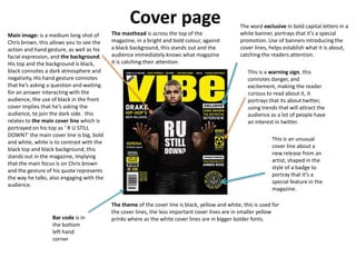
The cover features Chris Brown asking "R U STILL DOWN?" in bold white letters against a black background to engage readers. Inside, Kanye West is featured in a serious pose taking up most of the page.
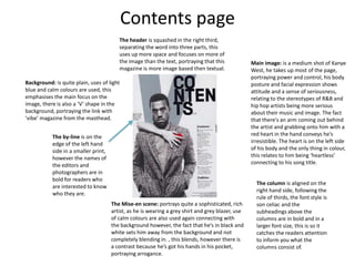
The contents page uses a 'V' shape and calm colors to focus on images over text. It lists columns on music, fashion and more.
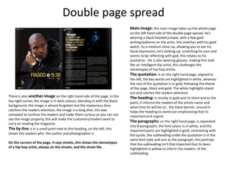
A spread profiles J. Cole reflecting while wearing a black hoodie and glasses to challenge stereotypes. His quotation is highlighted in white and gold to stand out from the black and gold theme.


![Analysing a magazine double page spread[1]](https://cdn.slidesharecdn.com/ss_thumbnails/analysingamagazinedoublepagespread1-130228063124-phpapp01-thumbnail.jpg?width=640&height=640&fit=bounds)


![Music magazine analysis[1]](https://cdn.slidesharecdn.com/ss_thumbnails/musicmagazineanalysis1-130219080201-phpapp01-thumbnail.jpg?width=640&height=640&fit=bounds)


