This document discusses and analyzes the cover of a Lady Gaga issue of Billboard magazine. Key aspects analyzed include the color scheme, positioning of Lady Gaga, and how cover lines are used. It also reflects on design choices and how they impact whether the cover will attract readers.
We all have good and bad thoughts from time to time and situation to situation. We are bombarded daily with spiraling thoughts(both negative and positive) creating all-consuming feel , making us difficult to manage with associated suffering. Good thoughts are like our Mob Signal (Positive thought) amidst noise(negative thought) in the atmosphere. Negative thoughts like noise outweigh positive thoughts. These thoughts often create unwanted confusion, trouble, stress and frustration in our mind as well as chaos in our physical world. Negative thoughts are also known as “distorted thinking”.
The Art Pastor's Guide to Sabbath | Steve ThomasonSteve Thomason
What is the purpose of the Sabbath Law in the Torah. It is interesting to compare how the context of the law shifts from Exodus to Deuteronomy. Who gets to rest, and why?
Instructions for Submissions thorugh G- Classroom.pptxJheel Barad
This presentation provides a briefing on how to upload submissions and documents in Google Classroom. It was prepared as part of an orientation for new Sainik School in-service teacher trainees. As a training officer, my goal is to ensure that you are comfortable and proficient with this essential tool for managing assignments and fostering student engagement.
Welcome to TechSoup New Member Orientation and Q&A (May 2024).pdfTechSoup
In this webinar you will learn how your organization can access TechSoup's wide variety of product discount and donation programs. From hardware to software, we'll give you a tour of the tools available to help your nonprofit with productivity, collaboration, financial management, donor tracking, security, and more.
How to Create Map Views in the Odoo 17 ERPCeline George
The map views are useful for providing a geographical representation of data. They allow users to visualize and analyze the data in a more intuitive manner.
The Indian economy is classified into different sectors to simplify the analysis and understanding of economic activities. For Class 10, it's essential to grasp the sectors of the Indian economy, understand their characteristics, and recognize their importance. This guide will provide detailed notes on the Sectors of the Indian Economy Class 10, using specific long-tail keywords to enhance comprehension.
For more information, visit-www.vavaclasses.com
Model Attribute Check Company Auto PropertyCeline George
In Odoo, the multi-company feature allows you to manage multiple companies within a single Odoo database instance. Each company can have its own configurations while still sharing common resources such as products, customers, and suppliers.
Synthetic Fiber Construction in lab .pptxPavel ( NSTU)
Synthetic fiber production is a fascinating and complex field that blends chemistry, engineering, and environmental science. By understanding these aspects, students can gain a comprehensive view of synthetic fiber production, its impact on society and the environment, and the potential for future innovations. Synthetic fibers play a crucial role in modern society, impacting various aspects of daily life, industry, and the environment. ynthetic fibers are integral to modern life, offering a range of benefits from cost-effectiveness and versatility to innovative applications and performance characteristics. While they pose environmental challenges, ongoing research and development aim to create more sustainable and eco-friendly alternatives. Understanding the importance of synthetic fibers helps in appreciating their role in the economy, industry, and daily life, while also emphasizing the need for sustainable practices and innovation.
Read| The latest issue of The Challenger is here! We are thrilled to announce that our school paper has qualified for the NATIONAL SCHOOLS PRESS CONFERENCE (NSPC) 2024. Thank you for your unwavering support and trust. Dive into the stories that made us stand out!
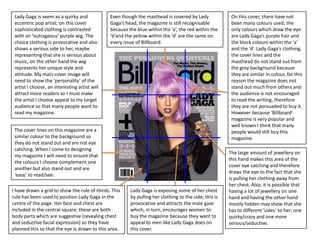
1. Lady Gaga is seem as a quirky and Even though the masthead is covered by Lady On this cover, there have not
eccentric pop artist; on this cover Gaga’s head, the magazine is still recognisable been many colours used; the
sophisticated clothing is contrasted because the blue within the ‘a’, the red within the only colours which draw the eye
with an ‘outrageous’ purple wig. The ‘b’and the yellow within the ‘d’ are the same on are Lady Gaga’s purple hair and
choice clothing is provocative and also every issue of Billboard. the block colours within the ‘a’
shows a serious side to her, maybe and the ‘d’. Lady Gaga’s clothing,
representing that she is serious about the cover lines and the
music, on the other hand the wig masthead do not stand out from
represents her unique style and the grey background because
attitude. My main cover image will they are similar in colour, for this
need to show the ‘personality’ of the reason the magazine does not
artist I choose, an interesting artist will stand out much from others and
attract more readers so I must make the audience is not encouraged
the artist I choose appeal to my target to read the writing, therefore
audience so that many people want to they are not persuaded to buy it.
read my magazine. However because ‘Billboard’
magazine is very popular and
well known I think that many
The cover lines on this magazine are a people would still buy this
similar colour to the background so magazine.
they do not stand out and are not eye
catching. When I come to designing
The large amount of jewellery on
my magazine I will need to ensure that
this hand makes this area of the
the colours I choose complement one
cover eye catching and therefore
another but also stand out and are
draws the eye to the fact that she
‘easy’ to read/see.
is pulling her clothing away from
her chest. Also, it is possible that
I have drawn a grid to show the rule of thirds. This Lady Gaga is exposing some of her chest having a lot of jewellery on one
rule has been used to position Lady Gaga in the by pulling her clothing to the side; this is hand and having the other hand
centre of the page. Her face and chest are provocative and attracts the male gaze mostly hidden may show that she
included in the central square; these are both which, in turn, encourages women to has to different ‘sides’ to her; one
body parts which are suggestive (revealing chest buy the magazine because they want to quirky/crazy and one more
and seductive facial expression) so they have appeal to men like Lady Gaga does on serious/seductive.
planned this so that the eye is drawn to this area. this cover.
2. The colour scheme for this magazine is white, This ‘pull-out gift guide’ acts as a lure/hook; it encourages the audience to buy the magazine so
red and black. These colours are eye catching that they can read this section. Unlike a lot of the coverlines, I like where this advert is placed
and compliment each other, however I think because it is in ‘white space’ and because it has a red boarder it stands out. Also the use of a
that a magazine with a different range of picture (of the gifts it has on offer) helps to attract viewers because they may see an item which
contrasting colours, which connote fun and they wish to buy and therefore they may buy the magazine in order to get the item. There are
are more ‘girly’, would appeal more to the many lures on this cover – Download Taylors new song for free, one magic move to sexy abs.
target audience (which seems to be girls aged
10-15). The colour red connotes passion and
danger and therefore this colour scheme This cover image is quite eye catching and
would be more suitable for a magazine aimed strong because of the eye contact which
at girls in their late teens or early 20’s. Also, makes the audience feel like they have a
in order to make her hair and skin stand out, I connection with her. Taylor swift has her
think that a brighter colour should have been hands in a heart shape; this could be to show
used for the background, e.g. purple, pink or her fans that she loves and appreciates them
blue, however if this had been done then the or it could show her love for music. Her make
colours black, red and white would not have up and hair look very natural which could show
been suitable for this magazine. that she is quite laid back, however when I
take photos for my main cover image I will
Cosmo girl is a ‘branch magazine’ from make sure that everything is positioned
Cosmopolitan. The definition of perfectly, for example her necklace which is
‘cosmopolitan’ is ‘familiar with many slightly to the right. I am hoping to use a
countries’ or ‘sophisticated’; they may have brightly coloured lipstick and possibly eye
used this name to show that the magazine is make up as well ad this will make my magazine
stylish, modern and popular worldwide. The stand out more than this one does.
word ‘girl’ shows that it is aimed at girls,
instead of women, as it contains material
which is more suitable for girls and some of I have drawn a grid on this image, to show
the rule of thirds. This rule has been used to
the content from ‘Cosmopolitan’ is not
position Taylor in the centre of the page; her
appropriate for girls, therefore it is important
hands are in the bottom, middle square and
for the magazines to be distinguishable.
her eyes are in the top, middle square. This
draws the viewer’s attention to the eye
The mode of address is very simple. They have used short This cover line acts are a contact she has and the ‘heart’ position of
phrases to clearly show what will be in the magazine. Words lure/hook. The main piece of her hands. However the cover lines have not
such as Love, Glam and jewellery appeal to the target audience information is written in been organised in the same way; they
(teenage girls) because they are topics which a lot of girls are large, red text. This draws the overlap over many different sections which
interested in reading about. eye of the audience and makes the magazine look busy and they also
encourages people to buy the overlap the image a lot, therefore the eye is
The word love, (which is mentioned 3 times on the cover) links to magazine so that they can draw away from Taylor and on to the cover
the heart shape which Taylor’s hands are in. This suggests that love read about ‘The most lines.
will be a theme throughout the magazine. intriguing people of 2008’.
3. The eye is immediately draw to this masthead for many reasons: firstly it is on the left side of
Unlike many pop magazines this cover does not
the page so on a stand it will always be seen, secondly it is bright red and stands out from the
have a huge amount of cover lines; I think that
rest of the cover, thirdly it has a single white ‘Q’ in it instead of a long masthead (the white
this looks good because the page looks
also stands out from the red, and lastly it is the same in every issue so it is well known and
sophisticated and clear whereas many pop
recognisable.
magazine covers look busy and the cover lines
often take the attention away from the main
On this cover Lily Allen is not wearing any image.
clothes on her upper body but has her back
facing towards the audience. This is
On this cover I have drawn a grid to show the
provocative and attracts the male gaze and
rule of thirds. I think that across the top of the
yet it is still sophisticated because all that
magazine the rule of thirds has been used; in
the audience can see is her back; attracting
the first square there is the masthead, in the
the male gaze encourages women to buy the
second is Lily Allen nude upper body and in the
magazine because they want to appeal to
third they have placed most of the cover lines.
men like Lily Allen does on this cover. When
This is an unconventional place to put a block
somebody in the main cover image has their
of cover lines because they are usually down
back towards the audience I would worry
the left hand side so that they can be seen
that they may not gain strong eye contact
when the magazine is in a stand, however I
with the audience and therefore the
think that on this cover placing the cover lines
audience would not be drawn to the
here looks good and appeals to the audience
magazine and they may not feel and
because it fits with the rule of thirds and the
connection with her; on this cover I feel that
different sized fonts draw the attention to the
her eyes do not stand out enough to grab
key words.
peoples attention, so if I was to use the pose
that Lily Allen is in then I would highlight the
eyes with bright make-up and I would Although the genre of this magazine is not
ensure that the models hair was away from pop, I have decided to deconstruct it because it
their eyes so that they are not hidden. has Lily Allen on it and in my opinion her music
is pop. I have also chosen to deconstruct this
The word ‘WICKED’ on this cover has cover because ‘Q’ seems to feature many
ambiguous meanings; it could mean ‘cool’ different genres, including pop, however it may
or ‘evil’ or it could have a sexual On this cover animals have been used to reflect not fit to the stereo typical pop look and when I
meaning, this tells the readers that in this Lilly’s personality and attitude; they are dark in come to create my magazine I want to look
magazine there will be some information colour which connotes mystery and danger but more mature and be for a slightly older
about her life and they can use it to be also the phrase ‘sexy beast’ has been used to audience than a lot of pop magazines therefore
more like her. It has been repeated twice show that these animals are not only dangerous I think that the simple and ‘classic’ look of ‘Q’
and is in bright red capitals which is eye but are also seen as graceful and the use of these has some of the qualities I hope my magazine
catching and connotes passion and danger. big cats makes Lily seem even more provocative. will have.
4. The word ‘contents’ is written in If a magazine is not in a plastic wallet then people who are interested in buying the
the same way in every issue of magazine may look to the contents page to see in more detail what will be included
Vibe magazine, this makes it in the magazine, therefore it is essential that the pages listed are appealing and
recognisable, however this is not popular with the target audience. This will encourage people to buy the magazine
essential because a magazine because they will want to read about the things on the contents page and when
show be recognisable from the looking through the magazine to find these, other articles may catch their eye.
masthead and the style of the
cover as the front cover is what
people see on the stand and Despite the fact that this is a contents
therefore the job of the front page, it does not have much writing; I
cover is to draw people think that this may be because they in
in, whereas the job of the contents have not listed all the articles. Instead
page is to give details of what they have picked out the main topics
articles will be in the magazine. covered in the magazine and have
The main image in the page seems written small amount of detail about
to have been taken in order to fit them. The font is small and is a similar
around the text. Her position is colour to the background so it does not
provocative; therefore attracting stand out or grab peoples attention;
the male gaze and inspiring female the use of a ‘fancy’/’swirly’ font , for
readers to want her figure. The the headings, appeals to females and
clothing she is wearing shows a lot does stand out from the background
of flesh which also attracts the and the rest of the text, however
male gaze and the heels are both because it is black (the same colour as
‘sexy and sophisticated’. I think the rest of the text and similar the
that she has been made to look background colour) it is not eye
glamorous so that women will catching, therefore this magazine is
want to be like her and read about suitable for an older/ more mature
her. audience.
The colour scheme for this contents page (from a vibe magazine) is mainly black, grey and white; these colours connote
sophistication and also mystery, using these colours may encourage women to want these qualities and makes the magazine
more ‘stylish’. The colours used for the contents page do not need to be brightly coloured and eye catching; this one has
chosen a more sophisticated colour pallet which appeals to a slightly older audience than most pop music magazines,
however many magazines still choose to have bright colours because they connote fun and excitement.
5. The artist on this contents page from ‘Q’ The ‘Q’ logo has been placed in the top left hand corner of the page, this is in some
magazine seems to have been styled to ways un-needed however it may remind people which magazine they are reading or if
look as though he has no been styled, he this page is separated from the magazine then a reader would know which magazine it
looks untidy and casual because he has came from, therefore if this page was being read by somebody who had not read ‘Q’
not shaved and his hair has not been magazine before then they may become interested in buying it in the future.
styled. His eye contact helps to make the
reader feel that they have a connection The date has been written in quite a
to him and therefore they may want to large font at the top of this contents
read on or go straight to the article page, this is useful because it makes it
about him. clear when the magazine was made and
therefore readers will always know
In the bottom right hand corner there is whether the information is up to date.
a bright red arrow; this fits with the
colour scheme, however because the The fonts on this page are simple and are
back ground is his skin the arrow still all quite similar, this helps to make the
stands out. This arrow seems to have page clear and easy to understand
been placed here to tell the reader to however I feel that this simplicity does
turn the page and continue reading, not make key articles stand out; for my
however if the magazine has already magazine I aim to stick to a simple colour
been purchased then this is not needed scheme but I also wish to use a bright
because the reader will naturally colour and some different font styles and
continue reading; if they are previewing sizes to make the best
the magazine this may imply that there is articles/advertisements stand out so that
interesting info on the next page. people will want to read my magazine
The majority of this page (from ‘Q’ magazine) is taken up by the main image, there is a small column of text down the left had side
which, although it is the key information on the page, only fills about a third of the page. The layout is clear and simple; this style
makes it easy to navigate not only the contents page but also throughout the rest of the magazine because in order for the reader to
be able to find the correct page it must be clear which article is on which page. One way that they have achieved a simplistic look for
this page is the use of simple colours – white, black and red. These have been used in an organized way so that all the page numbers
are written in red and all the detailing is written in black; the red stands out from the rest of the writing and therefore the reader is
encouraged to read the page numbers first. If many different colours had been used then the page may have been busy therefore
making it difficult to read/understand.
6. Although this is not a pop magazine, I The black boxes stand out from the pink background without making the page look too
have decided to analyse it because this busy, therefore I think that this was a suitable choice of colour, also the use of pink and
page seems to be related to pop and it white writing stands out from the black boxes and still fits in with the colour scheme.
looks like a page from a pop magazine. This makes the magazine seem organized but also shows that it is for a target audience
The main aspect which is used in many of about 12 – 18. The choice of font is simple which makes it clear and easy to read, but
pop magazines is the bright colours, they have still made important information stand out by the use of colour and font size.
mainly pink in this issue, which are eye
catching and connote fun and beauty. I The use of shapes on this page is
aim to use pink in my magazine however particularly eye catching and ‘fun’; in
I feel that a more minimalistic colour many pop magazines, in my
should be used for the background and opinion, too many shapes are used on
brighter colours should be used for one page so they all clash and none of
writing or shapes in order to draw them stand out; they just make the
attention to the information. page look busy and unorganized.
However on this page only a small
At the bottom of this page there is a amount have been used and they all fit
‘lure/hook’ which is a voucher for “£2 with the colour scheme so that words
OFF”, this draws people in who wish to such as ‘CLUB NME’ and the number 1
go to the event advertised and will also stand out from the white background.
encourage other reader to go and In my magazine I will use some shapes
therefore spend money on drink, etc in order to draw attention to the
whilst they are there; this will provide information included however, I want
more money for the magazine. They my magazine to stand out and be
have made this ‘lure’ stand out by using suitable for a target audience between
a contrasting colour (yellow) for the the range of mid-teens and early
corner of the voucher and the main 20’s, therefore I will ensure it does not
writing on it. look too busy or colourful. Even
On this page the main image is not of the main person featured in the magazine; it is of the though bright colours are eye
‘group’ who are number one on this magazines list of “The hottest tunes”, the use of this catching, I think that if a magazine
image will draw the attention immediately to this group and will therefore encourage the uses to many colours then it can have
reader to read the rest of the list and possibly buy/listen to one of the songs. It also shows to opposite affect to what was wanted
readers, who have not heard of the group, what they look like and gives them an idea of the and people will be put off, so keeping
style of the group. to a simple colour palette is vital.
7. Even though this double page I think that using these pictures of her in different positions across the top is a very original
spread does not have a title, I think and eye catching idea, even though the figures are in black and white they still draw the eye.
that it does not need one because They show the R&B artist in different ‘moods’ and therefore the reader may feel that they
the blue writing in the ‘introduction’ have an understanding of her life and can make a connection with her, this is also supported
shows that the article will be about by the strong eye contact she is giving, although the picture is a ‘long shot’ her eyes have
Solange Knowles and therefore a dark makeup on so the audience may still notice them and feel a connection.
title is not needed; the reader has
been given all the information they
The layout of the page is quite
need to know. Also the blue writing
original; I have not seen many
draws the eye, so a title is not
magazines laid out in this way
needed to do this. The fact that she
– with images across the top
is Beyoncee’s sister may encourage
third and text across the
people to read this article.
bottom two thirds. This makes
Although the writing on this double the magazine stand out; if a
page spread is not equally spread person is previewing the
over the two pages, I think that the magazine they are likely to
pages look well organised and turn to the centre pages in
balanced. The first page has the order to see if the content
majority of the writing on it and the appeals to them therefore it is
second only has one column, still important that the double
however there has been an key page spread is interesting and
quote put in bold on the right hand eye catching.
page it helps to create balance.
The red dress she is wearing is short and
The use of black text ensures that these pages are clear and understandable and may therefore attract the male gaze, it is
also allows for bright colours to be used around it in order to make these parts also quite feminine and the bright red
stand out from the white background and black text. I think that the simple colour connotes passion, love, danger and heat,
palette will appeal to most female readers and although blue and red are not attracting the male gaze through the dress
coordinated, they do not clash with one another on these pages because they have will encourage women to buy clothes from
only been used in small amounts. The blue writing in the introduction to the text this magazine (if they sell them) or may
makes her name stand out and therefore, it is one of the first parts that people will encourage them to want to be like this
look at. woman.
8. Because of the small text it is The clothing which this group is wearing is quite old fashioned, but it seems to have a young
not clear what the rhetorical twist to it. This could be because the group or the magazine or anybody related to the group may
question is about however the want to bring this sort of clothing back into fashion. Another explanation for the clothing choice
use of a rhetorical question could be that the Black Eyed Peas are a unique and ‘cool’ and and they want to express this
“Will he, Won’t he?” creates through the clothes they wear. The clothing is the main colour within this double page spread
suspense and excitement, this because the writing is black and the background it white. Also because the picture covers a lot of
makes people want to read the two pages, there is not much room for other colour because this would draw the attention
the magazine to find out more away from the clothing which they are obviously trying to promote.
information about this choice
which will be made. Also, Will.I.Am is the only
using rhetorical questions member of the band who
allows the reader to believe stands out, this is because
that they are involved in his the other members have
life; they may feel as though been faded, using computer
the decision is not only technology, so that they do
important to Will.I.Am but not take the readers
also themselves as well. attention away from
Will.I.Am, this has been
The same colours from the done because this article is
clothing have been used for mostly about Will.I.Am; it is
the key phrase “Will he, possible that the only
Won’t”, this helps to make the reason the group are posing
The different positions of the with him is so that they are
magazine look well planned
members of the group shows each more easy to recognise
and connects all the different
of their personalities, this makes the when they are together
aspects. These colours, gold
reader feel a connection with them, than Will.I.Am is when he
and silver, connote richness
but the sunglasses stop us from poses as a solo artist.
and popularity.
having eye contact with Will.I.Am.
The phrase “Will he, won’t he” seems to be not The arrows at the beginning of the text encourage the reader to start reading, this
only a rhetorical question, but also a play on is the only thing which really draws attention to the text. It does not contain much
words - his name is WILL.i.am – they have used colour; the only small change in colour is used for a quote; for this the background
the beginning of his name to create a phrase becomes black and the writing becomes white, this does draw the eye but only
which relates to him in more than one way. after the reader has looked at the picture and the rhetorical question.
9. This article is not from a pop Lily Stands out in this article because she covers the majority of a page and is wearing red
magazine, however I have decided which is only used for a couple of words on this double page spread, red would usually
to deconstruct it because Lily Allen connote passion, danger and heat however on these pages I think that is mainly connotes
is a Pop singer and yet this article danger and aggression; her facial expression and clothing support the idea that she is not
look very different to how I imagine feeling very happy, she may be finding her life stressful because of the newspaper (which
my/ most pop magazine double links back to the quote made of cuttings) and therefore she may be feeling angry or
page spreads would look like. The aggressive. These are all shown through the Gothic style, clothes, coloured writing.
main reason that this article does
not seem to be ‘pop’ is because of Another reason why this magazine does
the colour scheme; the blacks and not seem to be pop because of Lily
reds connote danger, seriousness Allen’s dark hair and make-up; this style
and mystery, these are not themes makes her seem Gothic and therefore
which most pop magazines wish to she does not appeal to my target
show. audience when she is styled in this way,
however on the cover of ‘Q’ (one of my
other deconstructions) she does not
There is not a large amount of text
look very Gothic even though there is a
on this page (it is possible that it
lot of black; I think that this is because
continues onto further pages); the is
she is in a ‘sweet’/’innocent’ position
obvious because it is the opposite
and her facial expression supports this
colour to the white background,
and therefore she does not look like she
however it is not eye catching
has a sad/bad attitude unlike on this
because it is all one small font and
double page spread.
the only words which stand out are
her name which are written in red, There are many striking things about this double page spread; the first thing which
the quote and the clothes take the draws the eye is the quote which seems to be made out of newspaper cuttings, this
attention away from the writing so may suggest that she has been in the news so much that she feels that they lie about
reading the full article is actually her and therefore she has written her opinion in the style of a news paper heading so
one of the last things the reader that she may finally get her true opinion ‘in the news’. By putting Lily Allen's opinion in
does. very large text, the reader immediately feels the need to read this and this may lead to
them agreeing with her and feeling sorry for her or, on the other hand, they may agree
with “people” and think that she is an attention seeker, if they feel sorry for her or like
her then they may feel that they know her/about her life because in some ways they
know how she feels because in this article she expresses herself.