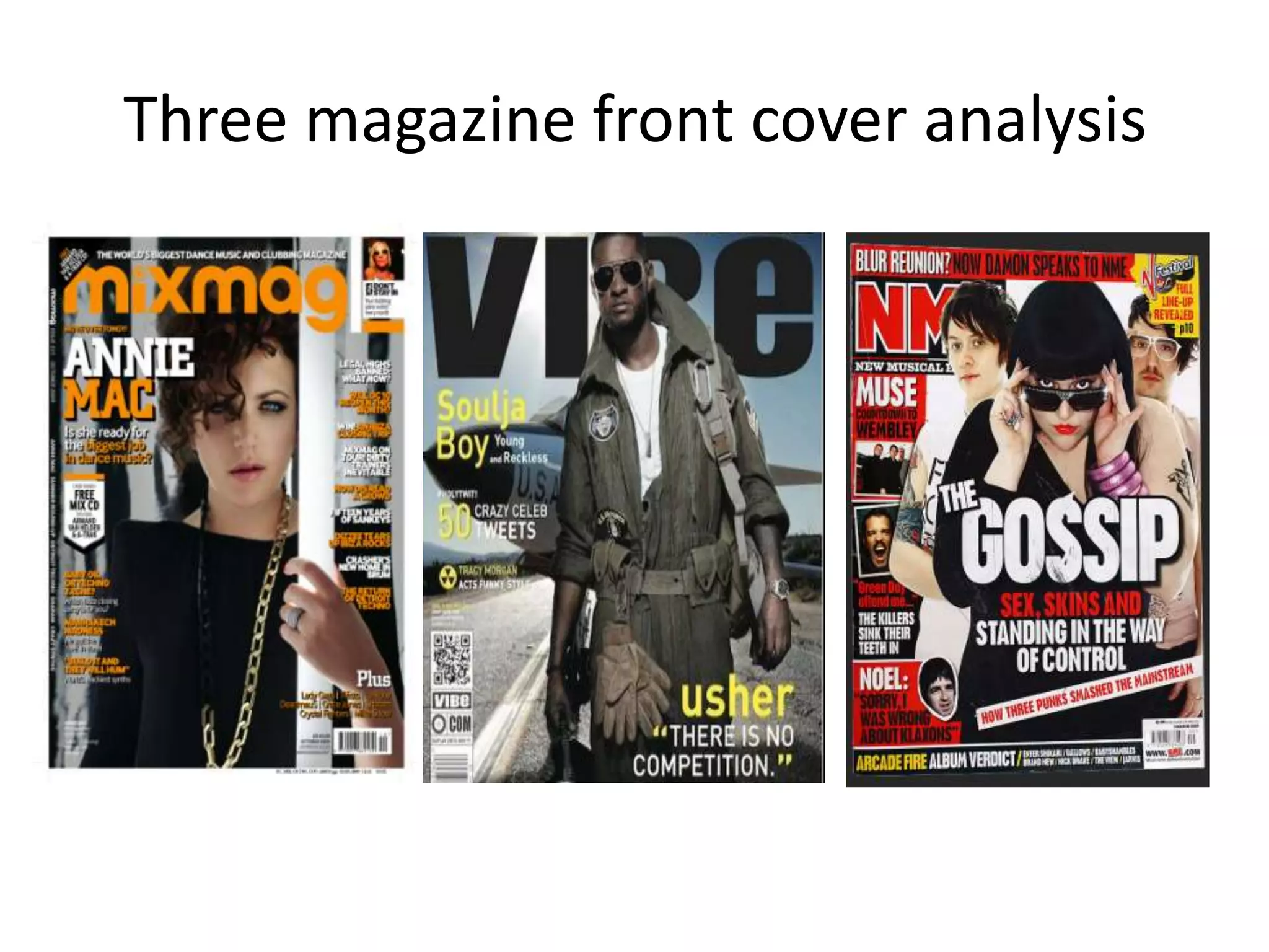
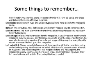
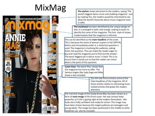
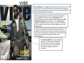
Three magazine front cover analysis
Some things to remember…
    Before I start my analysis, there are certain things that I will be using, and these
    words have their own effective meaning.
Masthead: It is usually in huge and unique typography to help identify the magazine
    name.
Banner: This layout is a mini notification which many readers could be interested in.
Main headline: The main story in the front cover. It is usually included in a relatively
    larger typography.
Main image: This is a main attraction for the magazine. It usually covers nearly whole
    magazine showing popular or interesting images to grab the reader’s attention. For
    example: in a music magazine, if an enlarged image of Beyonce is shown, then the
    reader are more likely to grab that magazine.
Left side third: Shows some brief content of the magazine. Only the most interesting
    and mood capturing headlines are included. This is useful because when a bunch
    of magazines are stacked together in a magazine store or a newsagents, the
    magazines usually cover each other’s main image and masthead. However, their
    left hand side are still visible. Thus using this idea is useful.
MixMag            The skyline shows attraction to the readers, saying ‘The
                  world’s biggest dance music and clubbing magazine’. Just
                  by reading this, the readers would be interested to see
                  what the world’s favourite dance music magazine have
                  in offer.
              The masthead has been identified by the unique design of
              text. It is enlarged in bold and orange, making it easier to
              identify the name of the magazine. The font style of shows
              modernisation that the magazine is informal.
     This can be identified as the main headline of the cover.
     This is because the name of woman is given in full CAPITAL
     letters and immediately under it, a rhetorical question is
     used. The magazine is involving the audience, asking
     them, the question. This can make the reader eager to
     buy and read the magazine just to find out the answer.
     The word ‘biggest job in dance music’ is bold. This is to
     ensure that it stands out so that the reader can notice
     what is the point of this question.
     Cover lines: The word ‘Plus’ shows that
     the magazine has more to offer. The
     famous singers like Lady Gaga and Mike
     Snow is also included.
                                The left side third contains some of the
                                main headlines of the magazine. All of
                                these articles relates to interesting music
                                related articles that grabs the readers
                                attention.
     The mid shot image of the lovely Annie Mac has been shown as a
     form of main image of this front cover. Her eye contact looks
     powerful, as if she is gazing right at the readers themselves. She
     looks she is fully confident and ready for action. This image may
     have been chosen because the target audience are teenagers and
     young adults. The image has been positioned in the middle so other
     headlines can also be included.
VIBE
       The masthead is enlarged, bold and black (unique colour) in the
       front cover. This shows that this is the name of the magazine.
       Vibe is a hip-hop magazine and the font of the masthead kind of
       shows the excitement of hip-hop.

         The energetic picture of Usher has been included in
         this magazine front cover as a main picture. The
         position of the image is shifted on the right so the left
         side third section can be done. In terms of mise en
         scene, ‘Soulja Boy’ means soldier; so Usher is dressed
         up in a soldier uniform with his own fighter jet on the
         background.

          You can notice that only Usher’s picture has been
         added in this front cover and no one else. This shows
         that Usher has become a well known world R & B star
         and, it also reinforces the quote ‘there is no
         competition’.

                   This main headline is about celebrity
                   ‘gossips’. This has been included in
                   the left side third section. Readers
                   who have interest in celebrity life
                   story can be eager to buy this
                   magazine.
NME
The masthead is dark red, outlined by white line. This unique
aesthetic of text can easily identified as a ‘Main name’ of the
magazine.


     The main headline is the main story; it is enlarged so
     the hungry readers can feast on their interest. Hungry
     for celebrity gossips! It pulls the reader to grab this
     magazine and just start reading about them.


      This banner has its own unique colour. This was
      done to make it ‘stand out’ so the readers can
      easily notice them.


      Jessie J and other two stars are included as a
      main image in this magazine. They’re giving
      their series detective looks. For example: Jessi J
      with her dark glases slighly lifted down like she
      is about inspect something. This picture has
      been linked together with the main headline
      ‘GOSSIP’.

         The rhetorical question was also
         used. the Blur fans wil‘Blur
         Reunion?’ all l want to know the
         question’s answer.
Picture of Sam Sparro has
been included with the page
number ’64’ written.

Not all of the contents are
given here but only the
interesting bits are given.

The page numbers are big
along with the topics, making
it easier for readers to choose
interesting articles.

Information of the free CD
attached with this magazine
has also been given.
VIBE magazine is a hip hop magazine.
Therefore the theme of this contents
page has also included a rough
‘Contents’ title.

All the major articles and information
has been included along with the
page numbers.
 There is a headline and it also has
sub headings, showing brief
introduction.

The hip hop magazine has a hip hop
singer as an main image. He is
showing his gold teeth along with his
unique chains, ready to rap.
This contents page is a bit different from other
magazine contents. NME is rock and indie music
magazine.

The contents has been give in different
section, making it easier to select the reader’s
interest. If readers are interested in upcoming
Live events then they can go on the following
page, if they want to know about the news, then
they can go in this section.

This magazine target market are for the people
who love rock and indie music so the image of
two of the top singers has been included in the
contents page, making the contents page look
more interesting.

The advert below the contents page is about
online subscription. This was a really good idea to
include this in the contents page because people
are always likely to visit this page. Also including
the ‘Save 33%’ can persuade some of the readers
to subscribe online.

Magazine front cover analysis

  • 1.
    Three magazine frontcover analysis
  • 2.
    Some things toremember… Before I start my analysis, there are certain things that I will be using, and these words have their own effective meaning. Masthead: It is usually in huge and unique typography to help identify the magazine name. Banner: This layout is a mini notification which many readers could be interested in. Main headline: The main story in the front cover. It is usually included in a relatively larger typography. Main image: This is a main attraction for the magazine. It usually covers nearly whole magazine showing popular or interesting images to grab the reader’s attention. For example: in a music magazine, if an enlarged image of Beyonce is shown, then the reader are more likely to grab that magazine. Left side third: Shows some brief content of the magazine. Only the most interesting and mood capturing headlines are included. This is useful because when a bunch of magazines are stacked together in a magazine store or a newsagents, the magazines usually cover each other’s main image and masthead. However, their left hand side are still visible. Thus using this idea is useful.
  • 3.
    MixMag The skyline shows attraction to the readers, saying ‘The world’s biggest dance music and clubbing magazine’. Just by reading this, the readers would be interested to see what the world’s favourite dance music magazine have in offer. The masthead has been identified by the unique design of text. It is enlarged in bold and orange, making it easier to identify the name of the magazine. The font style of shows modernisation that the magazine is informal. This can be identified as the main headline of the cover. This is because the name of woman is given in full CAPITAL letters and immediately under it, a rhetorical question is used. The magazine is involving the audience, asking them, the question. This can make the reader eager to buy and read the magazine just to find out the answer. The word ‘biggest job in dance music’ is bold. This is to ensure that it stands out so that the reader can notice what is the point of this question. Cover lines: The word ‘Plus’ shows that the magazine has more to offer. The famous singers like Lady Gaga and Mike Snow is also included. The left side third contains some of the main headlines of the magazine. All of these articles relates to interesting music related articles that grabs the readers attention. The mid shot image of the lovely Annie Mac has been shown as a form of main image of this front cover. Her eye contact looks powerful, as if she is gazing right at the readers themselves. She looks she is fully confident and ready for action. This image may have been chosen because the target audience are teenagers and young adults. The image has been positioned in the middle so other headlines can also be included.
  • 4.
    VIBE The masthead is enlarged, bold and black (unique colour) in the front cover. This shows that this is the name of the magazine. Vibe is a hip-hop magazine and the font of the masthead kind of shows the excitement of hip-hop. The energetic picture of Usher has been included in this magazine front cover as a main picture. The position of the image is shifted on the right so the left side third section can be done. In terms of mise en scene, ‘Soulja Boy’ means soldier; so Usher is dressed up in a soldier uniform with his own fighter jet on the background. You can notice that only Usher’s picture has been added in this front cover and no one else. This shows that Usher has become a well known world R & B star and, it also reinforces the quote ‘there is no competition’. This main headline is about celebrity ‘gossips’. This has been included in the left side third section. Readers who have interest in celebrity life story can be eager to buy this magazine.
  • 5.
    NME The masthead isdark red, outlined by white line. This unique aesthetic of text can easily identified as a ‘Main name’ of the magazine. The main headline is the main story; it is enlarged so the hungry readers can feast on their interest. Hungry for celebrity gossips! It pulls the reader to grab this magazine and just start reading about them. This banner has its own unique colour. This was done to make it ‘stand out’ so the readers can easily notice them. Jessie J and other two stars are included as a main image in this magazine. They’re giving their series detective looks. For example: Jessi J with her dark glases slighly lifted down like she is about inspect something. This picture has been linked together with the main headline ‘GOSSIP’. The rhetorical question was also used. the Blur fans wil‘Blur Reunion?’ all l want to know the question’s answer.
  • 6.
    Picture of SamSparro has been included with the page number ’64’ written. Not all of the contents are given here but only the interesting bits are given. The page numbers are big along with the topics, making it easier for readers to choose interesting articles. Information of the free CD attached with this magazine has also been given.
  • 7.
    VIBE magazine isa hip hop magazine. Therefore the theme of this contents page has also included a rough ‘Contents’ title. All the major articles and information has been included along with the page numbers. There is a headline and it also has sub headings, showing brief introduction. The hip hop magazine has a hip hop singer as an main image. He is showing his gold teeth along with his unique chains, ready to rap.
  • 8.
    This contents pageis a bit different from other magazine contents. NME is rock and indie music magazine. The contents has been give in different section, making it easier to select the reader’s interest. If readers are interested in upcoming Live events then they can go on the following page, if they want to know about the news, then they can go in this section. This magazine target market are for the people who love rock and indie music so the image of two of the top singers has been included in the contents page, making the contents page look more interesting. The advert below the contents page is about online subscription. This was a really good idea to include this in the contents page because people are always likely to visit this page. Also including the ‘Save 33%’ can persuade some of the readers to subscribe online.