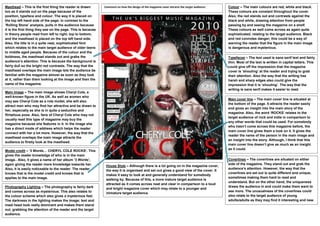
Masthead – This is the first thing the reader is drawn        Comment on how the design of the magazine cover attracts the target audience:   Colour – The main colours are red, white and black.
too as it stands out on the page because of the                                                                                               These colours are constant throughout the cover.
position, typeface and colour. The way it is placed on                                                                                        Also, the red stands out and contrasts against the
the top left hand side of the page, in contrast to the                                                                                        black and white, drawing attention from people
‘Rolling Stone’ analysis, pulls in the audience because                                                                                       passing by and seeing the magazine on a shelf.
it is the first thing they see on the page. This is because                                                                                   These colours as well come across as again quite
in theory people read from left to right, top to bottom,                                                                                      sophisticated, relating to the target audience. Black
and the masthead is placed on the top left hand side.                                                                                         and red connotes danger; this could be a way of
Also, the title is in a quite neat, sophisticated font                                                                                        warning the reader that the figure in the main image
which relates to the main target audience of older teens                                                                                      is dangerous and mysterious.
to middle aged people. Because of the colour and the
boldness, the masthead stands out and grabs the                                                                                               Typefaces – The text used is sans serif text and fairly
audience’s attention. This is because the background is                                                                                       thin. Most of the text is written in capital letters. This
fairly dull so the bright red contrasts. The way that the                                                                                     could give off the impression that the magazine
masthead overlaps the main image lets the audience be                                                                                         cover is ‘shouting’ at the reader and trying to grab
familiar with the magazine almost as soon as they look                                                                                        their attention. Also the way that the writing has
at it, rather than them looking at the image and then the                                                                                     harsh and sharp edges also could give the
name of the magazine.                                                                                                                         impression that it is ‘shouting’. The way that the
                                                                                                                                              writing is sans serif makes it easier to read.
Main image – The main image shows Cheryl Cole, a
well-known figure in the UK. As well as women who
                                                                                                                                              Main cover line – The main cover line is situated at
may see Cheryl Cole as a role model, she will also
                                                                                                                                              the bottom of the page. It attracts the reader easily
attract men who may find her attractive and be drawn to
                                                                                                                                              and gives an insight into the main story of the
her, especially as she is in quite a seductive and
                                                                                                                                              magazine. Also, the word ‘ROCKS’ relates to the
flirtatious pose. Also, fans of Cheryl Cole who may not
                                                                                                                                              target audience of rock and indie in comparison to
usually read this type of magazine may buy the
                                                                                                                                              any other words that could be used. For somebody
magazine because she features in it. In the image she
                                                                                                                                              who hasn’t come across this magazine before, the
has a direct mode of address which helps the reader
                                                                                                                                              main cover line gives them a look on it. It gives the
connect with her a lot more. However, the way that the
                                                                                                                                              reader the name of the person in the main image and
masthead overlaps the main image attracts the
                                                                                                                                              an insight into the story. Although, I think that this
audience to firstly look at the masthead.
                                                                                                                                              main cover line doesn’t give as much as an insight
                                                                                                                                              as it could.
Model credit – ‘3 Words… CHERYL COLE ROCKS’. This
gives the reader knowledge of who is in the main
image.. Also, it gives a name of her album ‘3 Words’,                                                                                         Coverlines – The coverlines are situated on either
again giving the reader more knowledge towards her.                                                                                           side of the magazine. They stand out and grab the
                                                               House Style – Although there is a lot going on in the magazine cover,
Also, it is easily noticeable to the reader. The reader                                                                                       audience’s attention. However, the way that the
                                                               the way it is organised and set out gives a good view of the cover. It
knows that is the model credit and knows that is                                                                                              coverlines are set out is quite different and unique,
                                                               makes it easy to look at and generally understand for somebody
applies to the main image.                                                                                                                    sometimes making them hard to read and
                                                               walking by. Because of this, a more mature target audience is
                                                                                                                                              understand. But on the other hand, the uniqueness
                                                               attracted as it comes across neat and clear in comparison to a loud
Photography Lighting – The photography is fairly dark          and bright magazine cover which may relate to a younger and
                                                                                                                                              draws the audience in and could make them want to
and comes across as mysterious. This also relates to                                                                                          see more. The unusualness of the coverlines could
                                                               immature target audience.
the colour scheme which also gives a mysterious feel.                                                                                         also relate to the target audience of young
The darkness in the lighting makes the image; text and                                                                                        adults/adults as they may find it interesting and new.
mast head look really dominant and makes them stand
out, grabbing the attention of the reader and the target
audience.

Front Cover Research

  • 1.
    Masthead – Thisis the first thing the reader is drawn Comment on how the design of the magazine cover attracts the target audience: Colour – The main colours are red, white and black. too as it stands out on the page because of the These colours are constant throughout the cover. position, typeface and colour. The way it is placed on Also, the red stands out and contrasts against the the top left hand side of the page, in contrast to the black and white, drawing attention from people ‘Rolling Stone’ analysis, pulls in the audience because passing by and seeing the magazine on a shelf. it is the first thing they see on the page. This is because These colours as well come across as again quite in theory people read from left to right, top to bottom, sophisticated, relating to the target audience. Black and the masthead is placed on the top left hand side. and red connotes danger; this could be a way of Also, the title is in a quite neat, sophisticated font warning the reader that the figure in the main image which relates to the main target audience of older teens is dangerous and mysterious. to middle aged people. Because of the colour and the boldness, the masthead stands out and grabs the Typefaces – The text used is sans serif text and fairly audience’s attention. This is because the background is thin. Most of the text is written in capital letters. This fairly dull so the bright red contrasts. The way that the could give off the impression that the magazine masthead overlaps the main image lets the audience be cover is ‘shouting’ at the reader and trying to grab familiar with the magazine almost as soon as they look their attention. Also the way that the writing has at it, rather than them looking at the image and then the harsh and sharp edges also could give the name of the magazine. impression that it is ‘shouting’. The way that the writing is sans serif makes it easier to read. Main image – The main image shows Cheryl Cole, a well-known figure in the UK. As well as women who Main cover line – The main cover line is situated at may see Cheryl Cole as a role model, she will also the bottom of the page. It attracts the reader easily attract men who may find her attractive and be drawn to and gives an insight into the main story of the her, especially as she is in quite a seductive and magazine. Also, the word ‘ROCKS’ relates to the flirtatious pose. Also, fans of Cheryl Cole who may not target audience of rock and indie in comparison to usually read this type of magazine may buy the any other words that could be used. For somebody magazine because she features in it. In the image she who hasn’t come across this magazine before, the has a direct mode of address which helps the reader main cover line gives them a look on it. It gives the connect with her a lot more. However, the way that the reader the name of the person in the main image and masthead overlaps the main image attracts the an insight into the story. Although, I think that this audience to firstly look at the masthead. main cover line doesn’t give as much as an insight as it could. Model credit – ‘3 Words… CHERYL COLE ROCKS’. This gives the reader knowledge of who is in the main image.. Also, it gives a name of her album ‘3 Words’, Coverlines – The coverlines are situated on either again giving the reader more knowledge towards her. side of the magazine. They stand out and grab the House Style – Although there is a lot going on in the magazine cover, Also, it is easily noticeable to the reader. The reader audience’s attention. However, the way that the the way it is organised and set out gives a good view of the cover. It knows that is the model credit and knows that is coverlines are set out is quite different and unique, makes it easy to look at and generally understand for somebody applies to the main image. sometimes making them hard to read and walking by. Because of this, a more mature target audience is understand. But on the other hand, the uniqueness attracted as it comes across neat and clear in comparison to a loud Photography Lighting – The photography is fairly dark and bright magazine cover which may relate to a younger and draws the audience in and could make them want to and comes across as mysterious. This also relates to see more. The unusualness of the coverlines could immature target audience. the colour scheme which also gives a mysterious feel. also relate to the target audience of young The darkness in the lighting makes the image; text and adults/adults as they may find it interesting and new. mast head look really dominant and makes them stand out, grabbing the attention of the reader and the target audience.