1. There has been an effective use of mode of
The colour scheme is bold and basic to catch address here; “DUUDE!” and also “stoner”
the audience’s eye, while the colours also Front Page Analysis – the target audience will be able to
relate to rock ‘n’ roll; such as red and understand these words and will feel as if
black, they are blunt, up front and quite the magazine is catering more to their
hardcore colours for a front page and this will personality. This, in turn, will draw them in
lure in the right type of target audience. NME and make them more likely to buy the
almost always uses the colours white, red and magazine.
black on their front coves. This helps to
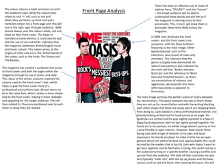
In NME men dominate the front
maintain a brand identity. It could also be said
covers and this front cover is no
that the use of red and white indicates that
exception with the Oasis brothers
the magazine celebrates British/English music
featuring as the main image. Other
and music culture. This makes sense, as the
bands featured, such as The
origins of indie rock are in the British bands of
Libertines, also consist of male-only
the sixties, such as the Kinks, The Stones and
members. This indicates how the
The Beatles.
genre is largely male dominated. An
idea of masculinity is also indicated by
The magazine has created a symbiotic link across
the main sell-line: ‘Rock’s messiest
its front covers and with the pages within the
Bust Ups’ and the reference to ‘Black
magazine through its use of colour and style.
Eyes and Smashed Guitars’, as there
The colour of the artists’ costume matches the
are connotations of violence and
colours used on the front cover’s text, which
aggression; we associate this more
helps to give the front cover more of a
with masculinity as opposed to
professional and uniform look. All text seems to
femininity.
be in the same font, which creates a more simple
look to the front cover, making it more readable The main image portrays the perfect scene of rivalry between
and appealing for the target audience. The sell- the two brothers. The space between the two of them shows
lines related to Oasis are positioned near to each they are not up for reconciliation and with the writing blocking
other to show they are related. each other shows that there are issues which are stopping them
from doing so. Liam stands in a very confrontational manner, not
directly looking at Noel but his head turned at an angle. His
eyebrows are arched and his eyes slightly squinted in a type of
angry facial expression with his lips tightly pursed together. His
hands are in his pockets, his whole image doesn’t portray in him
a very friendly or open manner. However, Noel stands there
facing Liam with a type of emotion in his eyes and facial
expression, his hands are down his sides and he has an open
gesture about him where he does look approachable, this could
be read by the readers that in fact its Liam who doesn’t want to
get back together and its Noel who is trying, this could end up in
the audience turning on a specific brother causing a conflict and
up roar from the audience. The style of their costumes are also
very typically “indie rock” with the zip up jackets and the basic
colours, such as red and black, then wearing the jeans, this will
2. The masthead on this magazine “NME” the colour red
stands out and grabs the attention, as well as not being
too much to look at. Even though red could commonly
be seen as a feminine colour, it could also be seen as
masculine due to the simplicity of it, men and especially
the target audience of this magazine are not fussed
about “pretty colours” and the décor. Also, the fact that
the masthead is an acronym immediately becomes
more appealing to the male audience as its simple and
easy to read, it has no feminine qualities to it therefore
makes the male audience feel like they own this
magazine and no females would even bother to read it. The other sell lines of NME are
all uppercase which suggest
urgency and importance and
The majority of the front cover is devoted to this particular that they need to be read, also
main sell line “Rocks messiest bust ups”, it also has two uppercase writing suggests
parts, the main piece which the magazine has made clear is masculinity. The sell lines are all
the Gallagher brothers. The other piece is about other messy about bands and music, which is
bust ups from other perhaps less relevant to the audiences just what the men want to read
interests bands(?). The mode of address here is perfect for the about, they have no interests in
target audience. The language used will entice men in as it’s anything else other than their
the language they speak, words used such as “black eyes” and music choices and what they like
“messiest bust ups” will create an interest, men like the to hear. All the bands that are
aggression especially between such known characters, this will advertised are relative to the
allow them to “pick a side” which allows conversation TA’s interests and what they
between him and his friends. The layout of the front cover has want to hear/read about.
been done in a way of a gig poster. The Gallagher brothers are
the main feature that the “people” will come to see, then
beneath their pictures, is a caption saying “also starring” this
puts the Gallagher brothers high up on “a pedestal” of
sorts, makes them seem important and almost as if the
audience HAVE to read about them. Below the statement
“also starring” is other bands who have evidently had “messy
bust ups” this provides the audience with more excitement as
there may be information they haven't head of yet referring to
the other “less relevant bands/artists” the format of a gig
poster immediately will be appreciated by the audience as gigs
will be a interest of theirs. It will be appealing to the TA as it
would feel as if the magazine is specifically catering to their
needs and how they may find it more interesting or “eye-
catching.