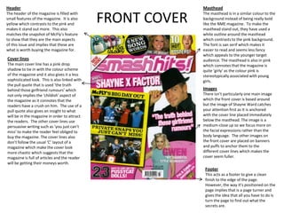
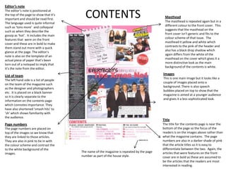
TASK 2
ANALYSIS OF A SECOND
  MUSIC MAGAZINE
FRONT COVER
Masthead
The masthead isn’t very bold but the
style of font is very distinctive to the                                                            Main image
magazine and is easily recognisable                                                                 The main image on this magazine is
as it also has an outline that contrasts                                                            smaller and much less dominant than on
with both the background and title.                                                                 the cover of NME. This changes the
                                                                                                    focus of the front cover from the image
                                                                                                    to the cover lines. The image is a long
                                                                                                    shot so we can see the body language of
                                                                                                    the band to show their closeness to one
 Other images
                                                                                                    another. The Mise-en scene of the
 The front cover uses a lot of second
                                                                                                    photo anchors to the genre of music and
 images to support the cover lines
                                                                                                    target audience as the background is
 which implies that the target
                                                                                                    pink which is a typical ‘girly’ stereotype.
 audience is quite young and prefers
                                                                                                    The clothes they are wearing also
 picture based magazines.
                                                                                                    connote the ‘pop’ stereotype and boy
                                                                                                    band.
 Cover lines
 The cover lines are a mix of
 contrasting colours. The main
 cover line is on a banner across the
 main image which implies that                                                                      Name Dropping
 what they’ve got to say is more                                                                    The magazine uses name dropping to
 important than their pictures. The                                                                 show who will be featured in the
 other cover lines are also in                                                                      magazine. As it’s in a footer it also gives
 contrasting boxes which makes the         Use of flash                                             the cover a fuller feel and a neat finish.
 page look busier and more ‘teen           The use of flashes to advertise features inside
 friendly’ for the younger target          makes it stand out. The ‘real-life special’ is in bold
 audience.                                 to show that this is meant to the focus of the puff.
Header                                                       Masthead
The header of the magazine is filled with
small features of the magazine. It is also
yellow which contrasts to the pink and
makes it stand out more. This also
                                               FRONT COVER   The masthead is in a similar colour to the
                                                             background instead of being really bold
                                                             like the NME magazine. To make the
                                                             masthead stand out, they have used a
matches the snapshot of McFly’s feature                      white outline around the masthead
to show that they are the main aspects                       which contrasts to the pink background.
of this issue and implies that these are                     The font is san serif which makes it
what is worth buying the magazine for.                       easier to read and seems less fancy
                                                             which appeals to the younger target
Cover lines                                                  audience. The masthead is also in pink
The main cover line has a pink drop                          which connotes that the magazine is
shadow to tie in with the colour scheme                      quite ‘girly’ as the colour pink is
of the magazine and it also gives it a less                  stereotypically associated with young
sophisticated look. This is also linked with                 girls.
the pull quote that is used ‘the truth
behind those girlfriend rumours’ which                       Images
not only implies the ‘childish’ aspect of                    There isn’t particularly one main image
the magazine as it connotes that the                         which the front cover is based around
readers have a crush on him. The use of a                    but the image of Shayne Ward catches
pull quote also gives an insight to what                     your attention first as It is anchored
will be in the magazine in order to attract                  with the cover line placed immediately
the readers. The other cover lines use                       below the masthead. The image is a
persuasive writing such as ‘you just can’t                   medium-close up so we focus more on
miss’ to make the reader feel obliged to                     the facial expressions rather than the
buy the magazine. The cover lines also                       body language. The other images on
don’t follow the usual ‘C’ layout of a                       the front cover are placed on banners
magazine which make the cover look                           and puffs to anchor them to the
more chaotic which suggests that the                         different cover lines which makes the
magazine is full of articles and the reader                  cover seem fuller.
will be getting their moneys worth.
                                                              Footer
                                                              This acts as a footer to give a clean
                                                              finish to the edge of the page.
                                                              However, the way it’s positioned on the
                                                              page implies that is a page turner and
                                                              gives the idea that all you have to do is
                                                              turn the page to find out what the
                                                              secrets are.
Editor’s note
The editor’s note is positioned at
the top of the page to show that it’s
important and should be read first.
The language used is quite informal
                                           CONTENTS                                          Masthead
                                                                                             The masthead is repeated again but in a
                                                                                             different colour to the front cover. This
such as ‘tons more’ and colloquial
                                                                                             suggests that the masthead on the
such as when they describe the
                                                                                             front cover isn’t generic and fits to the
gossip as ‘hot’. It includes the main
                                                                                             colour scheme of that issue. The
features that were on the front
                                                                                             masthead it yellow and white which
cover and these are in bold to make
                                                                                             contrasts to the pink of the header and
them stand out more with a quick
                                                                                             also has a black drop shadow which
glance at the page. The editor’s
                                                                                             again differs from the white of the
note is also on the template of an
                                                                                             masthead on the cover which gives it a
actual piece of paper that’s been
                                                                                             more distinctive look as the main
torn out of a notepad to imply that
                                                                                             background of the contents is white.
it’s the note from the editor.

List of team                                                                                Images
                                                                                            This is one main image but it looks like a
The left hand side is a list of people
                                                                                            couple of images placed onto a
on the team of the magazine such
                                                                                            background. There is also speech
as the designer and photographers
                                                                                            bubbles placed on top to show that the
etc. It is placed on a black banner
                                                                                            magazine is aimed at a younger audience
so it is clearly separate to the
                                                                                            and gives it a less sophisticated look.
information on the contents page
which connotes importance. They
have also shortened ‘smash hits’ to
‘sh’ which shows familiarity with
the audience.
                                                                                            Title
Page numbers                                                                                The title for the contents page is near the
The page numbers are placed on                                                              bottom of the page so the focus of the
top of the images so we know that                                                           readers is on the images above rather than
they are linked to those articles.                                                          what the magazine contains. The page
They are also in pink to tie in with                                                        numbers are also in a darker shade of pink
the colour scheme and contrast the                                                          that the article titles so it is easy to
to the white background of the                                                              differentiate between the two. Again, the
images.                                  The name of the magazine is repeated by the page   articles that were features on the front
                                         number as part of the house style.                 cover are in bold as these are assumed to
                                                                                            be the articles that the readers are most
                                                                                            interested in reading.
DOUBLE PAGE SPREAD
Pattern
They have the pattern of a tyre print
to anchor to the theme of the article.
It also gives a neat finish to the
corner of the page.


 Copy
 The font is easy on the eye so it’s                Title
 easier to understand and read. The                 The title of the article isn’t in a block
 language is not very sophisticated in              font, it’s transparent with a white outline
 order for the younger target                       around it to make it stand out from the
 audience to be able to understand it               page. It’s in white to contrast with the
 such as using shorter sentences with               dark colours of the image. The term ‘boy
 less technical terms. The text also                racers’ is used to connect with the young
 only takes up a small section of the               ‘girly’ target audience. The sub-heading
 page which leaves the article mainly               underneath is also quite basic because
 image based which again makes it                   you can see what the article is about
 easier on the eye and more                         from the amount of photos in the article.
 appropriate for the younger
 audience.


 In bold there is snippets of
 information about the band at the
 bottom which makes the article into
 a small news article of the band as
 well as informing the readers about
 what they have done.
DOUBLE PAGE SPREAD
                                                                Caption
                                                                The caption/masthead that is used on the
                                                                contents page is again repeated on the
                                                                article page to keep the title of the
                                                                magazine running throughout the
                                                                magazine. The pink banner at the top of
                                                                the page is also the same as the contents
                                                                page so the colour are still contrasting but
                                                                fitting the generic colour scheme.

                                                           Images
                                                           The images that are used are action shots
                                                           rather than posed shots like the main image.
                                                           This is to support what is being said in the
                                                           article. The photos are also spaced out with a
                                                           white gap between them so it is easy to
                                                           distinguish the different photos. On each
                                                           image, there are quotes referring to who is the
                                                           image which again is suitable for the younger
                                                           audience because it gives them less to read in
                                                           one long article.

Advertisement/ Competition
This is positioned in the bottom right corner so
it’s the last thing you notice before turning the      Use of puff
page so it’s hard to miss it. They have linked the     The puff is pink in colour which matches the
competition to the theme of the article and the        banner at the top of the page in order to give
people featured in the article as a way of             a clean finish to the page. It also attracts the
persuading people to take part. It also blends         attention to that particular photo which is also
well with the layout of the page as it looks as        larger than the other second images which
though it is in it’s own image box as well following   connotes it is more important than the others.
the colour scheme of the page unlike NME when
the advertisement is in a contrasting colour.

Task 2

  • 1.
    TASK 2 ANALYSIS OFA SECOND MUSIC MAGAZINE
  • 2.
    FRONT COVER Masthead The mastheadisn’t very bold but the style of font is very distinctive to the Main image magazine and is easily recognisable The main image on this magazine is as it also has an outline that contrasts smaller and much less dominant than on with both the background and title. the cover of NME. This changes the focus of the front cover from the image to the cover lines. The image is a long shot so we can see the body language of the band to show their closeness to one Other images another. The Mise-en scene of the The front cover uses a lot of second photo anchors to the genre of music and images to support the cover lines target audience as the background is which implies that the target pink which is a typical ‘girly’ stereotype. audience is quite young and prefers The clothes they are wearing also picture based magazines. connote the ‘pop’ stereotype and boy band. Cover lines The cover lines are a mix of contrasting colours. The main cover line is on a banner across the main image which implies that Name Dropping what they’ve got to say is more The magazine uses name dropping to important than their pictures. The show who will be featured in the other cover lines are also in magazine. As it’s in a footer it also gives contrasting boxes which makes the Use of flash the cover a fuller feel and a neat finish. page look busier and more ‘teen The use of flashes to advertise features inside friendly’ for the younger target makes it stand out. The ‘real-life special’ is in bold audience. to show that this is meant to the focus of the puff.
  • 3.
    Header Masthead The header of the magazine is filled with small features of the magazine. It is also yellow which contrasts to the pink and makes it stand out more. This also FRONT COVER The masthead is in a similar colour to the background instead of being really bold like the NME magazine. To make the masthead stand out, they have used a matches the snapshot of McFly’s feature white outline around the masthead to show that they are the main aspects which contrasts to the pink background. of this issue and implies that these are The font is san serif which makes it what is worth buying the magazine for. easier to read and seems less fancy which appeals to the younger target Cover lines audience. The masthead is also in pink The main cover line has a pink drop which connotes that the magazine is shadow to tie in with the colour scheme quite ‘girly’ as the colour pink is of the magazine and it also gives it a less stereotypically associated with young sophisticated look. This is also linked with girls. the pull quote that is used ‘the truth behind those girlfriend rumours’ which Images not only implies the ‘childish’ aspect of There isn’t particularly one main image the magazine as it connotes that the which the front cover is based around readers have a crush on him. The use of a but the image of Shayne Ward catches pull quote also gives an insight to what your attention first as It is anchored will be in the magazine in order to attract with the cover line placed immediately the readers. The other cover lines use below the masthead. The image is a persuasive writing such as ‘you just can’t medium-close up so we focus more on miss’ to make the reader feel obliged to the facial expressions rather than the buy the magazine. The cover lines also body language. The other images on don’t follow the usual ‘C’ layout of a the front cover are placed on banners magazine which make the cover look and puffs to anchor them to the more chaotic which suggests that the different cover lines which makes the magazine is full of articles and the reader cover seem fuller. will be getting their moneys worth. Footer This acts as a footer to give a clean finish to the edge of the page. However, the way it’s positioned on the page implies that is a page turner and gives the idea that all you have to do is turn the page to find out what the secrets are.
  • 4.
    Editor’s note The editor’snote is positioned at the top of the page to show that it’s important and should be read first. The language used is quite informal CONTENTS Masthead The masthead is repeated again but in a different colour to the front cover. This such as ‘tons more’ and colloquial suggests that the masthead on the such as when they describe the front cover isn’t generic and fits to the gossip as ‘hot’. It includes the main colour scheme of that issue. The features that were on the front masthead it yellow and white which cover and these are in bold to make contrasts to the pink of the header and them stand out more with a quick also has a black drop shadow which glance at the page. The editor’s again differs from the white of the note is also on the template of an masthead on the cover which gives it a actual piece of paper that’s been more distinctive look as the main torn out of a notepad to imply that background of the contents is white. it’s the note from the editor. List of team Images This is one main image but it looks like a The left hand side is a list of people couple of images placed onto a on the team of the magazine such background. There is also speech as the designer and photographers bubbles placed on top to show that the etc. It is placed on a black banner magazine is aimed at a younger audience so it is clearly separate to the and gives it a less sophisticated look. information on the contents page which connotes importance. They have also shortened ‘smash hits’ to ‘sh’ which shows familiarity with the audience. Title Page numbers The title for the contents page is near the The page numbers are placed on bottom of the page so the focus of the top of the images so we know that readers is on the images above rather than they are linked to those articles. what the magazine contains. The page They are also in pink to tie in with numbers are also in a darker shade of pink the colour scheme and contrast the that the article titles so it is easy to to the white background of the differentiate between the two. Again, the images. The name of the magazine is repeated by the page articles that were features on the front number as part of the house style. cover are in bold as these are assumed to be the articles that the readers are most interested in reading.
  • 5.
    DOUBLE PAGE SPREAD Pattern Theyhave the pattern of a tyre print to anchor to the theme of the article. It also gives a neat finish to the corner of the page. Copy The font is easy on the eye so it’s Title easier to understand and read. The The title of the article isn’t in a block language is not very sophisticated in font, it’s transparent with a white outline order for the younger target around it to make it stand out from the audience to be able to understand it page. It’s in white to contrast with the such as using shorter sentences with dark colours of the image. The term ‘boy less technical terms. The text also racers’ is used to connect with the young only takes up a small section of the ‘girly’ target audience. The sub-heading page which leaves the article mainly underneath is also quite basic because image based which again makes it you can see what the article is about easier on the eye and more from the amount of photos in the article. appropriate for the younger audience. In bold there is snippets of information about the band at the bottom which makes the article into a small news article of the band as well as informing the readers about what they have done.
  • 6.
    DOUBLE PAGE SPREAD Caption The caption/masthead that is used on the contents page is again repeated on the article page to keep the title of the magazine running throughout the magazine. The pink banner at the top of the page is also the same as the contents page so the colour are still contrasting but fitting the generic colour scheme. Images The images that are used are action shots rather than posed shots like the main image. This is to support what is being said in the article. The photos are also spaced out with a white gap between them so it is easy to distinguish the different photos. On each image, there are quotes referring to who is the image which again is suitable for the younger audience because it gives them less to read in one long article. Advertisement/ Competition This is positioned in the bottom right corner so it’s the last thing you notice before turning the Use of puff page so it’s hard to miss it. They have linked the The puff is pink in colour which matches the competition to the theme of the article and the banner at the top of the page in order to give people featured in the article as a way of a clean finish to the page. It also attracts the persuading people to take part. It also blends attention to that particular photo which is also well with the layout of the page as it looks as larger than the other second images which though it is in it’s own image box as well following connotes it is more important than the others. the colour scheme of the page unlike NME when the advertisement is in a contrasting colour.