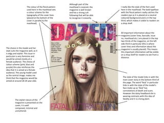
Although part of the
                       The colour of the floral pattern   masthead is covered, the      I really like the style of the font used
                       used here in the masthead sets     magazine is well known        here in the masthead. The bold typeface
                       a colour scheme for the            and has a strong cult         with the floral pattern really catches the
                       typography of the cover lines      following that will be able   readers eye as it is placed on a neutral
                       (placed at the bottom of the       to recognise it instantly.    coloured background and is in the top
                       cover in parallel to the                                         third, which makes it visble to readers on
                       masthead)                                                        a shop shelf.


                                                                                        All important information about the
                                                                                        magazine (cover lines, barcode, issue
                                                                                        no, masthead etc.) are placed in the top
                                                                                        two thirds of the magazine, on the left
                                                                                        side third in particular (this is where
                                                                                        cover lines and information about the
The choice in the model and her
                                                                                        magazine is usually placed). This means
style suits the magazine well, as it
                                                                                        this important information will be visible
is edgy and stylish. This issue in
                                                                                        on a shop shelf for readers to see from a
particular is very feminine and
                                                                                        distance.
would be aimed mostly at a
female audience. The choice of
colour scheme (pink, blue and
purple) this also reinforces the
idea that it is aimed at a female
audience. The young model used
as the central image, makes me
                                                                                          The style of the model links in with the
think that the magazine would be
                                                                                          main cover story in the bottom third of
aimed at around 18-24 year olds.
                                                                                          the page. The word ‘fatal’ in particular
                                                                                          links in with the style of the model’s
                                                                                          face make-up as ‘fatal’ has
                                                                                          connotations of death and scare.
                                                                                          However the daisy headband she is
                                                                                          wearing contrasts with this idea of
          The stylish nature of the                                                       fatality and it is a living plant.
          magazine is presented on the
          cover, it is well
          composed, minimal and
          uncluttered.
The masthead being tipped onto it’s side is
                           supposed to represent a winking face. Most    The barcode and price are not
                           of the covers will feature a winking cover    put on the cover of the
                           model which is supposed to represent the      magazine, this is to avoid it
                           flirtatious, fun and youthful nature of the   obscuring the main cover image
                           magazine.                                     and simplicity of the magazine.

                                                                                                 I love the central image used on
                                                                                                 magazine. It is very eye catching
       Although the masthead is placed
                                                                                                 and hard to take your eyes off. The
       horizontally, the readers that
                                                                                                 choice of model used and the
       buy this magazine are familiar
                                                                                                 spider on her face is very unusual
       with layout and style of the
                                                                                                 , and the way that the model is
       magazine so would be able to
       pick it out easily from a shelf.
                                                                                                 seen to be looking directly at the
                                                                                                 reader creates a direct mode of
       But this magazine in particular is
                                                                                                 address that really grabs the
       usually bought or pre-paid for by
                                                                                                 reader’s attention.
       subscribers, which explains the
       minimalistic, simple and
       uncluttered layout that the
       magazine always tend to use.


     Cover lines; ‘Thoughtful’ is used as                                                         The choice of model (Cara
     the only cover line for this                                                                 Delevingne) used on the cover
     magazine, it is vague and leaves the                                                         for this magazine is usually
     reader wanting to know more about                                                            always a certain type of person.
     the cover story (leading them to buy                                                         They tend to be youthful, flirty
     it). I-D magazine uses this technique                                                        and quirky to represent the
     on almost all of their covers to                                                             magazine’s content and origin.
     entice to reader into buying the                                                             The cover models used for I-D
     issue to find out more about the                                                             magazine are almost always
     cover model and their                                                                        female (with a few exceptions)
     interview/story.                                                                             although it is a magazine aimed
                                                                                                  at both male and females, it is
A clear colour scheme is shown on this cover.                                                     generally more female
The ‘I-D’ font colour matches the colour of                                                       orientated.
the models hair, and her hair matches the
colour of the background she is laid on. The
coloured eyeliner used on her eyes highlights
the direct mode of address made with the
reader and creates a central point for the
reader to look at along with the unusual
placement of a tarantula.
As the magazine has a well known cult of buyers, it
The masthead used on NME magazines are         isnt a significant problem that the cover model’s                      This magazine cover features
usually of the colour red (as shown on this    head slightly covers the masthead as regular                           much more cover content
issue). The colour scheme is also generally    buyers will still be able to recognise the magazine                    that the other two I have
red, white and black, however on this cover    due to its colour scheme and bold typography.                          analysed, it is regularly found
blue is added to the cover lines, to catch                                                                            on most shops shelves and is
the reader’s eye as it features the main                                                                              well known for its busy cover
cover story content.                                                                                                  full of different features


Under the masthead is                                                                                                 The use of colourful
more information about the                                                                                            graphology on this cover
magazine, including a puff                                                                                            works well against the
‘new musical express’ the                                                                                             neutral background of a brick
issue date and price of the                                                                                           wall. The cover model is
magazine. This information                                                                                            dressed in accordance with
is important for this                                                                                                 the colour scheme and it all
magazine in particular as it                                                                                          fits in well together.
is sold nationwide on shop
shelves.                                                                                                              Although I am not personally a
                                                                                                                      huge fan of busy cover pages I
    This cover page features a large                                                                                  think the graphology of this one
    amount of writing about the                                                                                       in particular has the usual
    content of the magazine (plug)                                                                                    conventions of a music
    this is in different colours to the                                                                               magazine, and is produced
    usual layout of the magazine to                                                                                   eloquently with the
    make it stand out to readers as                                                                                   reader/target audience in mind.
    part of the main cover story.
                                                                                                                       This magazine is a very well known
  The main cover lines on this cover are                                                                               ‘indie’ magazine genre, this has an
  placed at the bottom of the page                                                                                     affect on the choice of cover
  horizontal to the rest of the writing, the                                                                           models used, used here is front
  typography of ‘The record that changed                                                                               man Alex Turner from the
  my life’ is significantly bigger than the                                                                            successful indie rock band Arctic
  rest of the writing on the cover and in a                                                                            Monkeys
  different font style. It also partly comes
  of the page which gives a 3D effect                                                                                            The barcode is placed here
  therefore making it stand out to the                                                                                           at the bottom of the page
  reader even more so                                                                                                            along with the issue
                                                       The use of a rhetorical question at the bottom of this cover              number. It is discreet and
                                                       works well in persuading the reader as it will be the last                non invasive to the busy
                                                       thing they read (as you read from the top to the bottom of                layout of the cover.
                                                       the page). This rhetorical device will leave the reader
                                                       wanting to know more and thus persuade them into
                                                       buying the magazine.

Magazine Analysis

  • 1.
    Although part ofthe The colour of the floral pattern masthead is covered, the I really like the style of the font used used here in the masthead sets magazine is well known here in the masthead. The bold typeface a colour scheme for the and has a strong cult with the floral pattern really catches the typography of the cover lines following that will be able readers eye as it is placed on a neutral (placed at the bottom of the to recognise it instantly. coloured background and is in the top cover in parallel to the third, which makes it visble to readers on masthead) a shop shelf. All important information about the magazine (cover lines, barcode, issue no, masthead etc.) are placed in the top two thirds of the magazine, on the left side third in particular (this is where cover lines and information about the The choice in the model and her magazine is usually placed). This means style suits the magazine well, as it this important information will be visible is edgy and stylish. This issue in on a shop shelf for readers to see from a particular is very feminine and distance. would be aimed mostly at a female audience. The choice of colour scheme (pink, blue and purple) this also reinforces the idea that it is aimed at a female audience. The young model used as the central image, makes me The style of the model links in with the think that the magazine would be main cover story in the bottom third of aimed at around 18-24 year olds. the page. The word ‘fatal’ in particular links in with the style of the model’s face make-up as ‘fatal’ has connotations of death and scare. However the daisy headband she is wearing contrasts with this idea of The stylish nature of the fatality and it is a living plant. magazine is presented on the cover, it is well composed, minimal and uncluttered.
  • 2.
    The masthead beingtipped onto it’s side is supposed to represent a winking face. Most The barcode and price are not of the covers will feature a winking cover put on the cover of the model which is supposed to represent the magazine, this is to avoid it flirtatious, fun and youthful nature of the obscuring the main cover image magazine. and simplicity of the magazine. I love the central image used on magazine. It is very eye catching Although the masthead is placed and hard to take your eyes off. The horizontally, the readers that choice of model used and the buy this magazine are familiar spider on her face is very unusual with layout and style of the , and the way that the model is magazine so would be able to pick it out easily from a shelf. seen to be looking directly at the reader creates a direct mode of But this magazine in particular is address that really grabs the usually bought or pre-paid for by reader’s attention. subscribers, which explains the minimalistic, simple and uncluttered layout that the magazine always tend to use. Cover lines; ‘Thoughtful’ is used as The choice of model (Cara the only cover line for this Delevingne) used on the cover magazine, it is vague and leaves the for this magazine is usually reader wanting to know more about always a certain type of person. the cover story (leading them to buy They tend to be youthful, flirty it). I-D magazine uses this technique and quirky to represent the on almost all of their covers to magazine’s content and origin. entice to reader into buying the The cover models used for I-D issue to find out more about the magazine are almost always cover model and their female (with a few exceptions) interview/story. although it is a magazine aimed at both male and females, it is A clear colour scheme is shown on this cover. generally more female The ‘I-D’ font colour matches the colour of orientated. the models hair, and her hair matches the colour of the background she is laid on. The coloured eyeliner used on her eyes highlights the direct mode of address made with the reader and creates a central point for the reader to look at along with the unusual placement of a tarantula.
  • 3.
    As the magazinehas a well known cult of buyers, it The masthead used on NME magazines are isnt a significant problem that the cover model’s This magazine cover features usually of the colour red (as shown on this head slightly covers the masthead as regular much more cover content issue). The colour scheme is also generally buyers will still be able to recognise the magazine that the other two I have red, white and black, however on this cover due to its colour scheme and bold typography. analysed, it is regularly found blue is added to the cover lines, to catch on most shops shelves and is the reader’s eye as it features the main well known for its busy cover cover story content. full of different features Under the masthead is The use of colourful more information about the graphology on this cover magazine, including a puff works well against the ‘new musical express’ the neutral background of a brick issue date and price of the wall. The cover model is magazine. This information dressed in accordance with is important for this the colour scheme and it all magazine in particular as it fits in well together. is sold nationwide on shop shelves. Although I am not personally a huge fan of busy cover pages I This cover page features a large think the graphology of this one amount of writing about the in particular has the usual content of the magazine (plug) conventions of a music this is in different colours to the magazine, and is produced usual layout of the magazine to eloquently with the make it stand out to readers as reader/target audience in mind. part of the main cover story. This magazine is a very well known The main cover lines on this cover are ‘indie’ magazine genre, this has an placed at the bottom of the page affect on the choice of cover horizontal to the rest of the writing, the models used, used here is front typography of ‘The record that changed man Alex Turner from the my life’ is significantly bigger than the successful indie rock band Arctic rest of the writing on the cover and in a Monkeys different font style. It also partly comes of the page which gives a 3D effect The barcode is placed here therefore making it stand out to the at the bottom of the page reader even more so along with the issue The use of a rhetorical question at the bottom of this cover number. It is discreet and works well in persuading the reader as it will be the last non invasive to the busy thing they read (as you read from the top to the bottom of layout of the cover. the page). This rhetorical device will leave the reader wanting to know more and thus persuade them into buying the magazine.