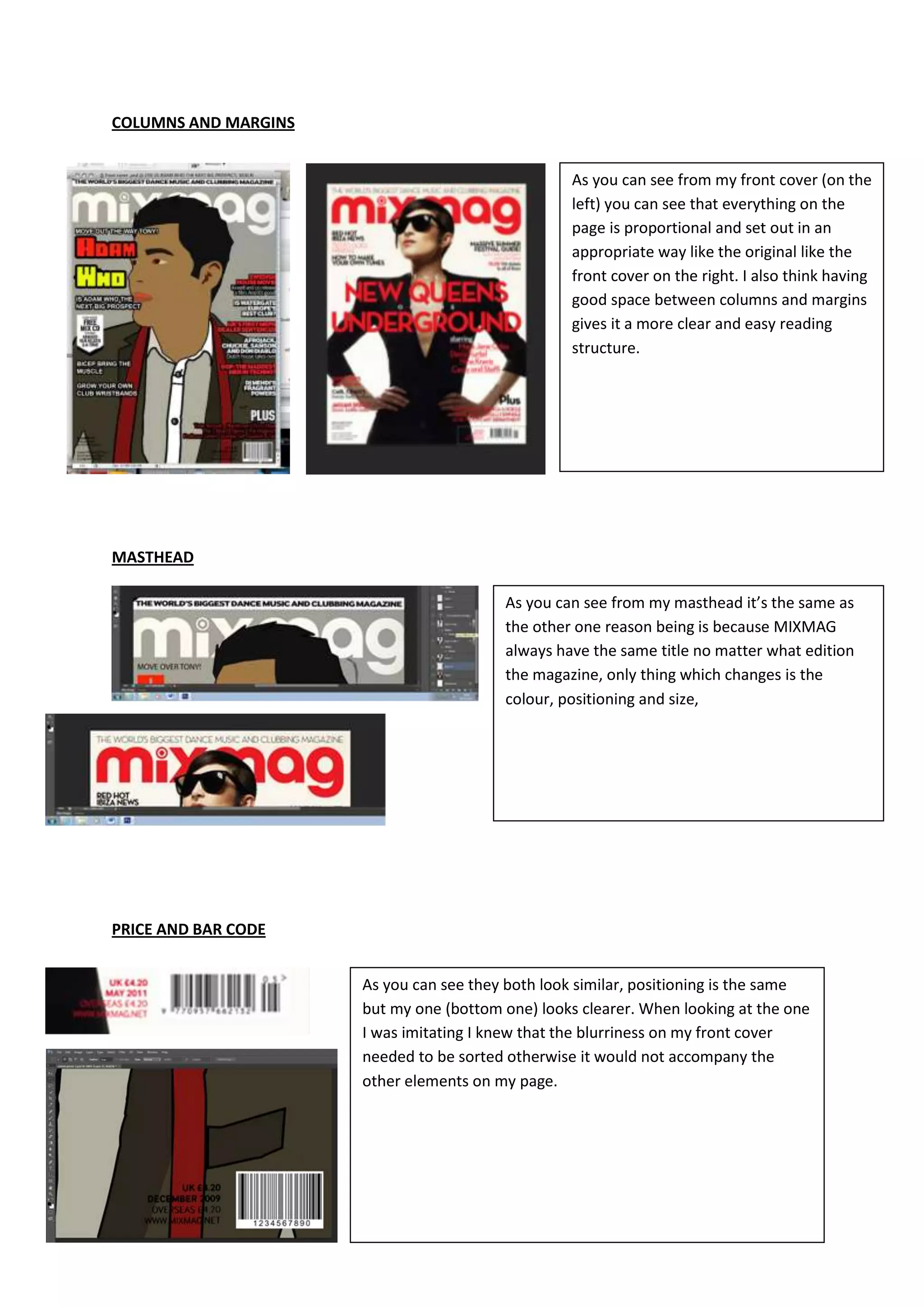
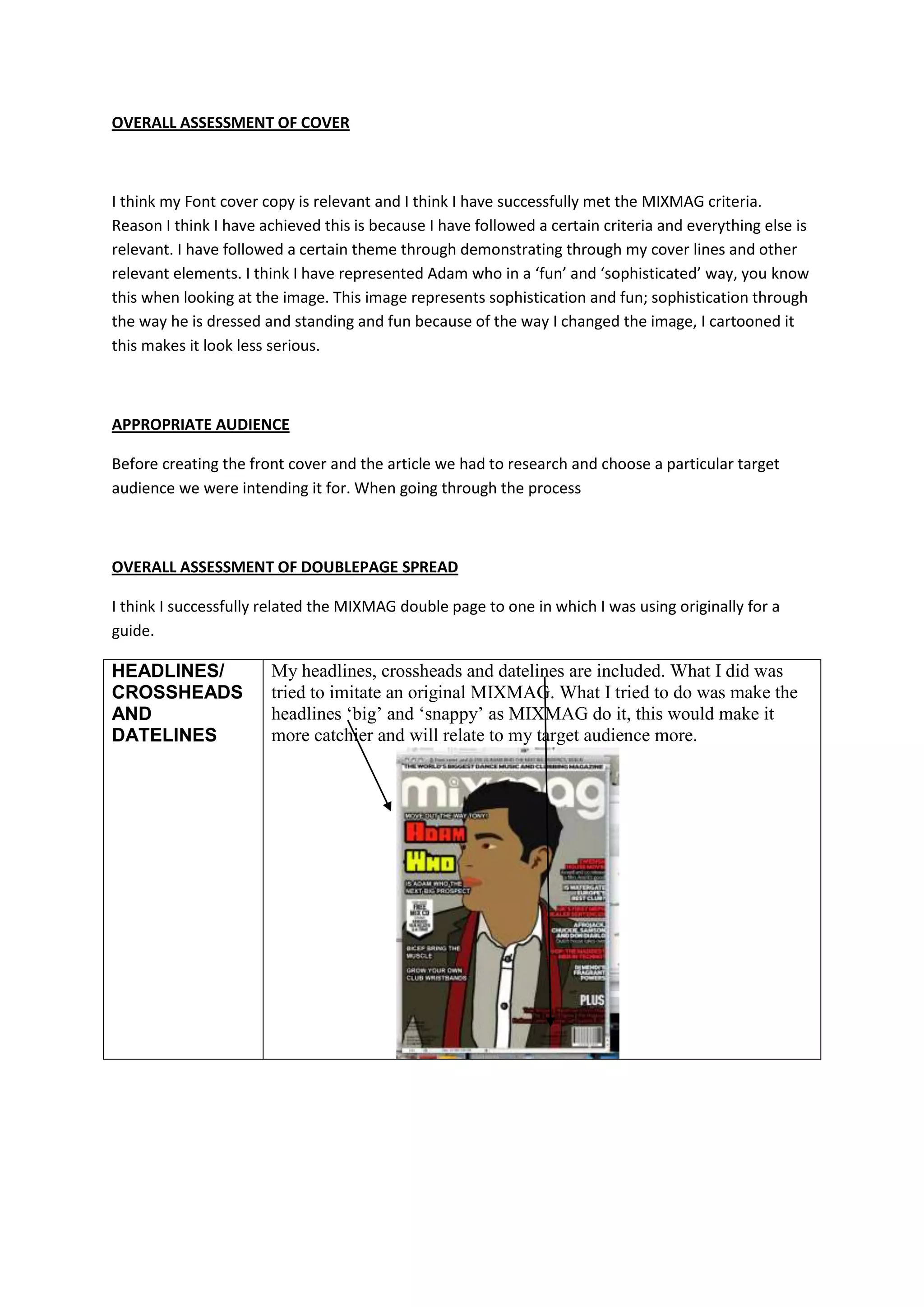
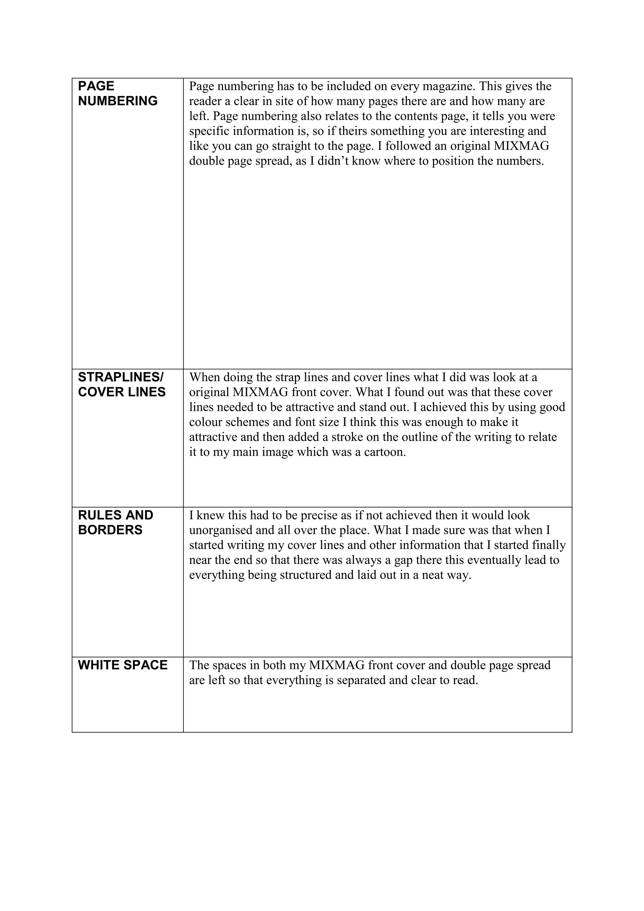
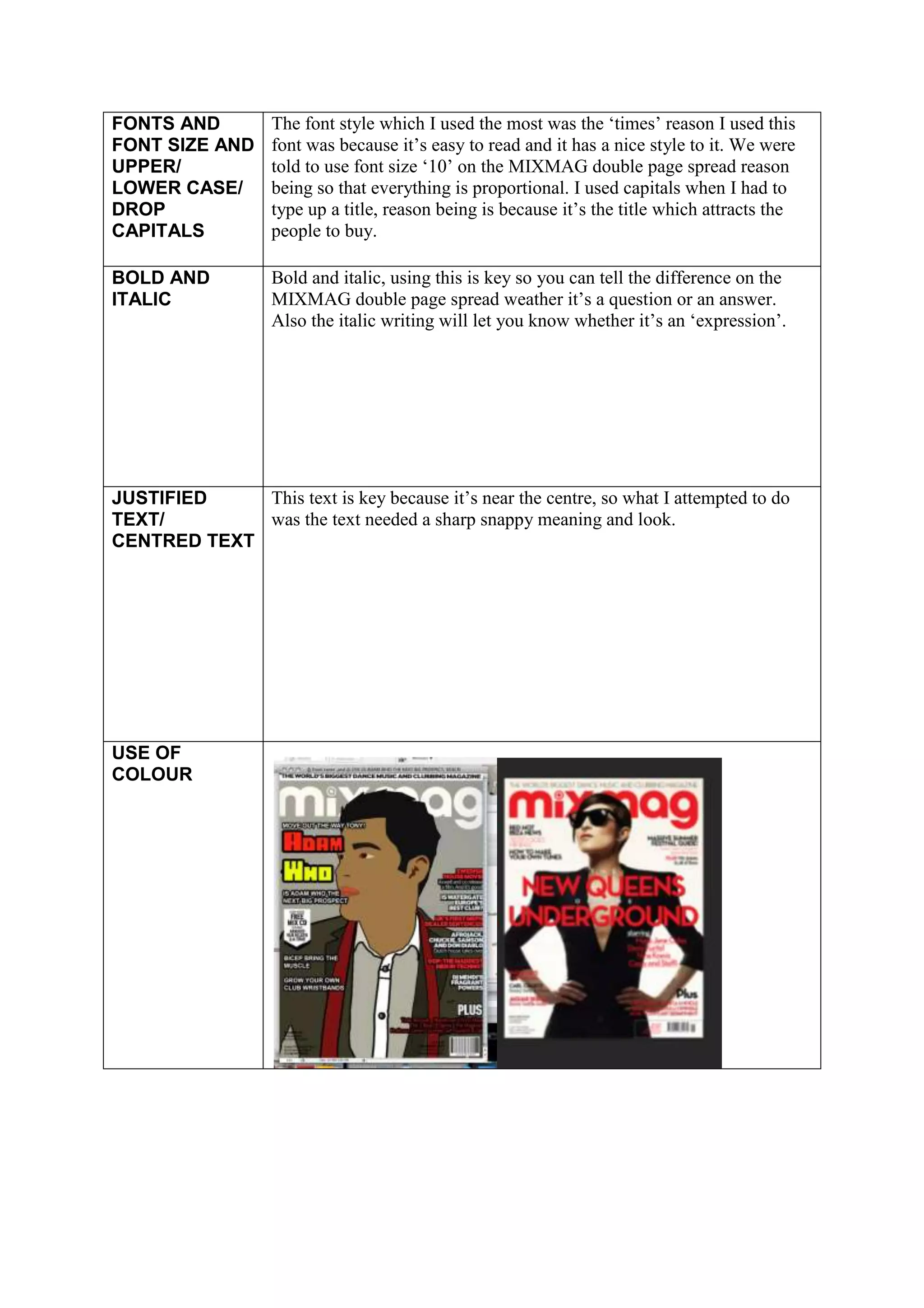
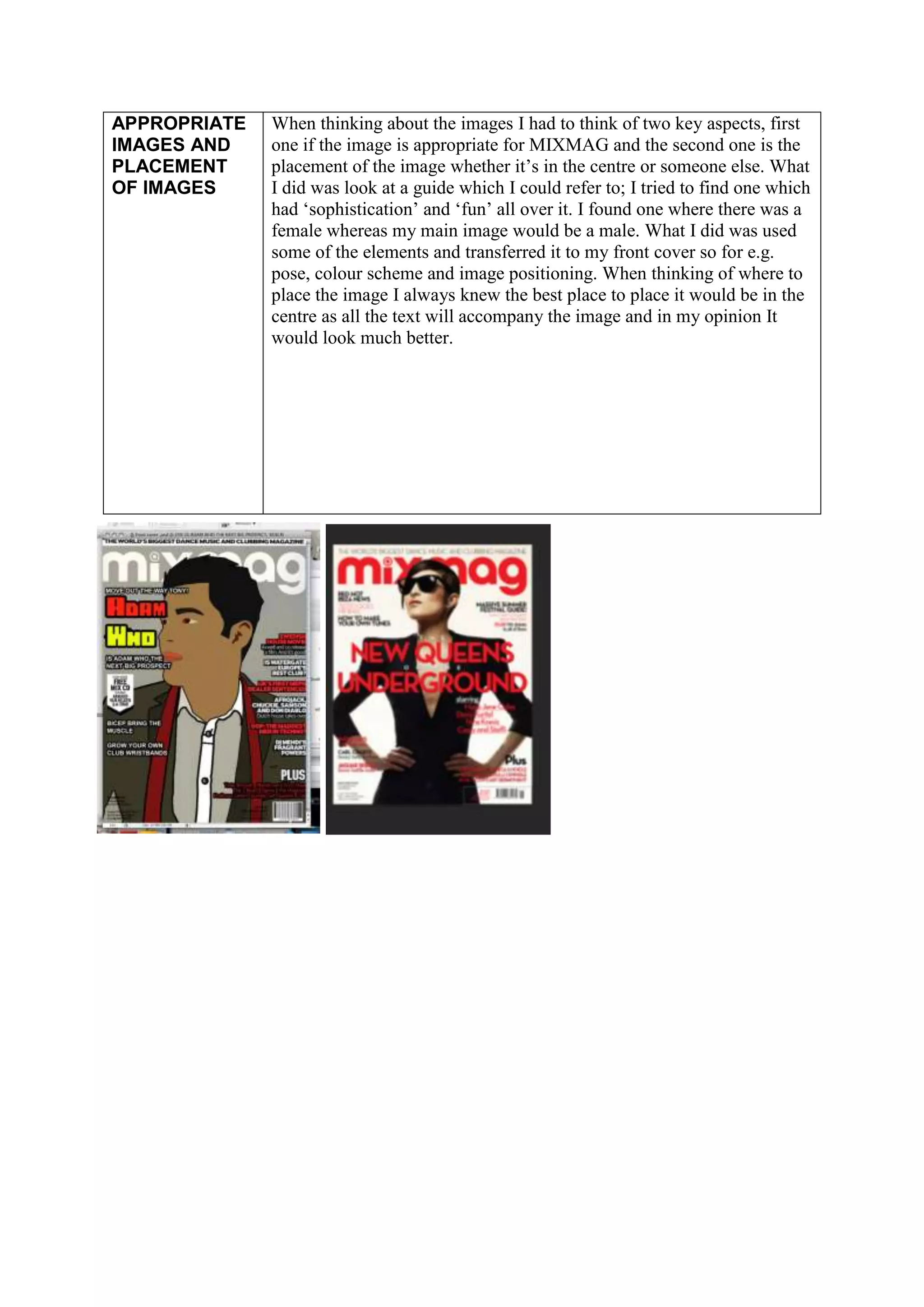
COLUMNS AND MARGINS


                                                   As you can see from my front cover (on the
                                                   left) you can see that everything on the
                                                   page is proportional and set out in an
                                                   appropriate way like the original like the
                                                   front cover on the right. I also think having
                                                   good space between columns and margins
                                                   gives it a more clear and easy reading
                                                   structure.


MASTHEAD

                                         As you can see from my masthead it’s the same as
                                         the other one reason being is because MIXMAG
                                         always have the same title no matter what edition
                                         the magazine, only thing which changes is the
                                         colour, positioning and size,


PRICE AND BAR CODE


                      As you can see they both look similar, positioning is the same
                      but my one (bottom one) looks clearer. When looking at the one
                      I was imitating I knew that the blurriness on my front cover
                      needed to be sorted otherwise it would not accompany the
                      other elements on my page.
OVERALL ASSESSMENT OF COVER


I think my Font cover copy is relevant and I think I have successfully met the MIXMAG criteria.
Reason I think I have achieved this is because I have followed a certain criteria and everything else is
relevant. I have followed a certain theme through demonstrating through my cover lines and other
relevant elements. I think I have represented Adam who in a ‘fun’ and ‘sophisticated’ way, you know
this when looking at the image. This image represents sophistication and fun; sophistication through
the way he is dressed and standing and fun because of the way I changed the image, I cartooned it
this makes it look less serious.


APPROPRIATE AUDIENCE

Before creating the front cover and the article we had to research and choose a particular target
audience we were intending it for. When going through the process


OVERALL ASSESSMENT OF DOUBLEPAGE SPREAD

I think I successfully related the MIXMAG double page to one in which I was using originally for a
guide.

HEADLINES/             My headlines, crossheads and datelines are included. What I did was
CROSSHEADS             tried to imitate an original MIXMAG. What I tried to do was make the
AND                    headlines ‘big’ and ‘snappy’ as MIXMAG do it, this would make it
DATELINES              more catchier and will relate to my target audience more.
PAGE          Page numbering has to be included on every magazine. This gives the
NUMBERING     reader a clear in site of how many pages there are and how many are
              left. Page numbering also relates to the contents page, it tells you were
              specific information is, so if theirs something you are interesting and
              like you can go straight to the page. I followed an original MIXMAG
              double page spread, as I didn’t know where to position the numbers.


STRAPLINES/   When doing the strap lines and cover lines what I did was look at a
COVER LINES   original MIXMAG front cover. What I found out was that these cover
              lines needed to be attractive and stand out. I achieved this by using good
              colour schemes and font size I think this was enough to make it
              attractive and then added a stroke on the outline of the writing to relate
              it to my main image which was a cartoon.


RULES AND     I knew this had to be precise as if not achieved then it would look
BORDERS       unorganised and all over the place. What I made sure was that when I
              started writing my cover lines and other information that I started finally
              near the end so that there was always a gap there this eventually lead to
              everything being structured and laid out in a neat way.


WHITE SPACE   The spaces in both my MIXMAG front cover and double page spread
              are left so that everything is separated and clear to read.
FONTS AND           The font style which I used the most was the ‘times’ reason I used this
FONT SIZE AND       font was because it’s easy to read and it has a nice style to it. We were
UPPER/              told to use font size ‘10’ on the MIXMAG double page spread reason
LOWER CASE/         being so that everything is proportional. I used capitals when I had to
DROP                type up a title, reason being is because it’s the title which attracts the
CAPITALS            people to buy.

BOLD AND            Bold and italic, using this is key so you can tell the difference on the
ITALIC              MIXMAG double page spread weather it’s a question or an answer.
                    Also the italic writing will let you know whether it’s an ‘expression’.


JUSTIFIED    This text is key because it’s near the centre, so what I attempted to do
TEXT/        was the text needed a sharp snappy meaning and look.
CENTRED TEXT


USE OF
COLOUR
APPROPRIATE   When thinking about the images I had to think of two key aspects, first
IMAGES AND    one if the image is appropriate for MIXMAG and the second one is the
PLACEMENT     placement of the image whether it’s in the centre or someone else. What
OF IMAGES     I did was look at a guide which I could refer to; I tried to find one which
              had ‘sophistication’ and ‘fun’ all over it. I found one where there was a
              female whereas my main image would be a male. What I did was used
              some of the elements and transferred it to my front cover so for e.g.
              pose, colour scheme and image positioning. When thinking of where to
              place the image I always knew the best place to place it would be in the
              centre as all the text will accompany the image and in my opinion It
              would look much better.

Unit 51 lo4 assignment 2 started 6th november

  • 1.
    COLUMNS AND MARGINS As you can see from my front cover (on the left) you can see that everything on the page is proportional and set out in an appropriate way like the original like the front cover on the right. I also think having good space between columns and margins gives it a more clear and easy reading structure. MASTHEAD As you can see from my masthead it’s the same as the other one reason being is because MIXMAG always have the same title no matter what edition the magazine, only thing which changes is the colour, positioning and size, PRICE AND BAR CODE As you can see they both look similar, positioning is the same but my one (bottom one) looks clearer. When looking at the one I was imitating I knew that the blurriness on my front cover needed to be sorted otherwise it would not accompany the other elements on my page.
  • 2.
    OVERALL ASSESSMENT OFCOVER I think my Font cover copy is relevant and I think I have successfully met the MIXMAG criteria. Reason I think I have achieved this is because I have followed a certain criteria and everything else is relevant. I have followed a certain theme through demonstrating through my cover lines and other relevant elements. I think I have represented Adam who in a ‘fun’ and ‘sophisticated’ way, you know this when looking at the image. This image represents sophistication and fun; sophistication through the way he is dressed and standing and fun because of the way I changed the image, I cartooned it this makes it look less serious. APPROPRIATE AUDIENCE Before creating the front cover and the article we had to research and choose a particular target audience we were intending it for. When going through the process OVERALL ASSESSMENT OF DOUBLEPAGE SPREAD I think I successfully related the MIXMAG double page to one in which I was using originally for a guide. HEADLINES/ My headlines, crossheads and datelines are included. What I did was CROSSHEADS tried to imitate an original MIXMAG. What I tried to do was make the AND headlines ‘big’ and ‘snappy’ as MIXMAG do it, this would make it DATELINES more catchier and will relate to my target audience more.
  • 3.
    PAGE Page numbering has to be included on every magazine. This gives the NUMBERING reader a clear in site of how many pages there are and how many are left. Page numbering also relates to the contents page, it tells you were specific information is, so if theirs something you are interesting and like you can go straight to the page. I followed an original MIXMAG double page spread, as I didn’t know where to position the numbers. STRAPLINES/ When doing the strap lines and cover lines what I did was look at a COVER LINES original MIXMAG front cover. What I found out was that these cover lines needed to be attractive and stand out. I achieved this by using good colour schemes and font size I think this was enough to make it attractive and then added a stroke on the outline of the writing to relate it to my main image which was a cartoon. RULES AND I knew this had to be precise as if not achieved then it would look BORDERS unorganised and all over the place. What I made sure was that when I started writing my cover lines and other information that I started finally near the end so that there was always a gap there this eventually lead to everything being structured and laid out in a neat way. WHITE SPACE The spaces in both my MIXMAG front cover and double page spread are left so that everything is separated and clear to read.
  • 4.
    FONTS AND The font style which I used the most was the ‘times’ reason I used this FONT SIZE AND font was because it’s easy to read and it has a nice style to it. We were UPPER/ told to use font size ‘10’ on the MIXMAG double page spread reason LOWER CASE/ being so that everything is proportional. I used capitals when I had to DROP type up a title, reason being is because it’s the title which attracts the CAPITALS people to buy. BOLD AND Bold and italic, using this is key so you can tell the difference on the ITALIC MIXMAG double page spread weather it’s a question or an answer. Also the italic writing will let you know whether it’s an ‘expression’. JUSTIFIED This text is key because it’s near the centre, so what I attempted to do TEXT/ was the text needed a sharp snappy meaning and look. CENTRED TEXT USE OF COLOUR
  • 5.
    APPROPRIATE When thinking about the images I had to think of two key aspects, first IMAGES AND one if the image is appropriate for MIXMAG and the second one is the PLACEMENT placement of the image whether it’s in the centre or someone else. What OF IMAGES I did was look at a guide which I could refer to; I tried to find one which had ‘sophistication’ and ‘fun’ all over it. I found one where there was a female whereas my main image would be a male. What I did was used some of the elements and transferred it to my front cover so for e.g. pose, colour scheme and image positioning. When thinking of where to place the image I always knew the best place to place it would be in the centre as all the text will accompany the image and in my opinion It would look much better.