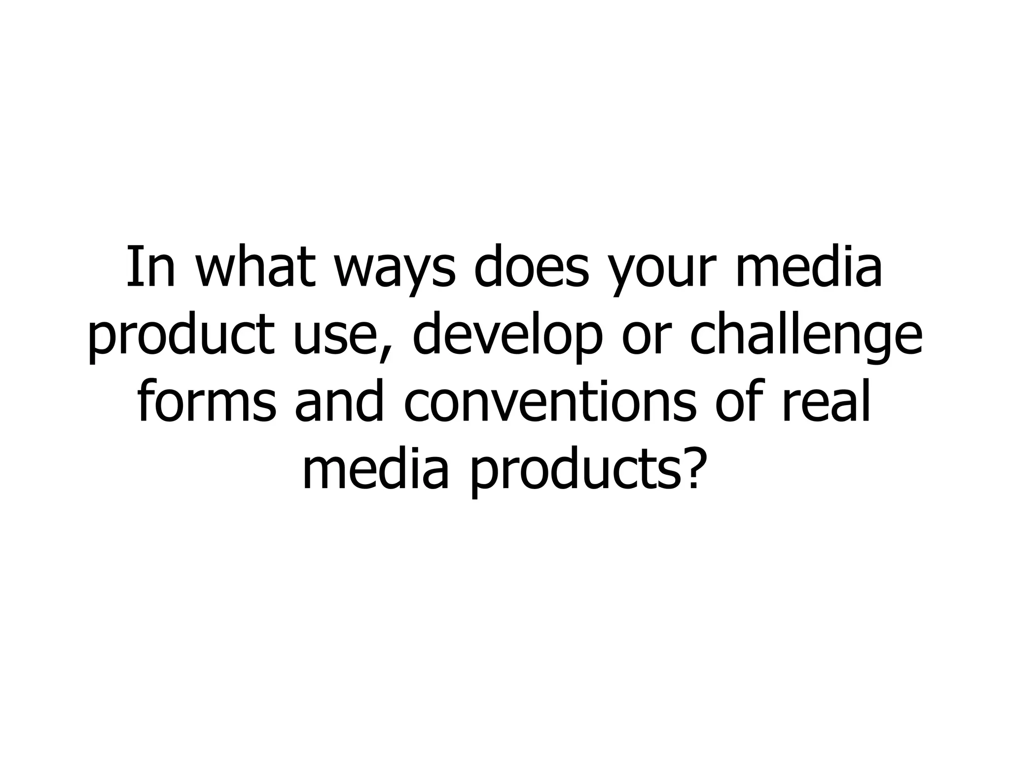
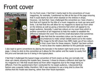
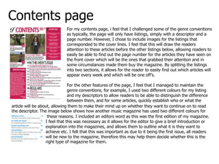
In what ways does your media
product use, develop or challenge
  forms and conventions of real
        media products?
Front cover
                              For my front cover, I feel that I mainly kept to the conventions of music
                              magazines, for example, I positioned my title at the top of the page ensuring
                              that it could clearly be seen when stacked on the shelves in shops.
                              However, i do feel that i have challenged this convention as i have chosen a
                              font that isn’t typical for the title of a music magazine as most use sans-serif
                              fonts. I do feel that this will allow for my magazine to stand out from other
                              on the shelves as well as giving a feminine feel which will appeal to my
                              target audience. Secondly, I used two colours on my cover lines which is
                              another convention of all magazines to help the reader to establish the
                              difference between the cover line and the small descriptors that sometimes
                              follow.      I also feel that the secondary colour can be used in some
                                           circumstances to make certain details stand out to the reader.
                                           The image to the left shows how NME made use of two colours
                                           in their cover lines for these reasons. ‘Explicit’ has been written
                                           in red to draw the readers attention to this particular section.
I also kept to genre conventions by placing the barcode in the bottom right hand corner of the
page. I chose to stick to this convention as it allows for the cashier and the reader to easily find
the price and barcode due to it being in the typical place.

I feel that I challenged the typical image convention of front covers as they are normally mid
close up’s clearly showing the models face, however, I chose to choose a different shot type for
my magazine as I felt that would stand out from other magazines due to the image being so
different. From the questionnaire that I conducted for my target audience, i discovered that
fashion was a popular hobby, therefore i felt it was necessary to use a long shot to show the
clothes that the model was wearing, rather than their facial expression.
Contents page
                              For my contents page, i feel that I challenged some of the genre conventions
                              as typically, the page will only have listings, simply with a descriptor and a
                              page number. However, I chose to include images for the listings that
                              corresponded to the cover lines. I feel that this will draw the readers
                              attention to these articles before the other listings below, allowing readers to
                              easily be able to find out the page number for the articles they have seen on
                              the front cover which will be the ones that grabbed their attention and in
                              some circumstances made them buy the magazine. By splitting the listings
                              into two sections, it allows for the reader to easily find out which articles will
                              appear every week and which will be one off’s.

                                For the other features of the page, I feel that I managed to maintain the
                                genre conventions, for example, I used two different colours for my listing
                                and my descriptors to allow readers to be able to distinguish the difference
                                between them, and for some articles, quickly establish who or what the
article will be about, allowing them to make their mind up on whether they want to continue on to read
the descriptor. The image below shows how another music magazine has used two different colours for
                    these reasons. I included an editors word as this was the first edition of my magazine.
                   I feel that this was necessary as it allows for the editor to give a brief introduction or
                   explanation into the magazines, and allows them to outline what it is they want to
                   achieve etc. I felt that this was important as due to it being the first issue, all readers
                   will be new to the magazine, therefore this may help them decide whether this is the
                   right type of magazine for them.
Double page spread
                                                           For my double page spread, I felt that I mainly
                                                           stuck with he genre conventions, for example, if
                                                           had my body copy organised into columns with
                                                           justified text to make the appearance of them
                                                           much tidier and clean cut. For the columns, I used
                                                           Times New Roman as my font as this is the typical
                                                           font for extensive text as it is easy on the eye for
                                                           readers. I felt that this was important as the
                                                           article itself was quite long. I feel that my
                                                           standfirst was in a good position to be noticed as
                                                           it stood out from the rest of the text as it had a
                                                           larger and different font. This was important for
                                                           me as my audience are mostly part-time workers
                                                           or students in full time education, they only have
                                                           small amounts of time for leisure, therefore
establishing whether they are interested in the topic of the article before reading is important.

I feel that I developed the convention of using a drop cap in articles as I wanted to have a very large
drop cap for my article as I felt that it grabbed the readers attention as soon as they turned to the page.
I feel that it signifies importance, which as it is the corresponding article to the main cover line, I felt
was necessary. I also included an end blob at the end of my article to signify that this was the end. This
ensures that the reader does not expect to find the article continued on the next page.

Finally I felt that I used the genre convention of having the page number and the date in the bottom
right hand corner as readers will be able to see the page numbers clearly when flicking through the
magazine as this is the typical position for page numbers.

Question 1

  • 1.
    In what waysdoes your media product use, develop or challenge forms and conventions of real media products?
  • 2.
    Front cover For my front cover, I feel that I mainly kept to the conventions of music magazines, for example, I positioned my title at the top of the page ensuring that it could clearly be seen when stacked on the shelves in shops. However, i do feel that i have challenged this convention as i have chosen a font that isn’t typical for the title of a music magazine as most use sans-serif fonts. I do feel that this will allow for my magazine to stand out from other on the shelves as well as giving a feminine feel which will appeal to my target audience. Secondly, I used two colours on my cover lines which is another convention of all magazines to help the reader to establish the difference between the cover line and the small descriptors that sometimes follow. I also feel that the secondary colour can be used in some circumstances to make certain details stand out to the reader. The image to the left shows how NME made use of two colours in their cover lines for these reasons. ‘Explicit’ has been written in red to draw the readers attention to this particular section. I also kept to genre conventions by placing the barcode in the bottom right hand corner of the page. I chose to stick to this convention as it allows for the cashier and the reader to easily find the price and barcode due to it being in the typical place. I feel that I challenged the typical image convention of front covers as they are normally mid close up’s clearly showing the models face, however, I chose to choose a different shot type for my magazine as I felt that would stand out from other magazines due to the image being so different. From the questionnaire that I conducted for my target audience, i discovered that fashion was a popular hobby, therefore i felt it was necessary to use a long shot to show the clothes that the model was wearing, rather than their facial expression.
  • 3.
    Contents page For my contents page, i feel that I challenged some of the genre conventions as typically, the page will only have listings, simply with a descriptor and a page number. However, I chose to include images for the listings that corresponded to the cover lines. I feel that this will draw the readers attention to these articles before the other listings below, allowing readers to easily be able to find out the page number for the articles they have seen on the front cover which will be the ones that grabbed their attention and in some circumstances made them buy the magazine. By splitting the listings into two sections, it allows for the reader to easily find out which articles will appear every week and which will be one off’s. For the other features of the page, I feel that I managed to maintain the genre conventions, for example, I used two different colours for my listing and my descriptors to allow readers to be able to distinguish the difference between them, and for some articles, quickly establish who or what the article will be about, allowing them to make their mind up on whether they want to continue on to read the descriptor. The image below shows how another music magazine has used two different colours for these reasons. I included an editors word as this was the first edition of my magazine. I feel that this was necessary as it allows for the editor to give a brief introduction or explanation into the magazines, and allows them to outline what it is they want to achieve etc. I felt that this was important as due to it being the first issue, all readers will be new to the magazine, therefore this may help them decide whether this is the right type of magazine for them.
  • 4.
    Double page spread For my double page spread, I felt that I mainly stuck with he genre conventions, for example, if had my body copy organised into columns with justified text to make the appearance of them much tidier and clean cut. For the columns, I used Times New Roman as my font as this is the typical font for extensive text as it is easy on the eye for readers. I felt that this was important as the article itself was quite long. I feel that my standfirst was in a good position to be noticed as it stood out from the rest of the text as it had a larger and different font. This was important for me as my audience are mostly part-time workers or students in full time education, they only have small amounts of time for leisure, therefore establishing whether they are interested in the topic of the article before reading is important. I feel that I developed the convention of using a drop cap in articles as I wanted to have a very large drop cap for my article as I felt that it grabbed the readers attention as soon as they turned to the page. I feel that it signifies importance, which as it is the corresponding article to the main cover line, I felt was necessary. I also included an end blob at the end of my article to signify that this was the end. This ensures that the reader does not expect to find the article continued on the next page. Finally I felt that I used the genre convention of having the page number and the date in the bottom right hand corner as readers will be able to see the page numbers clearly when flicking through the magazine as this is the typical position for page numbers.